Quaker Logo
Tags: granola bars | oatmeal | PepsiCo | USA
Quaker is a prominent brand specializing in oatmeal and other grain-based food products, known for their quality and nutritional value. The brand caters to health-conscious consumers seeking wholesome and convenient food options. Offering a wide range of products including oatmeal, granola bars, and cereals, Quaker has become a staple in many households for its reliable and nutritious offerings.
Meaning and History
Quaker was founded in 1877 by Henry Seymour and William Heston, who selected the name ‘Quaker’ as a symbol of honesty, integrity, and purity. Initially focused on producing high-quality oatmeal, the brand quickly gained recognition for its commitment to excellence. In 1901, Quaker Oats Company was officially formed through the merger of four oat mills, solidifying its position as a leader in the industry.
Throughout the 20th century, Quaker expanded its product line to include a variety of grain-based foods, adapting to changing consumer preferences and dietary trends. In the 1960s, the brand introduced the now-famous Quaker Instant Oatmeal, which provided a quick and easy breakfast option for busy families. This innovation was pivotal in cementing Quaker’s reputation for convenience without compromising on nutritional value.
In 2001, Quaker was acquired by PepsiCo, allowing the brand to benefit from PepsiCo’s extensive distribution network and resources. This acquisition enabled further product development and global expansion, bringing Quaker products to a wider audience. Quaker continued to innovate with new flavors, health-focused products, and sustainable packaging options, maintaining its relevance in a competitive market.
What is Quaker?
Quaker offers nutritious and convenient food products that promote a healthy lifestyle. The brand’s diverse range of oatmeal, cereals, and snacks caters to various dietary needs and preferences. Upholding a legacy of quality and innovation, Quaker continues to be a trusted choice for consumers seeking wholesome and delicious food options.
1876 – 1946
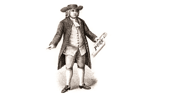
In 1877, the Quaker brand logo featured an illustration of a Quaker man dressed in traditional attire. This initial logo captured the brand’s namesake and conveyed a sense of heritage and authenticity. The detailed illustration emphasized the historical roots of the Quaker brand, establishing a strong identity.
1946 – 1956
By 1946, the logo evolved to a more refined depiction of the Quaker man. The image became less detailed but more recognizable, maintaining the essence of the original design while making it more adaptable for various uses. This iteration focused on the facial features and attire, ensuring the Quaker man remained a central element.
1956 – 1970
The 1956 logo, a full-color painting by Haddon Sundblom, brought a vibrant and lively appearance to the Quaker man. This iteration introduced rich colors and a friendly expression, enhancing the brand’s appeal and making the logo more engaging and memorable for consumers.
1970 – 2012 (corporate)
In 1970, Saul Bass’s design introduced a shadow cut-out style for the Quaker man. This version featured a simplified silhouette with minimal details, focusing on the iconic hat and face. The design used contrasting blue and white colors, creating a modern and clean look that stood out in the marketplace.
1970 – 1986
The redesign of 1970 placed the portrait of the Quaker man on a solid red square with rounded angles, which looked the same as the modern application icons. The portrait itself was redrawn with soft strokes, and the man started looking even more friendly.
1986 – 2007
In 1986 the portrait of the Quaker man was redrawn with more details, and placed inside an oval medallion with a white background a a red outline. The medallion was set in the top part of the composition, overlapping the rectangular banner with the blue body and red and yellow framing. The white uppercase wordmark was written across the banner.
2007 – 2014
Another redesign was held by the brand in 2007, with the slightly refined image of the man, gaining lighter strokes on his face. The whole badge was now framed in glossy gold and placed on a background with a vertically oriented red rectangle. Another change was made to the part of the logo with the lettering — it gained gradients, while the characters got shadowed, and now the whole composition became more vivid and voluminous.
2010 – 2011
In 2010 the composition of the Quaker logo was significantly changed. Now the portrait of a man was inscribed into the enlarged capital “Q”, the first letter of the wordmark, written in blue against a transparent background. The inscription was set in the title case of a geometric serif typeface and was underlined by the “Love Live” lettering in smaller characters.
2011 – 2012
The more traditional design was adopted for the Quaker logo, introduced in 2011. The portrait, drawn against a white background, was enclosed into a golden oval frame and placed on top of a gradient blue horizontally oriented banner with bold white lettering, decorated by thin yellow lines, on it. But this badge hasn’t stayed with the brand for long either.
2012 – 2018
The 2012 redesign by Hornall Anderson brought a refreshed and contemporary look to the Quaker logo. The updated logo featured a realistic yet stylized image of the Quaker man, with softer lines and a friendly expression. This version aimed to blend tradition with modernity, appealing to a broad audience while maintaining the brand’s heritage. The use of richer colors and refined details provided a polished and professional appearance.
2018 – Today
In 2018 the composition of the Quaker logo was simplified in order to represent the progress of the company. The Quaker portrait was slightly redrawn, keeping the color palette from the previous version. Now it is placed against a transparent background, and accompanied by an arched lettering in the same shade of blue as the man’s suit and hat, set at the bottom of the badge.
Font
The fonts used for the Quaker logo evolution display a range of styles, reflecting the brand’s adaptation to changing design trends over the years. Initially, the font was more ornate and serifed, capturing a sense of tradition and heritage. As time progressed, the typeface evolved to a cleaner, more modern serif style.
It maintained the brand’s authoritative and trustworthy image while ensuring better readability. In later iterations, especially from the 1970s onward, the font became bolder and simpler, with a strong, no-nonsense sans-serif typeface that emphasized clarity and modernity. Each change in typography underscored Quaker’s commitment to staying relevant and accessible while retaining a classic and reliable brand presence.
Color
Color choices for the Quaker logo have consistently reinforced the brand’s identity and values. The earliest logos utilized muted tones, which provided a timeless and trustworthy feel, appropriate for the brand’s heritage. Moving into the mid-20th century, the color palette saw the introduction of richer hues, like deep reds and blues, adding vibrancy and modern appeal.
The 1970s logo featured a significant shift to a striking blue and white color scheme, which was both eye-catching and conveyed freshness and simplicity. In recent designs, the use of bold, primary colors like red, blue, and white has been maintained, symbolizing purity, health, and trustworthiness, aligning with Quaker’s brand promise of wholesome, reliable products.
