The English Premier League, a prestigious professional soccer league, serves as a battleground for England clubs and elite Welsh teams to showcase their skills and compete for greatness. Although the league was officially established at the end of the last century, its roots date back to 1888.
Meaning and History
The English Football Championship is considered to be the oldest national championship. In 1885, professional soccer came to England with the formation of the Football Association (FA). Just three years later, the Football League was established.
However, it was in 1992 that the English Premier League, originally known as the Football Association Premier League, was born. It took the place of the First Division as England’s top soccer league, which was driven by a desire for greater financial gain after the First Division teams were relegated from the Football League. Since then, the Premier League has flourished and has come to epitomize prestige and success in sports leagues.
As a professional soccer league for English clubs, the Premier League is the pinnacle of the English soccer league system. Each participating team gets the opportunity to take part in 38 exciting matches throughout the tournament, which begins in late summer and runs until May.
The English Premier League, steeped in a rich heritage of soccer, continues to capture the hearts and minds of people around the world with its thrilling displays of skill, passion and drama. It is a testament to the enduring legacy of the beautiful game, becoming an unrivaled sporting spectacle that unites fans around the world.
What is Premier League?
The English Premier League, often referred to as the EPL, is one of the most prestigious and competitive professional soccer leagues in the world. It is played by the leading soccer clubs in England, and historically the league has also included elite Welsh teams.
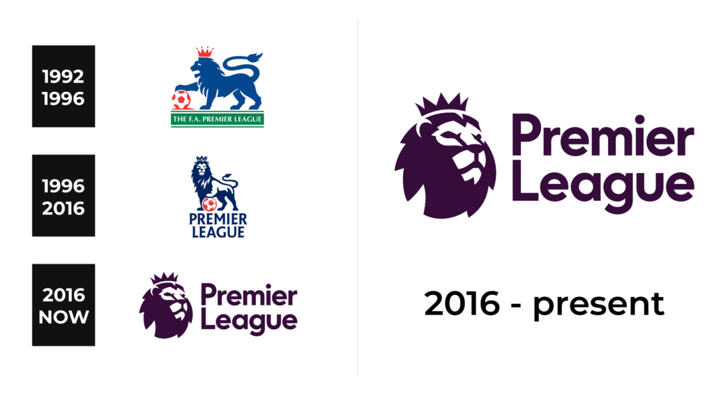
1992 – 1996
The original emblem of the Premier League was a powerful symbol – a blue lion leaning with one paw on a soccer ball and personifying strength, courage and leadership. The red crown on the lion’s head emphasized the royal power. The side view of the lion was depicted as a solid silhouette.
The soccer ball, made in white and red colors, perfectly complemented the crown. Beneath the lion, in white capital letters, were the words “FA Premier League”, elegantly placed on a green banner representing the football field, and two thin lines at the top and bottom added visual interest and impact.
1996 – 2016
The essence of the emblem remained the same – a blue lion clutching a red soccer ball – but with some changes. The lion now looked forward, looked more realistic and was adorned with white highlights. A darker shade of blue, combined with a slightly reduced crown, maintain the majestic aura of the king of beasts. The inscription at the bottom, “Premier League”, consisted of two lines of capital letters with serifs.
2016 – today
The latter update features the emblem that retained its roots but underwent a transformation. The lion, now looking to the right, has taken on a more serious look. Positioned to the left of the Premier League name in two lines, it uses a different font style. The color scheme has changed, adopting a very dark purple hue. Despite the absence of the previous colors and soccer image, the emblem has remained remarkably recognizable, paying homage to its heritage while maintaining a new identity.
Color
In terms of the color palette, the Premier League showed an understated yet eye-catching choice. Classic shades such as blue, white and purple were the base, evoking a sense of tradition and timelessness.
Font
Previously, the Premier League emblem was a simple sans serif font. However, the clever use of different line thicknesses prevented it from becoming boring and unremarkable. Later, they adopted a more complex typeface characterized by sharp serifs and diagonally cut ends. Finally, a rounded serif-free font was used to write the name in the latter logo, giving it simplicity, formality and elegance.


