The NBA is an important and one of the most notable sports associations in the USA. NBA games are exciting, fast, and professional. They attract millions of viewers. One can not only follow the game but also place NBA bets. A unique feature of the association is that in the entire history of its existence, the replacement of the ball took place only a few times. One can play NBA basketball with a specific ball, the requirements for which are officially fixed. It should be traditionally orange with black stitched seams.
Meaning and History
The league was founded in 1946 on June 6th in the city of New York. At the very beginning, the league was called the Basketball Association of America (BAA). It consisted of 2 divisions, which included eleven teams. After the addition of 6 more clubs three years later, it became known as the NBA. After that, the teams were divided into 3 divisions. A year later, several teams, though, left the NBA, so it was back to 2 divisions. In 1975, 4 clubs of the American Basketball Association joined the NBA.
What is NBA?
NBA is an association that includes professional basketball clubs in Canada and the USA. All of them are divided into two conferences: Western and Eastern. These athletes can be safely called the best basketball players in the world and, accordingly, the highest paid.
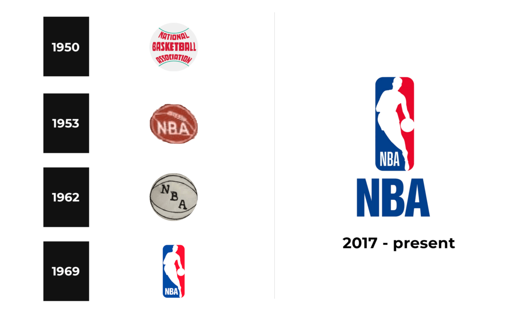
1950
The new name of the organization is printed in red in three lines across a round emblem in the form of a ball. The center line was printed straight while the other two strokes repeated the green lines on the ball. It was a formal emblem that reflected the strength, energy, and passion of every member that was part of the NBA.
1953
A more familiar orange ball served as the base of this logo version. It featured white lines and white initials. The latter were done using a bold sans-serif font with clean, straight lines. The logo looked sharp and its relative simplicity made it look more formal.
1962
A dynamic touch was added to the updated logo by placing the “NBA” inscription at a diagonal. The designers also added slab serifs to make the association look solid and strong. The logo was done in a classic black-and-white color palette.
1969
The NBA basketball league created an attractive, stylish logo. It depicts the outline of a basketball player dribbling the ball, which conveys the inner power of the players. The design is done in red, white, and blue. It is not known for sure which of the players is taken as the basis for creating the logo. There is speculation that this is Jerry West. However, the association itself does not recognize that the logo is copied from a specific basketball player.
2017
Small modifications were done in 2017. The white figure of the basketball players separating the blue and red halves of the emblem was kept the same but the logo appeared different. The first update that instantly catches the attention is the introduction of a new font. It features slimmer strokes and taller characters and even appears as if the letters were simply vertically stretched out. The blue color was also replaced by a darker, richer blue shade. The updated emblem looks more stylish and contemporary without making drastic changes to the recognizable image of the organization.
Font and Color
With an exception of an emblem introduced in 2017, all the other versions feature rather thick strokes for a bold, strong image of the sports association. For a relatively short period, it also used a font with slab serif, which enhanced the solid position of the organization.
When it comes to the color palette, NBA almost always went for a powerful red color. The blue has also been a prominent player since 1969. It is a color of reliability and trustworthiness, while white is not only an excellent base color but also a color that stands for perfection, which is what the NBA is all about.


