Pittsburgh Steelers is the name of one of the most popular and successful rugby teams, competing in NFL. The franchise was established in 1933 by Art Rooney. Today the franchise is still owned by the Rooney family and has Mike Tomlin as the head coach.
Meaning and history
![]()
One of the famous NFL teams, The Pittsburgh Steelers, got their current name only in the 1940s, as they were founded as “Pirates”. So, actually, the first logo in the team’s history was the one, designed in 1933, and repeating a black shield from the Pittsburgh coat of arms. The shield features three gold medals with eagles’ silhou-ettes on them and a wide horizontal stripe with a blue and white checkered pattern.
After getting their current name, the team creates a new logo, which will be twice redesigned during the franchise’s history.
1945 – 1961
![]()
The original logo for The Steelers first appeared in the 1940s and featured three colored images — of a steel factory and a worker, enclosed in a football-shape frame with a double outline, where the “Pittsburgh Steelers Football Club” lettering was placed. The color palette of the logo featured gray, black, yellow, and white.
1962 – 1968
![]()
The redesign of 1962 brought a completely different logo to the team — it was an image of a happy steel-worker, walking along the beam and kicking a football. The image was executed in intense yellow and black, looking funny and bright.
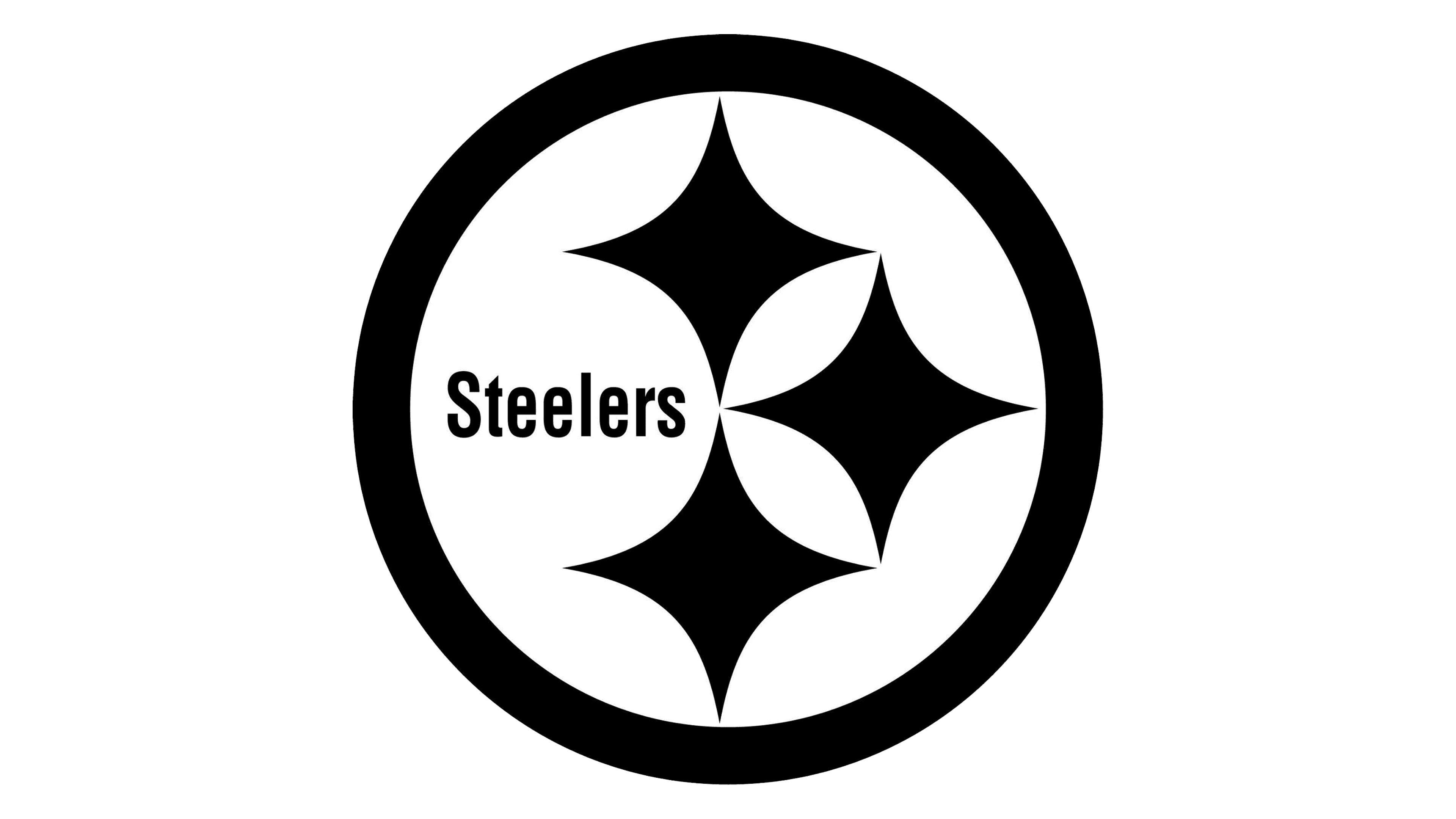
1969 – 2001
![]()
The iconic logo, we all know today, was designed in 1969 and got a nickname “The Steelmark”. It is a white circle in a thick gray outline with the “Steelers” wordmark in simple black sans-serif inside, decorated by three four-pointed stars, each of them in its own color — red, yellow and blue. Despite its visible simplicity, the logo is very meaningful and reflects the stages and the importance of the steel manufacturing process. The colors also symbolize coal, iron ore and scrap steel, that are needed for steel production.
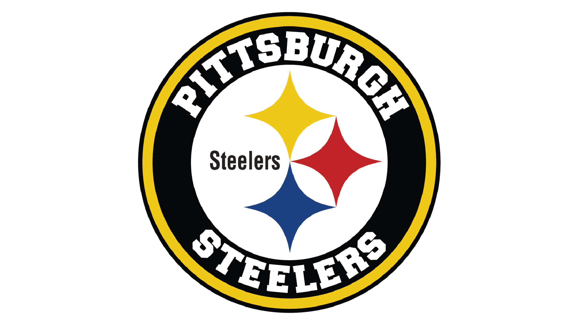
2002 – Today
![]()
The logo was modified in 2002. And got its contours cleaned and more distinct. The only significant change made during this year was an addition of a thin black outline to the rounded emblem. The colors were slightly brightened and that’s it. There is no need to change the icon, as it is a timeless logo, representing the team’s legacy and showing their value of roots and history.
Symbol
The Steelers symbol was created with the idea of showing the importance of steel, and the quote, that it “lightens your work, brightens your leisure, and widens your world”. The graphical symbol of Pittsburgh’s team is all built around trinity — in col-ors, in meaning, and in feelings.
Emblem
The iconic emblem is usually placed inside a yellow or gray square, but even when executed in monochrome on the printed materials, it is instantly recognizable, as has its special history and lots of hidden meaning it in.
Helmets
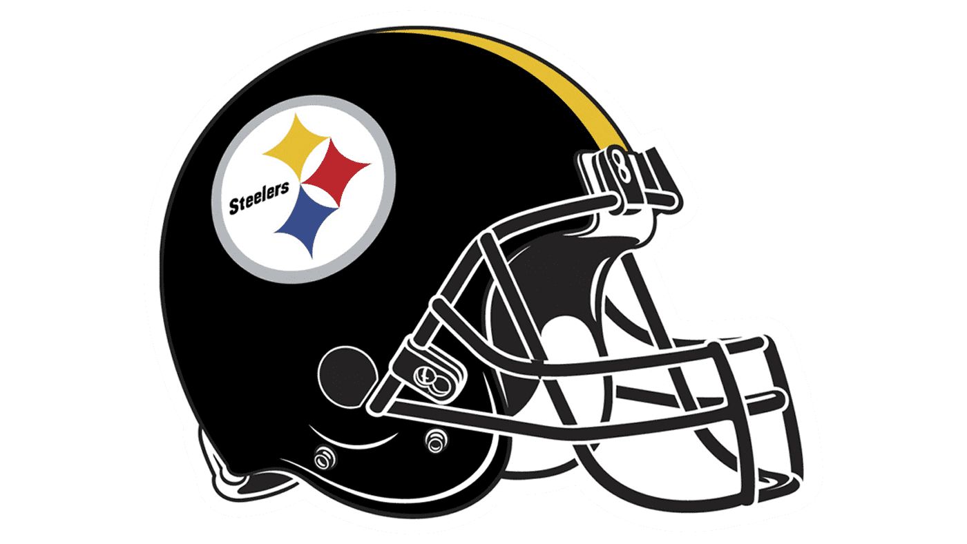
The Pittsburgh Steelers’ helmet looks bright and fun, despite the solid black color of the background, as the enlarged colorful emblem, placed on the side and a wide yellow line in the middle makes it look fresh and bright, evoking a sense of happi-ness and progress.
Uniforms
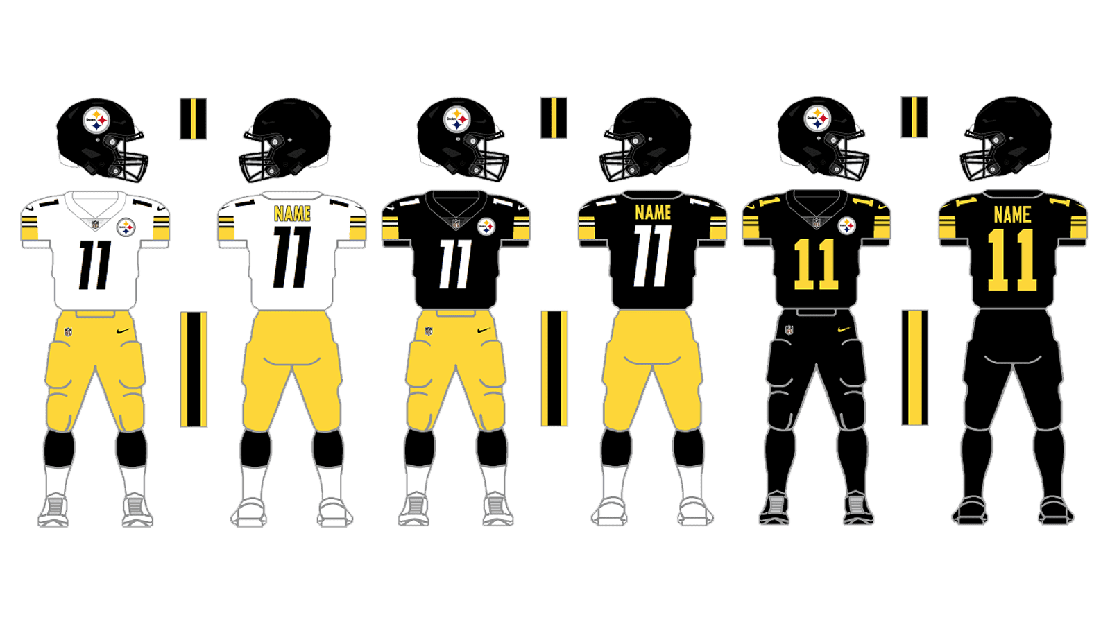
The Steelers main uniform consists of a black jersey with a white player’s number and delicate yellow shoulder details, and yellow pants with wide black side stripes.
For the road uniform, the team wears white jerseys with black numbers and the same yellow shoulder elements, and yellow pants with black accents as in the main variant.