Philips Logo
Tags: electronics | healthcare | Netherlands
Philips, a globally recognized brand, excels in the realms of healthcare, electronics, and lighting. This Dutch-origin multinational was established by Gerard Philips and his father Frederik in 1891. Initially a small bulb-making factory in Eindhoven, it has evolved into an entity with widespread influence, publicly owned and traded on stock exchanges. Philips’ operations span across continents, with a prominent presence in over 100 countries. This extensive reach is underpinned by a network of regional headquarters and state-of-the-art innovation labs, ensuring Philips’ robust engagement in various markets and its ability to adapt to regional demands and advancements.
Meaning and history
The genesis of Philips dates back to 1891 when Gerard Philips and his father, Frederik, embarked on a venture in Eindhoven, the Netherlands, producing carbon-filament lamps. This humble beginning marked the onset of a journey towards becoming a key figure in the electrical industry. Philips’ history is studded with significant achievements: the breakthrough into the radio market in 1927, the pioneering development of X-ray technology in 1918, and the foray into television production in the 1940s. Philips’ trajectory over the years is a testament to its adaptability and foresight. In recent decades, the company has pivoted towards health technology, embracing a mission to enhance global healthcare. Now, Philips stands as a formidable leader in health technology, dedicated to improving lives with a focus on healthcare systems, personal health products, and innovative solutions catering to the health continuum. This strategic shift from its traditional stronghold in electronics and lighting to healthcare technology marks its responsiveness to global market dynamics.
What is Philips?
Philips is a diversified health technology company, primarily focused on improving people’s health and well-being through meaningful innovation. It offers advanced technology solutions in diagnostic imaging, image-guided therapy, patient monitoring, and health informatics, as well as in consumer health and home care.
1891 – 1895
The dawn of Philips’ branding in the early 1890s was marked by a badge that epitomized elegance. This initial emblem featured the name “Philips & Co” in a sophisticated, flowing cursive, rendered in a distinguished italicized script. The design’s simplicity, with its stark black lettering set against a crisp white canvas, lent an air of refined grace to the brand’s first foray into visual identity.
1895 – 1905
In a significant shift in 1895, the Philips badge underwent a creative transformation. The earlier sophisticated wordmark made way for a succinct yet artistic monogram. In this design, the letter “P” gracefully overlapped the “Co,” with a tiny yet prominent ampersand artfully positioned inside the “C’s” arch. The emblem was subtly enhanced by the presence of an elegant equalizer symbol, discreetly placed in the bottom right, adding an extra layer of sophistication to the overall design.
1905 – 1910
The 1905 redesign marked a bold departure from monogram styles, introducing a striking visual statement with sturdy uppercase lettering in a prominent serif font. This reimagining amplified the Philips brand name, making it the focal point of the design. The logo was further enriched with lines of additional text, rendered in small caps and utilizing diverse typefaces to create a visually dynamic and layered effect.
1910 – 1915
In 1910, the Philips logo was reenvisioned to project a bolder, more assertive identity. This iteration featured a commanding, heavy uppercase “Philips” inscription in a meticulously crafted geometric serif font. The design was striking, with the black characters receiving an artistic touch through thin white strokes, all encased in a vibrant yellow outline. This logo embodied confidence and vibrancy, serving as the company’s visual hallmark for the next half-decade.
1915 – 1921
Philips’ 1915 redesign brought a refreshing and approachable change with its friendly two-leveled wordmark. Each level was underscored by a uniquely wavy line, adding a touch of whimsy to the design. The entire composition, set in a sleek black hue and utilizing a modern sans-serif font, showcased a perfect blend of contemporary style and uniformity, reflecting the brand’s evolving ethos.
1921 – 1923
The 1921 badge saw Philips embracing a vivid color scheme. The design featured crisp white lettering elegantly laid over a deep blue rectangular banner, encased in a striking yellow outline. Central to this design was the “Phillips” wordmark, neatly sandwiched between two undulating yellow lines. This tripartite banner also included additional white text above and a symbolic white light bulb below, each radiating short, sharp rays, adding depth and meaning to the brand’s visual representation.
1923 – 1924
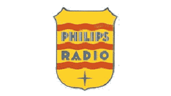
Philips’ 1923 redesign was a bold foray into color and shape transformation. The crest’s hue shifted to a bright, eye-catching yellow, with a smoothly rounded bottom. The banner underwent a simplification, now proudly featuring a two-leveled “Philips Radio” inscription in bold, uppercase sans-serif letters. The words, in a subdued blue, were framed by three striking red waves. A thin, sharp four-pointed star in a matching blue hue adorned the crest’s lower end, adding an elegant touch to the overall design.
1924 – 1936
Embracing minimalism in 1924, Philips adopted a badge that focused on a robust, heavy uppercase logotype. The color palette was refined, featuring shades of gray accented with subtle yellow stripes. The letters, set in an extra-bold geometric sans-serif typeface, exuded strength and stability, reflecting the brand’s solid foundation and forward-looking approach.
1936 – 1938
The 1936 redesign introduced a more refined touch to the Philips logo. The brand name was reimagined in a sophisticated sans-serif font, primarily in solid black. A distinctive twist was added with the letter “S” partially covered by a contrasting white decorative element. This design iteration, though brief in its tenure, added a layer of elegance and uniqueness to the Philips identity.
1938 – 1948
The 1938 Philips logo was a symbol of sleek elegance, featuring a lustrous golden crest with a gently rounded base. Within this crest lay a dark red circle, artistically adorned with three horizontal wavy lines and four stars arranged in a diagonal pattern. The upper section of the logo presented a contrasting blue rectangle, housing a white wordmark. The inscription, in a narrowed yet bold sans-serif font, conveyed a sense of neatness, confidence, and modern flair.
1948 – 1968
With the 1948 redesign, the Philips crest, a decade-old symbol, was reinterpreted in a monochromatic palette and positioned alongside a bold, geometric sans-serif logotype. This redesign not only refreshed the visual aesthetic but also created a harmonious link between the crest’s internal inscription and the standalone wordmark, unifying the elements in a cohesive visual narrative.
1968 – 1995
The 1968 redesign marked a significant evolution in the Philips brand identity. The new logo featured a bold blue wordmark in an all-caps, robust sans-serif typeface, set against a pristine white backdrop. This minimalist approach stripped away any extraneous elements, focusing purely on the power of the brand name. The chosen typography, reminiscent of fonts like Town 50 Chic Black and Dazzle Unicase Bold, communicated strength and simplicity, signaling a new era for the brand’s visual identity.
1995 – 2004
In 1995, the Philips logo underwent a dynamic refresh, with the traditional blue and white crest now accompanied by an enlarged logotype in a matching shade of blue. Beneath this, the brand introduced a catchy and stylish tagline, “Let’s make things better,” rendered in a sharp, contemporary cursive font. The tagline’s characters boasted sharp contours, harmonizing in color with the main elements, adding a fresh, modern twist to the brand’s image.
2004 – 2008
The 2004 redesign saw a significant change in Philips’ branding strategy. The crest was removed from the official logo, paving the way for a more streamlined and impactful visual. The logotype itself was reworked into a bolder style, adopting a deeper and more nuanced shade of blue. Below the main logotype, a new tagline, “Sense and Simplicity,” appeared in lowercase, blending gray and blue tones to create a subtle yet sophisticated effect.
2008 – 2013
In a nod to its heritage, the 2008 redesign reintroduced the crest, now repositioned to the right of the uppercase logotype. Both elements were rendered in a sleek monochrome, merging the past and present of the brand’s visual journey. This version of the logo, balancing historical significance with contemporary aesthetics, marked a significant chapter in Philips’ branding history, lasting five years.
2008 – 2013
2008 also saw a refinement in the Philips logo, with a focus on enhancing the vibrancy of its blue color. The letterforms underwent subtle modifications, including shorter and bolder shapes, with a distinct diagonal cut in the horizontal bar of the “L.” The new typeface of the Philips logotype bore similarities to fonts like Achates Heavy and Tanseek Sans Pro Regular, further evolving the brand’s visual language.
2013 – Today
In 2013, Philips revisited its iconic crest, enhancing its color palette to include a rich blue background, mirroring the hue from its previous logo iteration. The crest’s content, featuring the inscription and a sphere, was set in a contrasting white, creating a striking visual impact. This return to the iconic crest signified a blend of tradition and modernity, underlining Philips’ enduring legacy and forward-looking vision.
