Oracle is known as a software and server developer. The main product produced by Oracle is the DBMS. They are used by corporations for distributed storage of operational information, such as customer lists, equipment data, employee records, financial records, transaction histories, correspondence, legal documents, and much more. Oracle also makes enterprise applications – advanced programs that have run on desktop client computers, such as PCs, since the beginning. These programs are placed in database servers to obtain source information to track the necessary data and further manage the business.
Meaning and History
It was during 1977 when working at Amtex that Larry created one of his brilliant creations – An outstanding multipurpose database, encrypted under the name Oracle, emerged for the CIA. Bob Miner and Ed Oates worked with Ellison on this project. At the start of their own business, the guys, according to Ellison, had about $1,200, enthusiasm, and talent. Their company was founded in 1979 and was named SDL (Software Development Laboratories). The founders set about creating a more advanced version of their own software. The year 1982 became a new stage in the company’s development. It was then that SDL, which had a staff of eight, changed its name to Oracle Corporation. At that time, the team was seriously working on the third version of the program, which was released next year. Oracle’s aggressive acquisition of a number of companies engaged in the production of various types of software began in the 1990s and continues to this day. In 2014, co-founder and CEO of Oracle Larry Ellison left his post and took the position of the company’s Chief Technology Officer. Even after leaving the post of CEO, he still controls the company and that is why you can be sure of its future.
What is Oracle?
Initially, Oracle offered software for databases, then added programs for managing finances, sales, and supplies. The cloud service is also on the list of Oracle services. In general, the shares of the IT giant have grown by 73% over the past year. It cannot be said that the success of the corporation is limited to the contribution of Ellison alone, but it cannot be understated in any way. It was he who became the catalyst that allowed the company to get out of many crises and become what it is today.
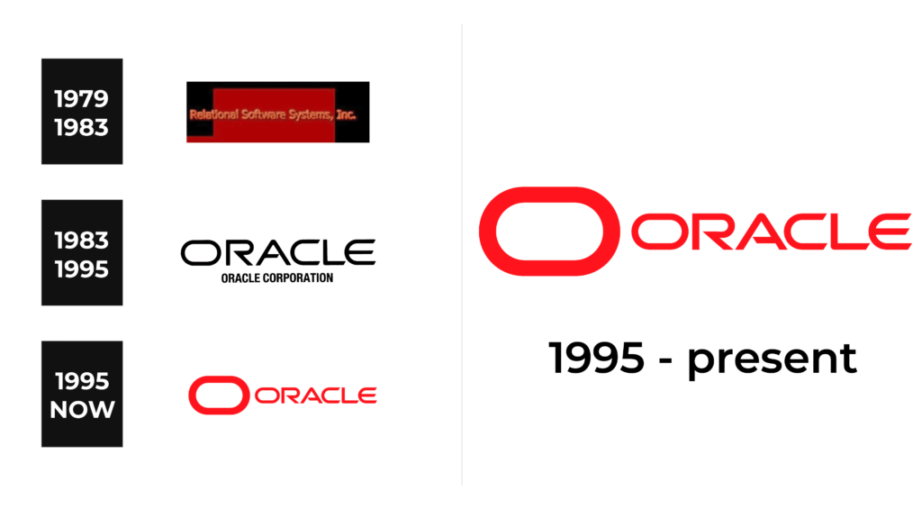
1979 – 1983
From the very beginning, the company chose a bright red color that matched the bold ambitions of its founders. It was featured in the form of a rectangle with a small “tail” on the left that was placed on a larger black rectangular background. The logo said “Rlational Software Systems, Inc.” using a basic, sans-serif font of an orange color. To make the inscription stand out better, the designers added a shadow that gave the characters an appearance of volume. This was a simple logo that matched the solid products of the company.
1983 – 1995
The logo consisted of a large “Oracle” inscription and the full name right underneath in a smaller font. The font choice for the top line was as unordinary as everything that is connected to the Oracle corporation. All the characters were uppercase and excellently combined smooth curves with sharp straight and diagonal cuts. It was a perfect representation of cutting-edge technologies offered by Oracle and their user-friendly and well-functioning features. The second line, though, was printed using rather basic font – Helvetica Neue Condensed. During this period, the logo was done in classic black.
1995 – Today
The company updated the logo in 1995. The main change was the replacement of black with strong red. The second line was removed and the name was now accompanied by an enlarged, horizontally stretched-out “O” that matched the “O” in the name.
Font and Color
The geometric sans serif font Good Times Regular, created by Ray Larabie and released by Typodermic, is the closest match for the font used to print the name in the Oracle logo. Other inscriptions in the logos are done using rather simple, sans-serif fonts.
Originally, the company went for a red and black color palette with a splash of orange. After the name change, it was replaced by a more sophisticated and classic black. Soon, the logo got a bright red coloring, which became closely associated with the corporation over the years. It not only shows the passion of the company when it comes to everything it is doing but also reflects its strength and confidence.


