Although the team had a rough start with the most losses in a season since 1899. This surely did not stop them. After seven games, the New York Mets finished as winners of their second World Series. Tom Seaver was a unique talent, therefore the Mets took a great deal that he was acknowledged for his invaluable contribution to the club. The pitcher is the first player to have their number retired in Mets history. So far, they have retired eight different numbers.
Meaning and History
![]()
The club, known as New York Mets, was founded in 1962 amid the National League’s struggle with the Continental League to replace the New York Giants and Brooklyn Dodgers, who had come from New York. That’s why they took the colors of both teams. Since 2009, the club has called Citi Field, which is next to the site of Shea Stadium, home. The New York Mets changed owners for $2.42 billion in 2020. It is known that Mets in the name comes from the word Metropolitan. However, not everyone knows that they could have been called the Bees or Islanders, among other names that were proposed before the final decision was made.
What is New York Mets?
The New York Mets are a professional baseball team based in the United States. When the Mets set a goal to win the game, there is nothing that will stop them from achieving the best results. Although it took them some time, they earned a great fan base.
1962 – Today
![]()
A bright orange monogram has been used by the team since its creation. The letter “N” is placed slightly above the “Y” with the latter overlapping it about halfway. The designer chose a very elegant font with flared serif and thin, delicate ends. The logo looks grand and very powerful. It is a great representation of a prominent team.
1962 – 1998
![]()
The team also had another emblem created for it when it was established. It had a more intricate design with multiple elements that brought more meaning to the logo. First of all, one can see a dark blue skyline that features several notable buildings, including Williamsburg Savings Bank, at the time Brooklyn’s tallest, and the Empire State Building. Against its background, the logo has the famous New York Bridge. Although it might not catch the attention right away, there is also a baseball ball. It has the outline of the ball as well as the arrow pattern done in orange. The whole emblem, as it turns out, is drawn right on the ball. The “Mets” part of the name is written using a bold, cursive font and orange color that matches the color of the ball. The monogram, which symbolized New York, was added to the left of the inscription. This emblem was designed by sports cartoonist Ray Gatto.
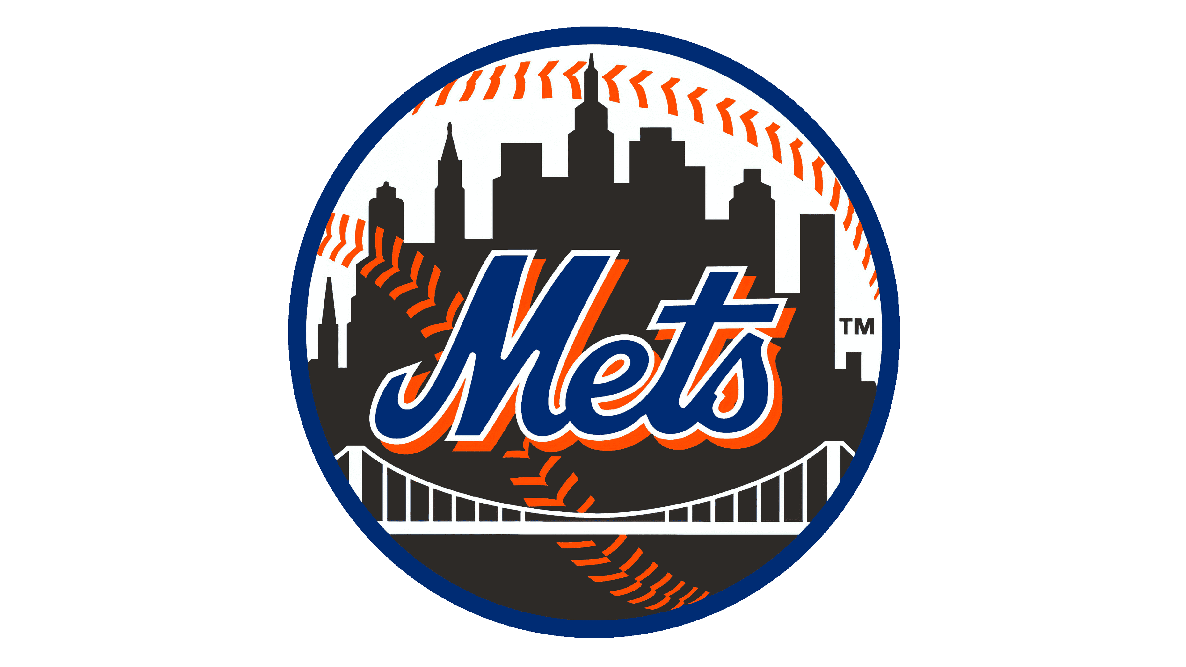
1999 – Today
![]()
Only minor details were modified in 1999. First of all, the team had the NY monogram removed. In addition, the bridge lines were made thicker, which allowed it to not get lost and created a more balanced look with the white top. It also now served as an element that underlined the team’s name.
Font and Color
For the monogram, the designers used an elegant, decorative font similar to the Lynchburg Script Normal font. As for the round emblem, it had a custom font created specifically for the Mets. However, there are similar fonts, such as Spills Base from Comicraft or Buffalo Nickel from Nick Curtis.
The color palette of the emblem is bold and vivid. First of all, there is an energetic orange that arouses feelings of enthusiasm and excitement. A dark blue color adds elegance, confidence, stability, and unity. It is a perfect color combination with the white serving as a nice contrast.