Launched in Boston, Massachusetts, in 1906, New Balance is an American enterprise focused on sneakers and upper wears. Throughout the course of history it has turned out into a marque, celebrated internationally for its unwavering dedication to high standards in customer comfort and style.
Meaning and History
![]()
New Balance’s name reflects that this brand is aimed at new heights in footwear quality development standards. They secured most of their facilities in the US and the UK, consciously choosing not to follow the practice of complete outsourcing to reduce costs.
The 1960s period saw New Balance invest in the athletic sector with the launch of the ‘Trackster,’ a sprinter boot notable for its range of widths. This innovation sparked an unforeseen growth of NB particularly in the 1970s and 1980s, further propelling its refocusing from shoe accessories to sneakers.
The brand has also made a line of strategic sponsorships and ventures. They supply sports teams and runners, fund public events, and open athletic attractions worldwide. These efforts have firmly established New Balance as an innovator in its industry.
What is New Balance?
New Balance is a global seller of athletic footwear and clothing, with over 100 years of history. It runs shops and sponsorships around the world to provide extra high quality and style sneakers to its customers, proving that its name is used for quite a solid reason.
1972 – 2006
![]()
This version presents a daring design. The ‘NB’ initials are stylized with sharp angles and extended lines that suggest speed and movement, reflecting the brand’s association with athletic performance. The font used for ‘new balance’ is simple, clean, and unadorned, providing a stark contrast to the initials above it. The color scheme is monochromatic, giving the logo a classic and versatile appearance.
2006 – 2008
![]()
The ‘NB’ initials have been updated to a more contemporary design, with the lines becoming thinner and more streamlined, suggesting a more high-tech approach. The ‘new balance’ inscription features a softer and more approachable font that is still clean and highly readable. The color has shifted to a warm red, indicating passion, energy, and a bold move towards the future.
2008 – today
![]()
This iteration seems to take a step back towards the traditional, merging the modern elements of the 2006 logo with the classic feel of the 1972 version. The ‘NB’ initials return to a bolder and thicker design but keep the streamlined feel of the 2006 update.
Color

The color remains a vivid red, symbolizing the brand’s continued dedication to energy and passion in their products.
Font
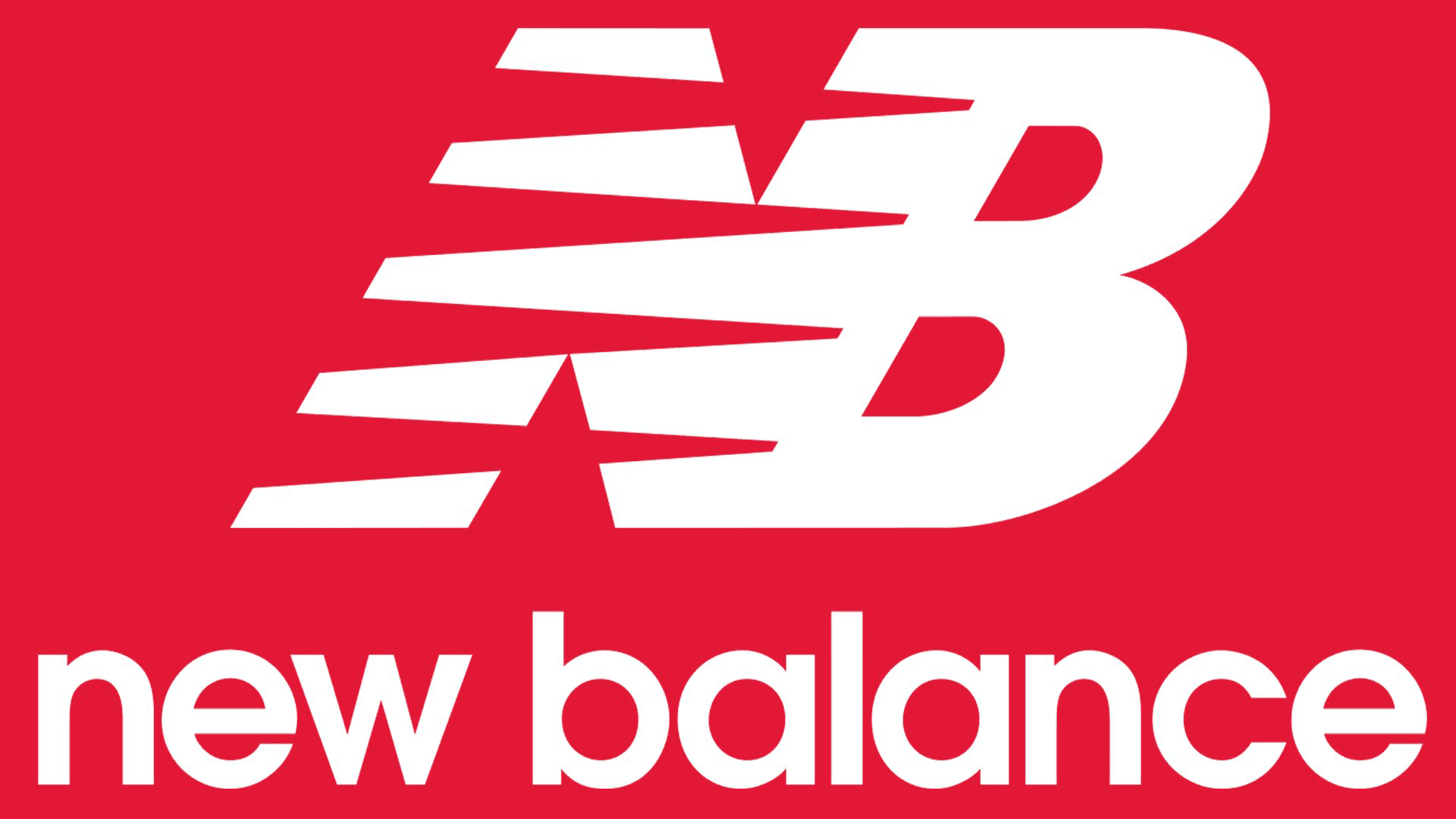
The ‘new balance’ text is bold and prominently placed below the initials, retaining lowercase letters.