The iconic emblem of the Minnesota Twins, a baseball team with its home base in Minneapolis, has a bright red letter “C” entwined with a dark blue letter “T.” Fans and baseball enthusiasts everywhere recognize this logo, which has come to represent the team. However, it was not always this way and the team had over ten other versions during its more than 100-year history. They not only reflected the name change but also presented a different side of the player while making it easy to associate one or the other version with this particular club.
Meaning and History
![]()
Starting from 1901, the Minnesota Twins gave their fans many reasons to be proud and joyful. They also have three World Series championships, one of which was won at the time they were still known as the Washington Senators. The name is explained by the fact that for the first sixty years, they represented Washington D.C. Their successes came in waves, which is quite common, and gave the players the strength and determination to go through low times. Although the team was renamed several times as it changed locations, the name Twin Cities was never officially accepted but surely stuck to the team.
What is Minnesota Twins?
It is well known that this is the name of professional baseball players. The Twins are not only known for their games, including winning the 1987 and 1991 World Series, but also AR statistics and AR games. These data visualizations, delivered in real-time and tailored to where fans are at Target Field, have the potential to significantly improve the way fans enjoy Twins games, connecting generations of baseball fans.
Washington Senators (first era)
1901
![]()
The logo of the team reflected their original name. The word “Washington” was printed using a sans-serif font with all uppercase characters that formed an arch. The dark blue color gave the logo a serious look. There were no other elements in the logo.
1902
![]()
A large “W” replaced the full word the next year. It was still done in dark blue and featured straight, clean lines. The team appeared confident and strong. The fact that it did not use its full name further showed that it was gaining more recognition.
1903
![]()
The new logo marked a new year in the history of the team. This time, Washington Senators, as they were known, went for a more intricate design. No, the logo did not get any new elements, but the font choice was meant to create a more sophisticated and grand appearance.
1904
![]()
This year, the team decided to bring back its original logo. It was a good move to show that the team already has some successful years behind it.
Washington Nationals
1905
![]()
Although the name has changed, it is not obvious from the logo. A minimalistic design with just a large “W” proved to be a truly timeless look. In this version, the designers created a logo similar to the one seen in 1902. Here, though, the font has slab serifs that add a bolder and more serious touch. You surely would not want to mess with a team that has such a serious emblem.
1906
![]()
It looks like there is a predictable trend in the logo versions. The team went from a simple and clean design to a font that features a lot more details. Each stroke has uneven lines and gaps or pointed elements going off to the side.
1907 – 1911
![]()
The previous logo was surely good, but it was too busy and hard to read from a distance. This new version still features uneven edges but the strokes otherwise are solid and do not have any gaps inside. This logo is closer to the 1905 version as it also has serifs, although this time they are cupped instead of being slab.
1912 – 1927
![]()
It seems that the team was done experimenting for some time and presented a classic and stylish version of its logo. There was nothing drastically new as the logo still featured “W” as the main and only element. It was still done in dark blue, which gave the logo a professional appearance. The letter is wide and is written using clean and straight strokes. This logo not only looks more timeless but can also be easily scaled.
1928
![]()
During this year, the Washington Nationals experimented with a different look, more specifically the color. The familiar dark blue was now used as a thin outline, while a bright and bold red was the star in this logo. It surely attracted a lot of attention. Combined with thick strokes and slab serifs, the red color created an impression of a powerful and confident team.
1929 – 1935
![]()
After trying a red version, the team brought back the logo designed in 2012 without making any adjustments to it. This version was in use until 1935.
1936 – 1947
![]()
It was this year that the team got quite creative with its emblem. In this version, we can see the U.S. Capitol Dome popping from a white baseball ball. The bat is added in the background, while another important accessory, the cap, is placed right at the top of the dome. An attentive eye will notice a small “W” added on the cap. The designers did not stop there and added “Washington Nationals” at the bottom. The inscription was done in dark blue and red to match the color palette of the rest of the emblem and printed in two lines to preserve a balanced appearance.
1948 – 1954
![]()
This logo still features the U.S. Capitol Dome, but here it is standing straight and has an arched blue backdrop that reminds of a sky. In the forefront, the logo has the familiar “W”. Here, it is done in contrasting, bright yellow and has a black outline that matches the black and white elements in this logo. Once again, the team used a symbolic image and the large initial to show where its values lie.
Washington Senators (second era)
1955 – 1958
![]()
Although the name was changed back to “Senators”, the logo has not undergone any changes. The team not only turned back to its roots when it came to the name but also showed the fans that they are still the same baseball team everyone loves.
1959 – 1960
![]()
A caricature drawing of a baseball player is done primarily in black and white with beige being used for the skin of the player. The character is not dressed as a typical baseball player but rather has more formal wear that is meant to reference the “Senators” part of the name. A red circle with a thick white border and a thinner black outline serves as the base and makes an association with the target and precise game.
Minnesota Twins
1961 – 1975
![]()
Designed by Ray Barton for just $15, this logo is a very visual representation of the team and its name. Twins, who are known as Minnie and Paul, shake hands across the Mississippi River. The latter flows right out of a relatively large baseball ball. The map of the home state is done in a blue-green color that matches the color of the hats on the characters as well as the waves on the river.
1976 – 1986
![]()
A few modifications were made to the logo. Some of the obvious ones are the darker blue color and a red inscription “Win! Twins!” at the top. The latter was especially motivating and reflected their motto.
1987 – 2009
![]()
This logo is relatively minimalistic and makes the team appear more professional. It was also easier to remember and resize as necessary. A baseball ball served as the basis. It had “Minnesota” printed across the top using a traditional serif font and dark blue color. The word “Twins” was printed in a significantly larger font. The red color as well as the blue shadow made it look powerful and sophisticated. If you look closer, it might seem that the designers wanted to stress the “Win” portion of the word “Twins” by making the first and last letters go beyond the base and underlining this portion.
2010 – 2022
![]()
The logo was once again reworked. The “Minnesota” inscription moved from the ball to the dark blue border that was added around the ball. They also added “Baseball Club” around the bottom. These inscriptions featured a traditional serif font of a white color to stand out against the darker background. The “Twins” portion of the name was done in a similar style as earlier but now had a thicker blue outline while the shadow consisted of only a gray line. This logo looks grand and stylish. It might be one of the best versions the team had so far.
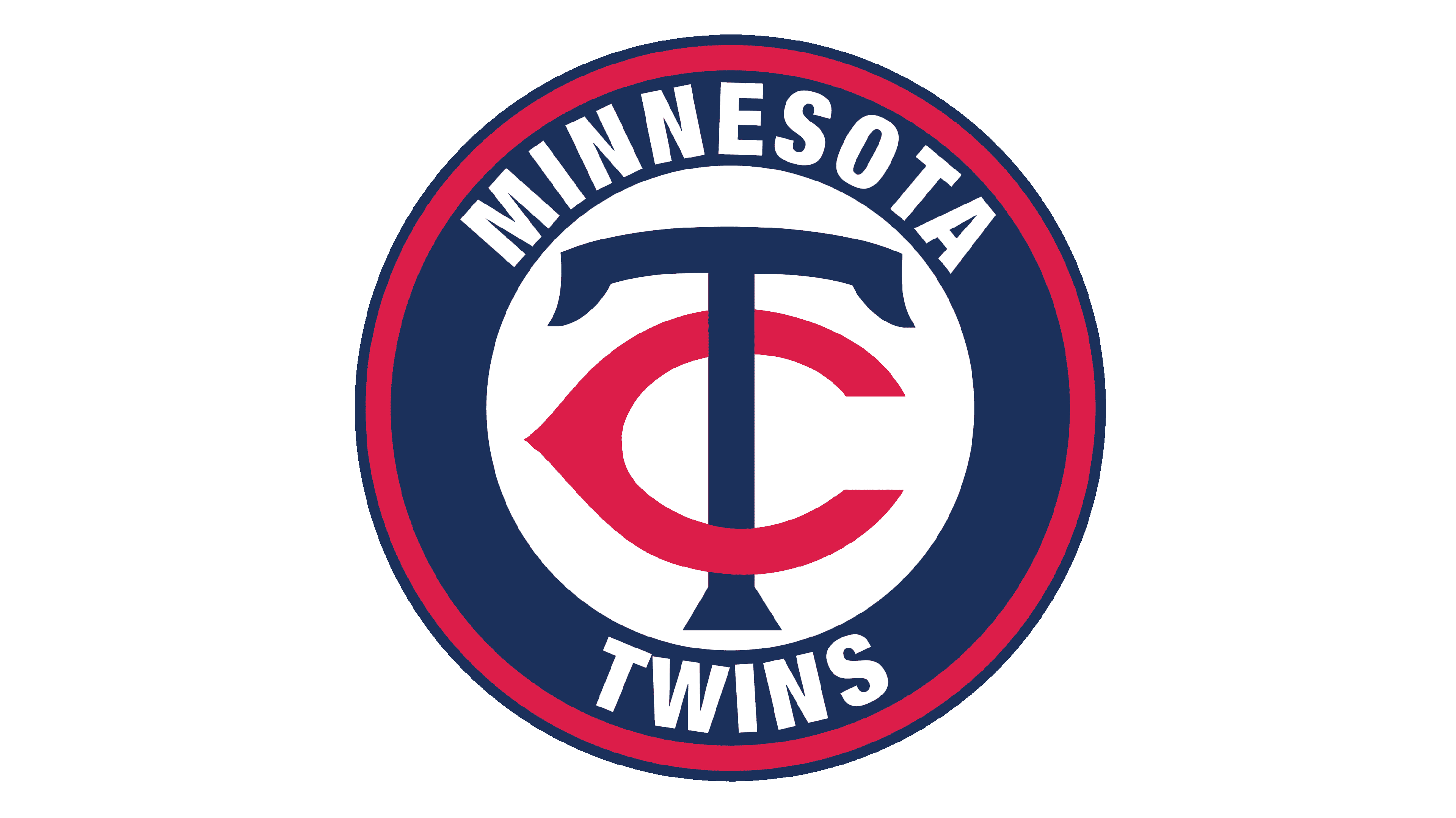
2022 – Today
![]()
Although done in the same color palette as earlier versions, this logo otherwise has nothing in common with them. It features a monogram that has the letters “T” and “C”. “Why “C” and not “M”?”, you might ask. This is because it is short for Twin Cities, where the baseball team plays. The font used in this logo has pointed, flared ends and the letter “C” somewhat resembles an eye. The designers wanted to show the unity of the two municipalities. In addition, Twin Cities was a potential name for the team early on. Although the redesigned logo was published at the end of 2022, the team began to use this logo only in 2023.
Font and Color
Looking at the over a century-long history of their logos, it is easy to tell that dark blue and red are special colors for the club. It is not surprising as both colors have great meaning, with the red reflecting the power and passion of the players while the blue represents order and confidence. The latter also balanced out the bright red.
With the exception of the logo introduced in 2022 and two other logos, the team went for a traditional font with or without serifs. The clean, straight lines gave it a professional and timeless look. The latest logo features a more stylish and bold font choice with flared stroke ends that create an illusion of serifs. Earlier on, the team already used a fancy font that resembled Quadrat Serial Bold font by SoftMaker. It was used in combination with a simpler font choice.