The Milwaukee Brewers do not have a lot of championships and to this day are the only team in the MLB that does not have the World Series trophy. Nonetheless, they played many breathtaking games and gathered plenty of fans in the stadiums. The rise in ticket prices shows increasing interest in their games. Having played for the Milwaukee Brewers for his entire 20-year career, Robin Yount is without a doubt the team’s most accomplished player. The team’s mascot is named “Bernie Brewer”.
Meaning and History
![]()
The Brewers were first known as Seattle Pilots and played their first game in Seattle in 1969. The reason the club is called the “Brewers” is because Milwaukee, their home since 1970, is well-known as a maker of beer. The Brewers’ finest hour was the 1981 and 1982 seasons. Since 1998, the team has been playing in the central division of the National League. Achievements are more than modest. There were a few times that it won third place and it did win one AL championship in its early days and won five titles in the NL and AL combined. Nonetheless, there are many reasons to hope that the team’s best years are still ahead.
What is Milwaukee Brewers?
The Milwaukee Brewers are a professional baseball team. Although they do not have a lot of notable achievements, the fact that they compete in Major League Baseball already says a lot. Miller Park is the home field for the Brewers.
1901
![]()
Initially, the logo was quite simple. It had only one word that was printed in an arch to add some interest. Neither was it printed using any fancy font. In fact, the strokes look pretty uneven and have rounded ends. The color choice, the dark blue, gave this version that professional and confident look.
1969
![]()
In its inaugural year, the team was based in Seattle and known as the “Seattle Pilots.” Their logo featured a striking red ship’s steering wheel set against a traditional white baseball, complete with the word “pilots” inscribed on it. Adding to the nautical theme, two vibrant yellow wings adorned each side of the steering wheel, symbolizing speed and agility.
1970 – 1977
![]()
As the Brewers changed name and location, they had a new logo designed for them. It depicts a strong, big guy in a yellow and white uniform with white outlines holding a bat and being ready to hit the ball. A swoosh line adds dynamics and reflects the movement of the player. The caricature drawing is not accompanied by any inscriptions.
1978 – 1993
![]()
A logo that adorned baseball uniforms from 1978 depicted the letters “M” and “B” in the shape of a baseball glove. The letter “M” was positioned at the top and stood for the fingers, while the lowercase “B” formed another finger and the palm of the hand. The characters were done in blue and had a thick yellow outline. The yellow is also supported by a white and yellow ball, which is placed in the center of the “B”. The logo was very symbolic, but unless you are somewhat familiar with the baseball teams, you might not decipher the name abbreviation right away.
1994 – 1999
![]()
A bold and more confident logo was presented fifteen years later. The color palette got much darker, which gave the logo a more professional and stylish appearance. The name initials were intertwined and placed symmetrically in the center of a square set at an angle. The designers also added two bats crossed in the back. A grand font choice and multiple borders contributed to the impressive look.
2000 – 2017
![]()
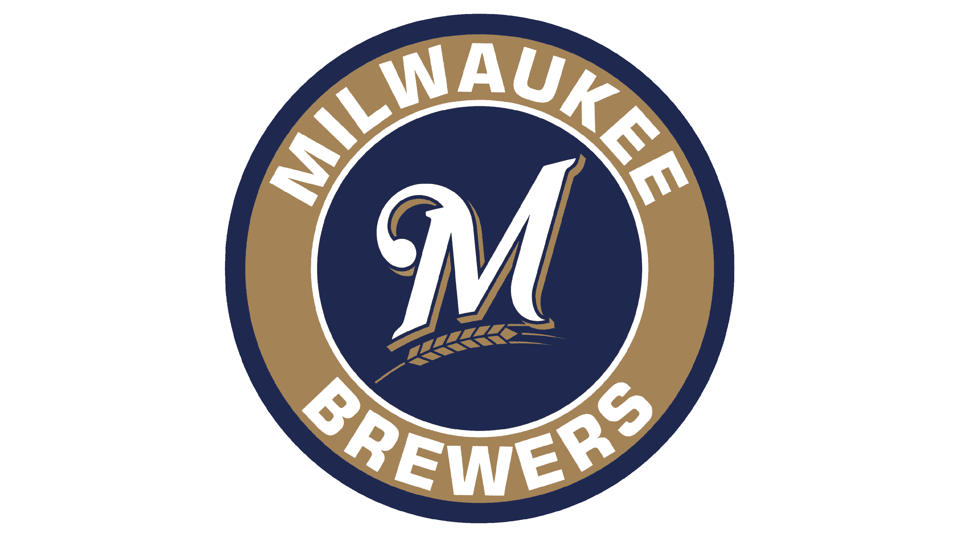
The logo got even better at the start of the new century. The team went from a geometric, serif font to a very elegant, voluminous cursive font. The color palette no longer has green and instead gets a touch of red in the ball pattern. The ball is set in the center behind the inscription and has a border with “Milwaukee” printed in golden across the top and wheat ears at the bottom to hint at the brewing traditions of the city. The logo truly turned out magnificent and reflected the long history of the team.
2018 – 2019
![]()
This logo has the same feel as the earlier version. The designers used the same font and color palette but gave the emblem a minimalistic twist. A large “M” is now the center of the emblem. Right underneath, there is just one wheat ear. It was a perfect way to modernize the logo and at the same time preserve the image that settled with many fans over the years.
2020 – Today
![]()
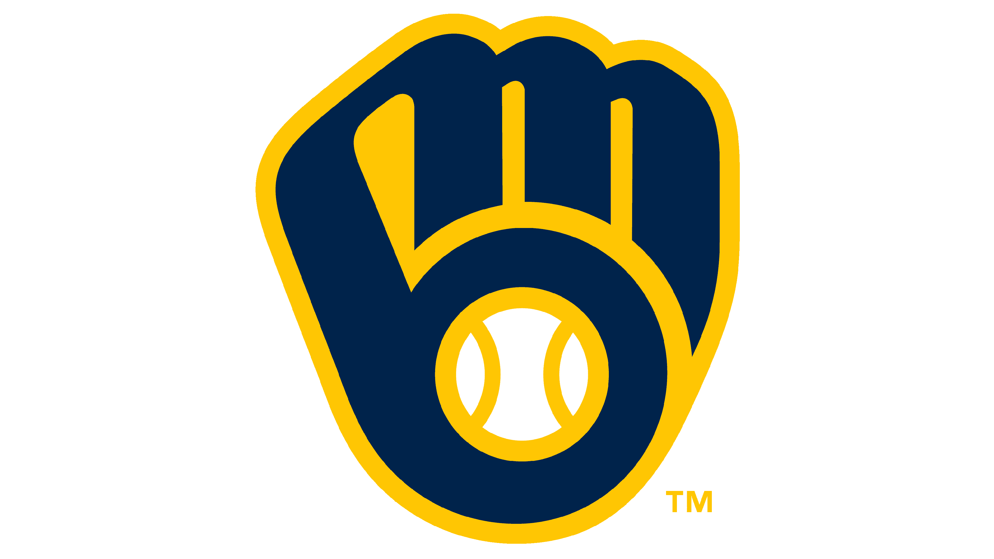
This logo combines a few elements seen in the Brewers’ logo earlier. In the center, there is the glove formed from the initials. It is set on a dark blue round base that reminds of the logo created back in 2000. The muted golden color was replaced by a bright yellow that attracted more attention. The full name was added across the top and bottom in contrasting white and using a geometric font with bracketed serifs.
Font and Color
The team has determined its color palette from the very start. These were blue, white, and yellow. In some versions, the vivid yellow was replaced by a rich golden that gave the logo a stylish and sophisticated appearance. In a few versions, there were some green and red details, but these were not the key colors. The yellow color attracted the attention while the blue reflected the commitment and responsibility of the team.
When it comes to font choices, the team went back and forth between a more strict, geometric font with serifs and more elegant and stylish cursive writing. In the first case, the team looked stronger and more confident, while in the second, it appeared as a respected club with history.