Michigan Wolverines is a student organization, set up in 1909. They are the athletic branch of the University of Michigan, playing in the nation’s major college sports association, Division 1. Moreover, they are the part in the Big 10, where they achieved numerous conference titles and tournament trophies. Their home and training games happen in Crisler Center, Ann Arbor City, while the wolverines’ general coach is Juwan Howard.
Meaning and history
The Michigan Wolverines appeared in the beginning of the 20th century as the University of Michigan’s answer to the students demanding the athletic program’s establishment. The main concept of the brand image and the name have never been changed throughout the franchise’s history.
Since the team showed up, it has always been related to the wolverines. Probably, they were called so because of Michigan’s reputation as a wolverine-raising and selling place. The university’s Wolverines’ logotype always showed the animal, but there were many reinventions of its style.
What is Michigan Wolverines?
Michigan Wolverines are the athletic program for the students willing to play sports for the University of Michigan. The franchise consists in the inter-college athletic organization of the USA (NCAA), and the Big Ten Conference. Founded in 1909, the franchise has achieved numerous trophies and awards since that time, including the Big Ten champion titles, NCAA trophies, etc.
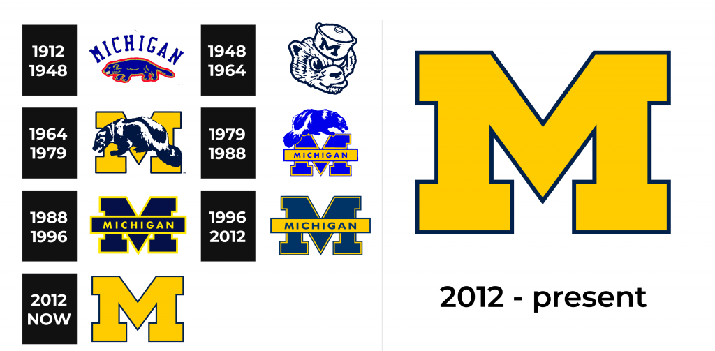
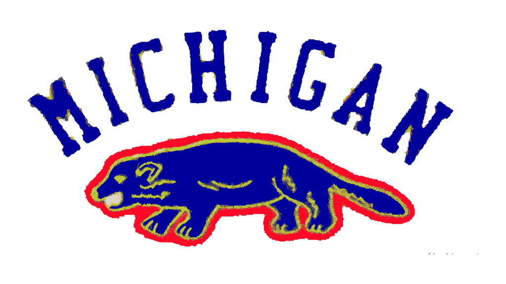
1912 – 1948
At the very start, they were using a blue and red logotype. It showed the blue wolverine drawn in profile and contoured bold red line and a thin yellow one. Above it was the state’s name in all capitals. The font had semibold grainy characters with small serifs.
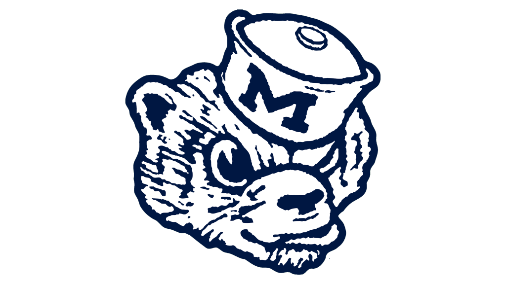
1948 – 1964
This modest and yet bright logotype was replaced by a funny head of a wolverine wearing a small kettle. The uppercase ‘m’ symbols were put on the side of this improvised hat. The animal’s picture showed an infuriated face with eyes wide open. Being a blue and white image, this logotype had always reminded of a determination and professionalism of the team members.
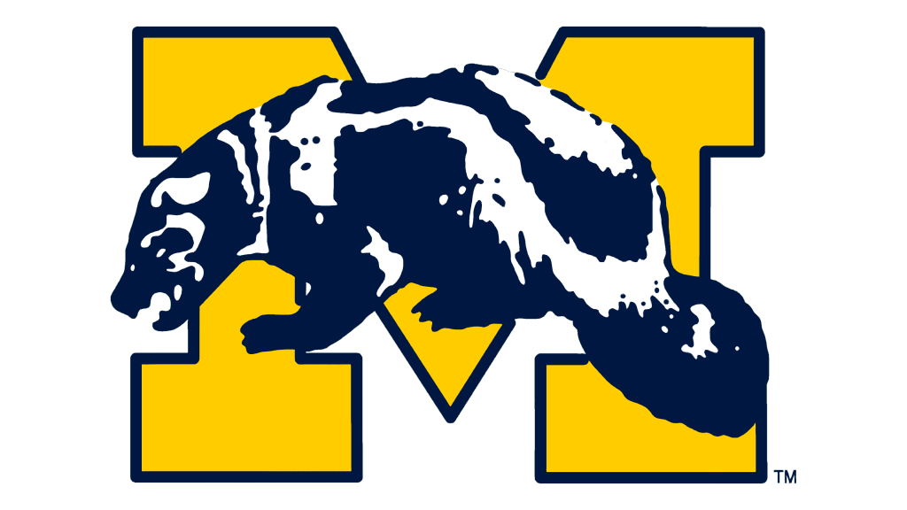
1964 – 1979
The emblem reinvention made in 1964 brought the most recognizable style, which has only received modifications in the future versions. This was a capital ‘m’ colored enriched yellow and contoured dark blue. Above it was a sitting mascot, drawn in full body. This version was successful due to the accurate shapes, adding some action and strength to the watermark.
1979 – 1988
In the later logotype, the wolverine rose on the letter and changed its outfit. The animal was now brighter and looked oppositely. The ‘m’ letter, also repainted bright blue for the bars and yellow for the contour, had received a horizontal bar with uppercase ‘Michigan’ word on it.
1988 – 1996
As the franchise got popular enough, they’ve removed the wolverine from the logotype. It would transform into just the capitalized letter with a horizontal rectangle placed over it.
1996 – 2012
From the mid-90s up to the 2010s, the Wolverines’ marketers used the ‘m’ a bit enlarged and repainted. Previously it was very dark blue letter contoured pungent yellow, but now it became somewhat close to sea blue.
2012 – today
The latter insignia shows the heavy character without any bars and words. It is yellow, while the contour is sea blue.
Font
The team’s ‘m’ has a heavy script, featuring very bold lines and large serifs. The two central lines meet and form a sharp edge. Although now it’s upscaled, in the logotypes of the 80s and 90s, the angle reached the bottom of the letter. In these logotypes, they also drew a horizontal stripe over the symbol. It contained the ‘Michigan’ word in a simple uppercase font without serif. The letters stood wide from one another.
Color
Now, the emblem’s official color palette consists of the rich yellow shade for the letter itself, and the dark blue for its outline. This shade of yellow is also known as maize, and even the Wolverines’ student cheering group is called ‘Maize Rage’. Previously, however, the colors were different. The letter was dark blue, and the contour was deep yellow.
