Los Angeles Chargers are a rugby franchise from the West Division of NFL, which was established in 1959 in California. At the very beginning of its history, the fran-chise was owned by the Hilton family, but today it is a property of Dean Spanos and the head coach of the team now is Anthony Lynn.
Meaning and history
![]()
The LA Chargers’ visual identity has had many redesigns throughout the team’s history, but the color palette and the main element of the logo we all know today were taken from the original version. The rugby club, established in Los Angeles, moved to San Diego in just one year after its foundation and came back to its original home in 2017. Though the place and name changes did not affect the visual concept of the Chargers.
1960
![]()
The initial logo of the team, created in 1960, was composed of a classic shield in blue, white, and yellow, where the horse profile and lightning were depicted. The “LA” letters were executed in blue and placed on the upper part of the shield, near the horse, while the “Chargers” wordmark in white was located on the bottom part of the logo.
1961 – 1973
![]()
In 1961 the team mover to San Diego, so the “LA” lettering is being removed from the logo. Another significant change was made to the color palette of the visual identity — blue has become lighter, as well as yellow. The contours of the horse and the lightning were modified and cleaned.
1974 – 1987
![]()
In 1974 the team decided to completely change their logo and now it is composed of a dark blue helmet with a yellow grill and a yellow lightning image in a white outline. It was a bright and strong logo, which stayed with the Chargers for more than a decade.
1988 – 2001
![]()
In 1988 the helmet was made more modern and the color palette was switched to a darker and a more “expensive” one. The grill got bigger and the lightning became sharper and more delicate. This logo was used by the Chargers for another decade.
2002 – 2006
![]()
To celebrate the beginning of the new century, the team redesign its logo again in 2002. Now it is as simple as never before — the helmet was removed and the light-ning was the only element that remained on the Chargers’ visual identity. Executed in white, with thin blue and yellow outline, it was horizontally arched, resembling a crown or a bridge.
2007 – 2016
![]()
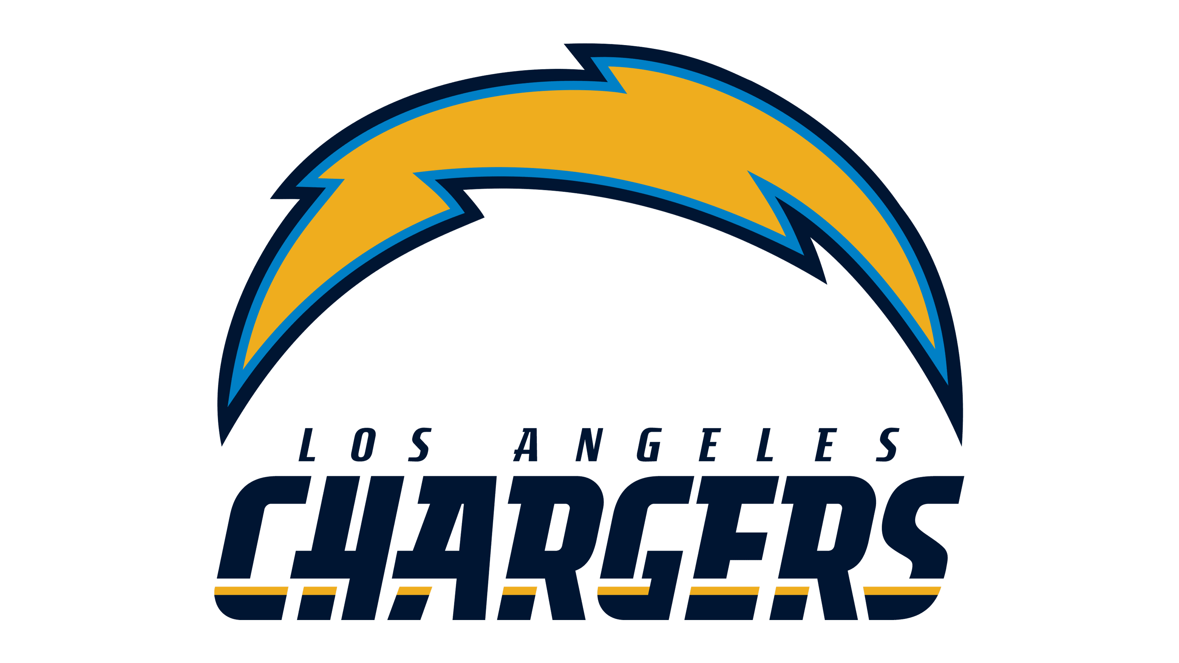
In 2007 the color palette of the logo was changed and now yellow was the main shade. The double outline featured two shades of blue — light and dark ones. The logo with the wordmark was also designed during this time period. It was a custom dark blue “Chargers” inscription in a bold italicized font, with the yellow line coming through all the letters and the iconic lighting above it. The team’s symbol started above the letter “H” and ended above the “R”. The “San Diego” in all capitals was placed under the main lettering. This was a brighter and more modern version of the previous logo and stayed with the team for almost ten years.
2017
![]()
2017 – 2019
![]()
The team comes back to Los Angeles in 2017. The logo concept and color palette remain the same, but the “San Diego” inscription is replaced by the “Los Angeles” one.
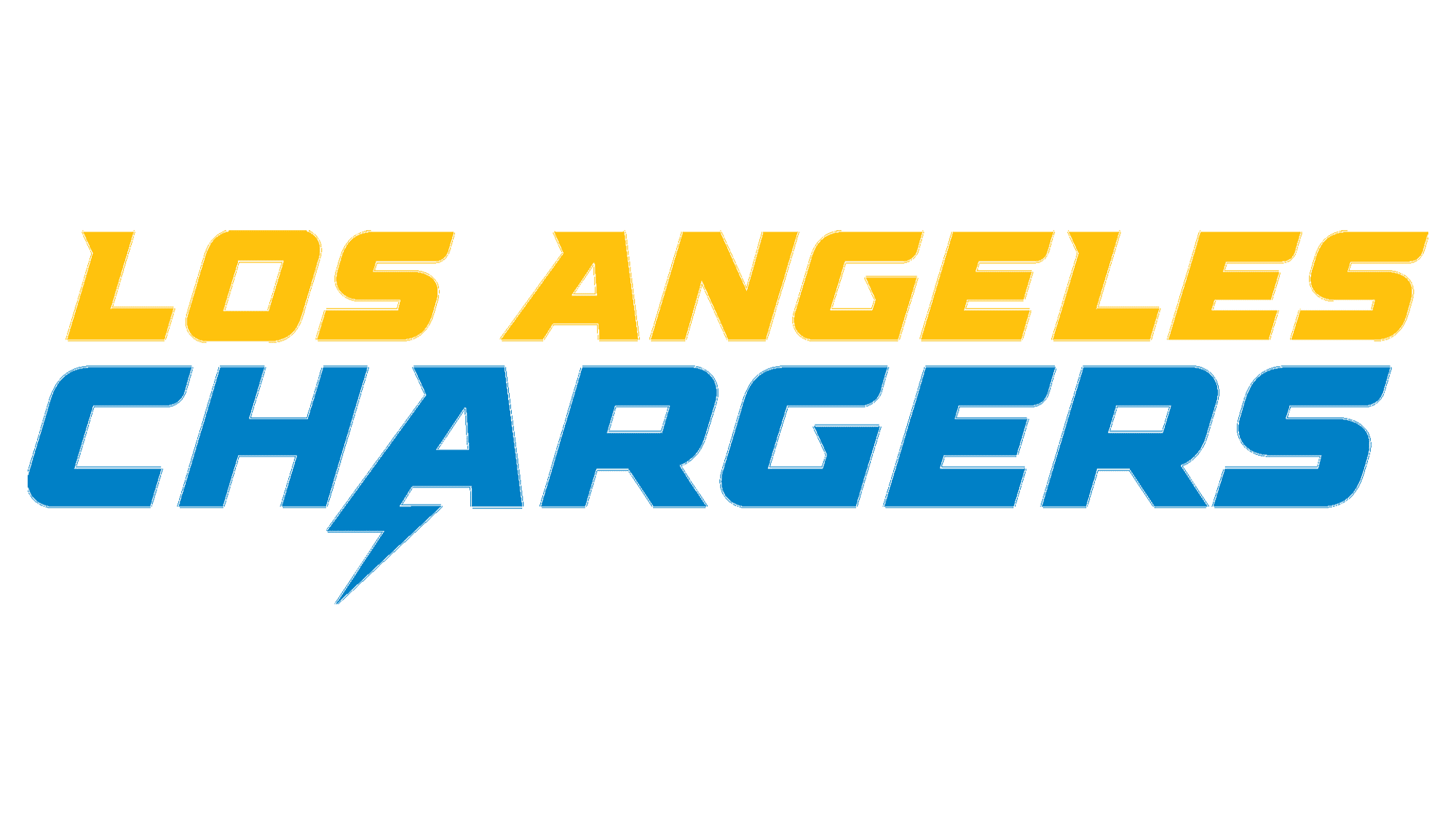
2020 – Today
![]()
The redesign of 2020 brought the new light color palette to the Chargers’ logo — it is now the same light blue and bright yellow, like on the shield from 1961. The emblem’s contours have been modified and now it looks bolder. Another significant change was made to the wordmark — now the “Los Angeles” part in yellow was placed above the “Chargers”, where the tail of the letter “A” is elongated in the shape of the lightning.
Symbol
The Golden Bolt is the commonly known name for the Los Angeles Chargers’ symbol. It has always been in the team’s logos, and the color palette was only changed in terms of lightness and intensity of the colors. The flash symbolizes power, speed and determination, white blue and yellow combination represents the team as progressive, passionate, and reliable.
Emblem
The team’s emblem is used in two main variants — it is whether placed on a white background, or in a light blue. In the case of the colorful version, the image gains an additional white outline, which makes it look crisper and fresher.
Helmets
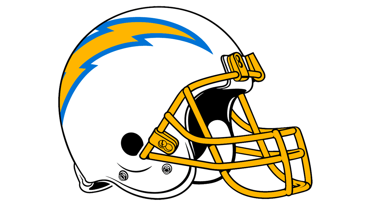
The Chargers’ helmets look clean and bright — the blue and yellow flashlight is placed in a white background, and the grill is colored yellow, which perfectly balanced the emblem.
Uniforms
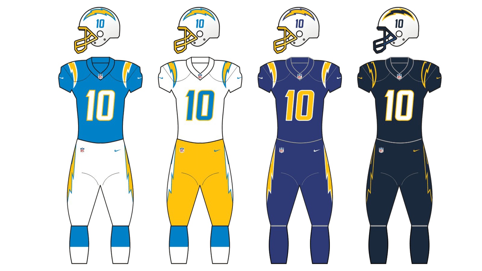
The uniforms of the Los Angeles Chargers are executed in the team’s official color palette and feature light blue jerseys with white elements in yellow outline and white pants with a yellow bolt in a blue framing on the sides. As an alternative version, the team wears white jerseys with blue players number and yellow pants, where the side bolts are colored white and blue.