H&M is a Swedish transnational corporation that runs over 4K retail locations under various names and 75 self-branded stores. They typically sell clothing, accessories, and footwear, replicated and mass-reproduced from older high-fashion goods at a lower price. The combination of decent quality products and affordable prices has made H&M the second-largest clothing retailer worldwide.
Meaning and History
![]()
Erling Persson is the brainchild behind the H&M brand. After a trip to the United States after WW2, he was impressed by high-volume clothing stores popular in the country. When he got back to Sweden in 1947, he opened the first H&M store in Västerås, which focused on women’s items. Hence the original brand name – Hennes, meaning ‘Hers’ in English.
His business grew rapidly, opening a second location in 1964. Four years later, Persson purchased a hunting menswear retail store called Mauritz Widforss in Stockholm, which led to the introduction of the male product line and transition to the name Hennes & Mauritz.
What is H&M?
H&M is a multinational company from Sweden, which sells affordable clothes, bags, and accessories for men and women.
1947 – 1968
![]()
The earliest logo is simply the word ‘Hennes’ in cursive, white neon-like font on a dark background, suggesting it was probably a sign on a store front.
1968 – 1968
![]()
The following iteration marks the transition to the acronym ‘H&M’ with ‘Hennes’ and ‘Mauritz’ written in a smaller font encircling the ampersand, which connects the ‘H’ and ‘M.’ The logo is enclosed in an oval shape and has a hand-drawn feel.
1968 – 1999
![]()
The designers add a composition of red ‘H&M’ where the letters are connected by a red ampersand. The letters and ampersand appear to be hand-painted with a brush due to the texture and stroke edges. This design conveys a sense of casual style and approachability.
1999 – today
![]()
The latter logo is a refined version of the previous one. The ‘H&M’ is still in the red, but the letters and the ampersand have been streamlined and modernized with clean lines and no brush texture, giving it a more contemporary and professional look.
Color
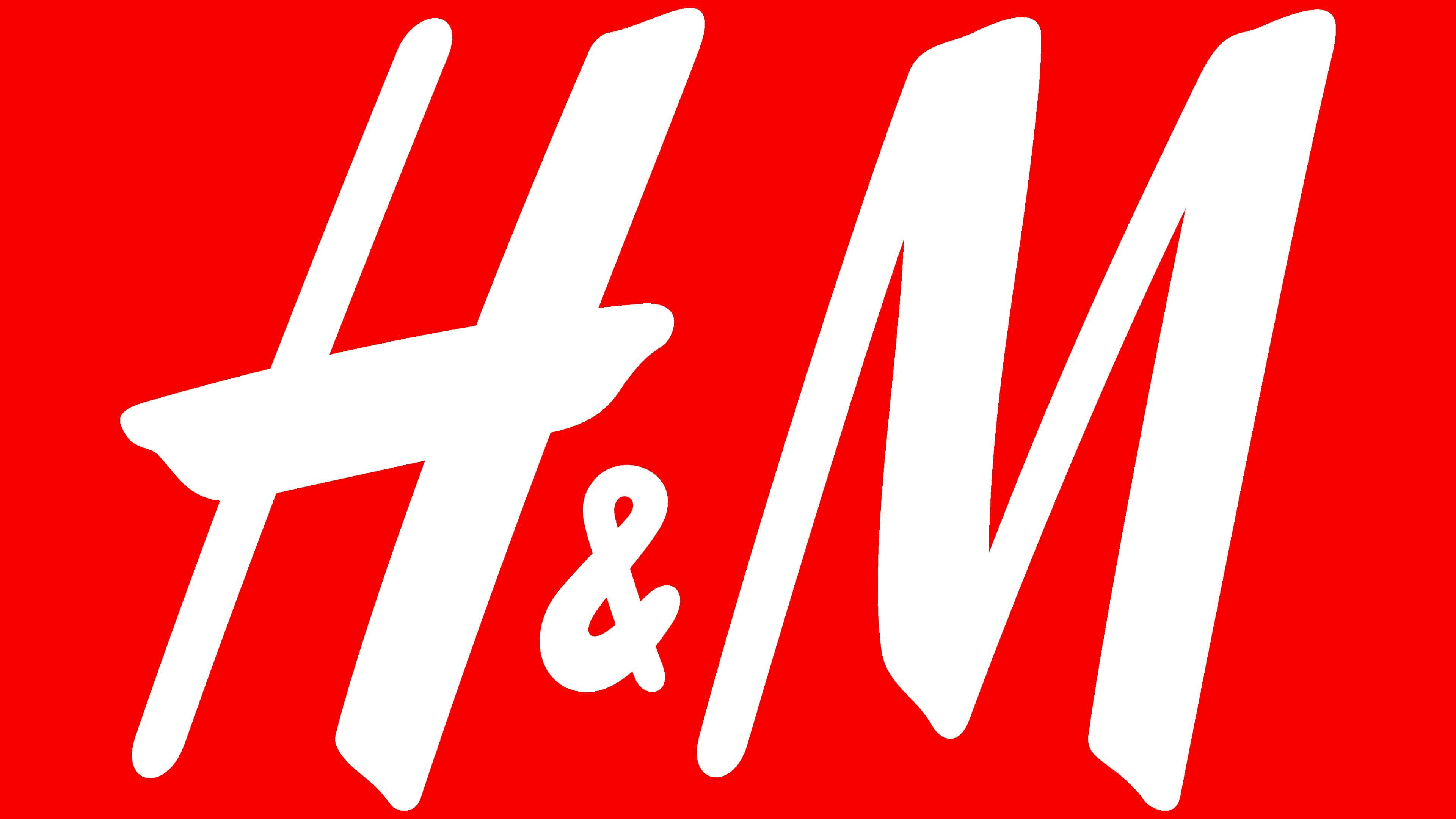
H&M uses a warm and pleasant red color to depict its official logotype.
Font
The brand’s logotype features only the name caption, rendered in two extra bold characters and an ampersand. Each letter looks hand-drawn with a brush.