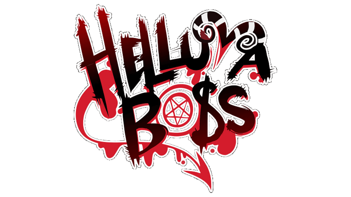
Helluva Boss Logo
Tags: animated series | TV series | USA
The animated series follows employees of a murder company in Hell performing various jobs. The killer agency consists of Blitz, the boss of the enterprise, as well as weapons specialist Moxie, his energetic wife Millie, and secretary Hellhound Moon. With the help of an ancient book obtained from the Goetian hell demon, Stolas, they manage to organize their work and work together to try to keep their business afloat. They work for the company IMP (Instant Doom Performers). This company is engaged in the murder of those people in the world of the living whose death their clients want. For example, a sinner comes to them, tells them who should be killed, and with the help of a special book, they go to the world of the living and fulfill the order.
Meaning and History
Back in 2019, Vivien “Vivziepop” Medrano’s projects made a lot of noise. The pilot episode of Hell’s Boss, made only on fan donations and merch sales, by ordinary artists, is one of them. Helluva Boss is a spin-off of the Hazbin Hotel project (which only had a pilot episode and a comic book backstory). The Helluva Boss series continued the idea of hell and its components – hierarchy and structure. It is clear that this is the product of a young author, with all the expected outcomes, but it is not clichéd and brings up new ideas. The author is growing and working on mistakes, which is evident from series to series.
What is Helluva Boss?
Helluva Boss is a series that fantasizes about the hell topic: What if life in hell is not so different from our everyday life? In Helluva Boss, the demon Blitz is trying to launch a startup assassin agency in a very competitive market with weapons specialist Moxie, thug Millie, and secretary Luna.
2019 – Today
A dark and bloody theme of the series is reflected in the logo. The designer did a great job making the name easily readable while adding a lot of interesting details. The black lettering with some red gradients stands out against the background. As a background, they added blood streaks and blotches to symbolize the murders present in the series. There are also horns that form the letter “V”. They spiral outward, an ancient sign for spirituality and life’s cycles. There is also a universal money sign, which not only shows that people manage to get what they want for money even in hell, but also symbolizes the killing business of the main characters. The letter “O” is replaced by a target symbol with a five-pointed star inside. The first is meant to symbolize that the characters have a specific target every single time, while the second is used in different contexts, one of which can be the symbol of the Devil. It is obvious that the designers wanted to make this emblem unique while reflecting specific elements of the series.
Font and Color
The color palette of the logo was chosen very appropriately. There is the red color, which is not only associated with burning in hell but is also a direct reflection of the bloody activities of the main characters. There is also the black, which is used to symbolize death, evil, darkness, and power. It is also a perfect match for the theme going on this the Helluva Boss.
The creators of the project have designed a custom font for the logo. It features varying size of letters and brushstrokes with bristles leaving sharp spikes. The latter enhances the overall dramatic look. Some of the letters were stylized as either horns, dollar sign, or something else.


