Fruit of the Loom is an old American textile company that creates clothing of all sorts, mostly casualwear. That includes clothes and underwear for men, women and children. They’ve been doing it since mid-19th century, and they remain one of the staples of the American textile industry, if not one of the more popular brands. It’s also not a low-quality or low-cost marque, even though it’s known for its reliability and sturdiness.
Meaning and History
The company was created in 1851 in Rhode Island, USA by the Knight Brothers. The business was originally named after them, as well. It wasn’t until 1856 that the current name was chosen. Even though there is plenty of fruit used in the company’s branding, the business has nothing to do with fruit or food. The name was originally chosen as a poetic byword for clothing, and the food was added later on.
What is Fruit of the Loom?
Fruit of the Loom is an American textile company that produces clothes of many different types. Their products are mostly 2, but they have many other lines for men, women and children.
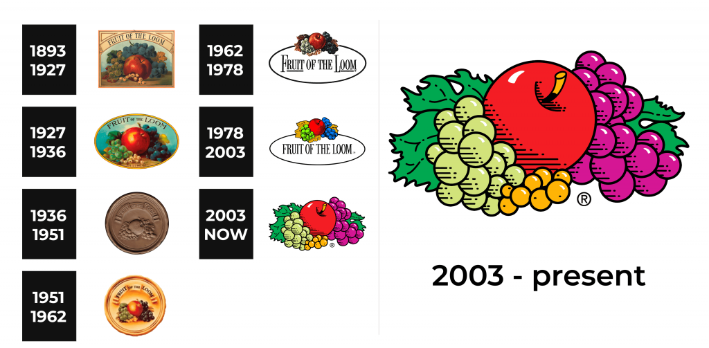
1893 – 1927
The original logo is a tall rectangle with an oil-painted picture inside. It’s a still life image that depicts several fruits lying on the table. The composition and choice changed little over the years. It depicts a bit red apple, surrounded by black and green grapes, some leaves and white berries below. Above is the big arch-like shape that says ‘Fruit of the Loom’ in capitalized, black letters.
1927 – 1936
The next design depicts many of the same elements, except in a much more hazed fashion. These are also placed in an oval shape this time, with a golden frame. The name of the brand is instead written along the top edge, without any arch shapes.
1936 – 1951
The 1936 emblem is instead a bronze stamp-like circle without any other colors. In its middle, they’ve placed the iconic fruits in mostly the same composition as before, except with less detail. They’ve also written the name above, placed in a curved way inside a semicircle styled as a scroll of paper.
1951 – 1962
During the 1951 redesign, they’ve essentially just colored the previous logo variant. The fruits got their usual colors, while the rest of the logo mostly became golden. The letters were the only exception, with the normal black look.
1962 – 1978
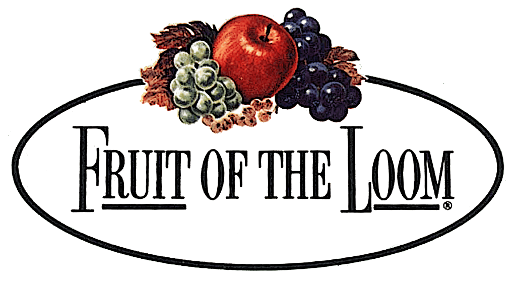
In 1962 came the new design, which persisted more or less until 2003. It depicts a blank white oval with the black edge and the name of the company inside, written in largely the same style as before, except with thinner, taller letters. At the peak of this oval, at the center of its top edge, they’ve placed the same iconic picture of fruits, barely different from the previous editions. It is darker, and there is more detail, however.
1978 – 2003
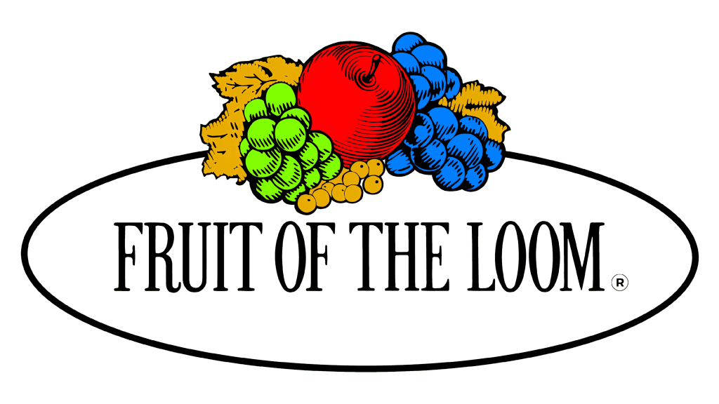
This redesign includes several key changes. Firstly, the oval is a bit longer, with a thinner edge. Secondly, the letters are now the same height, whereas they previously varied. Lastly, the fruits above lost much of their nuance once more. Each now uses only a single hue of color, without any shading or depth. There are strokes to denote what’s supposed to be shades, but these fruits became very simple compared to previous attempts.
2003 – today
The 2003 update doubles down on the simplicity trend. It removed the oval and notably changed the name part. It turned from a strict serif to a pretty soft and basic sans-serif, although the proportions of the letters remained largely the same. They are still tall and pretty thin. Additionally, they made the right call to reduce the ‘of the’ part in size and place the two words one on top of the other between the two larger bits. As for the fruits, they are even simpler in that the strokes are now just universal horizontal lines.
Font
The brand’s regular font, used for decades since almost the first logotype, changed in 2003 from a somewhat strict serif with thin and tall letters to a similar sans-serif with soft, but ultimately basic characters. They are still upright, professional and retain the old air of classicism. They are, however, a more modern choice compared to the previous design.
Color
There is a large diversity of colors in this logo. In the most recent logotypes, it mainly includes red, purple, beige, yellow and green (for the various fruits above). Besides that, black is used for many of the less poetic parts, such as the geometric shapes, letters, as well as the shading.
