FlipaClip, an animation application renowned for its intuitive interface and robust features, has gained widespread recognition, particularly among novice animators and creative individuals. Established in 2012 by founder Jonathan Meson, the team’s history is marked by a dedication to making animation accessible on mobile devices.
Meaning and History
Initially a personal endeavor, FlipaClip has evolved significantly, expanding its team and consistently pushing the boundaries of mobile animation technology. Their emphasis on user feedback and continuous improvement has been instrumental in the app’s success, creating a thriving community of users who appreciate its capabilities.
In 2019, FlipaClip celebrated a significant achievement, exceeding 30 million downloads, underscoring its broad appeal and effectiveness as an animation tool. Moreover, the team’s commitment to education and artistic expression has led to collaborations with educational institutions and organizations, promoting FlipaClip as an invaluable tool for teaching animation principles.
As they continue to innovate and adapt to the dynamic landscape of digital art and animation, FlipaClip maintains its prominent position as a leading choice for aspiring animators and digital artists.
What is FlipaClip?
FlipaClip is a mobile application designed for animators and digital artists. It supports an extensive array of functions, available through an intuitive interface. By now, the app estimates 30 million downloads, which is an extraordinary success in this field.
2012 – 2016
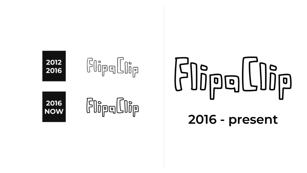
A sense of handcrafted authenticity defines the logo in this timeframe. ‘FlipaClip’ is rendered with lines that mimic the variability of pencil strokes, suggesting an organic, artistic process. It’s as if each letter was carefully drawn by an animator’s hand, reinforcing the app’s focus on the artistry of animation. The entire name caption is encased within a rectangle, highlighting the personalized experience of using the app during its early years.
2016 – today
Moving to the present logo, a transition to digital sleekness is evident. Uniformity and smoothness characterize the updated typeface, signaling a maturation of the brand and its technology. Curves in the ‘p’ and ‘a’ retain playful energy, maintaining the brand’s creative essence. By shedding the rectangle, the logo embraces a more open and versatile identity, in tune with the evolving digital animation landscape.
Color
The FlipaClip logo’s color palette transitioned from a pencil-inspired gray with a black contour to a solid, uniform white inscription contoured with thick black.
Font
The original design’s playful irregularities captured the spirit of animation’s freehand origins. In contrast, the updated font is clean and modern, symbolizing the app’s progression to a professional platform that streamlines the animation process while maintaining its creative core.


