England National Football Team Logo
Tags: England | professional team | soccer club
England National Football Team is the official representative of England in international competitions. The Team has several loud titles, such as the Winner of the Eighth World Cup (1966), the Finalist of the Sixteenth World Cup (2021), and Third place in the Third (1968) and Tenth (1996) European Championships.
Meaning and history
![]()
Along with Scotland, the England national soccer team is considered to be the oldest national team in the world. The England national team played its first international match in history in 1872 against Scotland. Up until the mid-19th, almost all meetings were held on the territory of Great Britain. It was not until 1954 that the English joined UEFA and took part in the European Championship, finishing third in 1968. In terms of titles, the England national team is only in the second ten teams from all over the world, but it has many historical records and victories to its credit.
The most serious win of the national team occurred in the game against Scotland when the English in 1882 won against their opponents with a score of 13:0. But the most serious defeat the English managed to suffer from the Hungarians, who defeated them with a score of 7:1 back in 1954.
At the beginning of the twenty-first century, the England national team has a team with great potential. Adam Crozier, executive director of the Football Association of England from 2000 to 2002, was the first to call this team the “Golden Generation”. At that time, amazing players played for the national team, showing a great game at club level.
The English national team was nicknamed “Three Lions” among fans and for good reason. The reason for this was the fact that the club’s crest shows three blue lions, which are arranged vertically.
When the captains of 11 London football clubs met in 1863 to discuss the rules of the game, they decided to unite and create an official league: the Football Association. They needed a symbol, which was the Royal Coat of Arms with three lions. By the way, the cricket association also used the same lions as its official logo. As a result, cricket and soccer emblems turned out to be the same. In 1949, the crown was removed from the FA emblem to distinguish it from cricket.
1879 – 1950
![]()
The original emblem of the England national football team, introduced in 1879, featured only three lions on a shield and a crown. Both the lions and the crown were executed in a blue-red color scheme, while the background of the coat of arms was white. This version of the emblem was active for more than 70 years.
1950 – 1993
![]()
In 1950, the logo was changed, with the Council of Arms working on it: the crown was removed, the lions were redrawn and ten Tudor roses representing the regions of England were added. The motivation was simple: to make the logo different from that of the cricket team. And it worked great, as a refined version of this emblem is still in use by the team today.
1993 – 1998
![]()
The redesign of 1993 was about the colors: the dark shade of blue stayed, but only for the frame of the coat of arms, while the heraldic lions were redrawn in a bright sky-blue, adding freshness to the badge and working great in a combination with red roses and a white background. The “England” tagline was written under the crest in a dark shade of blue.
1999 – 2003
![]()
The original navy-blue shade was brought back to the England National Football Team crest, and the solid blue horizontal banner was added to the composition. It was placed above the coat of arms and had a bold uppercase “England” written on it in white, using a fancy serif typeface.
2003 – 2009
![]()
In 2003 the emblem of the national team was refined again, with the shades of blue getting lighter, but not as bright as in 1993. The contours of the lions were also slightly modified, redrawn in thicker and shorter lines. Another change was made to the ten red roses, which got small details in yellow and green. The wordmark was rewritten in a geometric sans-serif typeface.
2009 – 2012
![]()
The redesign of 2009 has removed the banner with the “England” lettering from the composition, keeping only the iconic crest. The colors and contours of all elements on the emblem remained the same as in the previous version.
2012 – 2013
![]()
In 2012 there was a brave experiment with the emblem of the England National Football Team. The designers decided to redraw the famous crest in a red-and-white color palette, with no other accents. However, this badge only stayed active for one season.
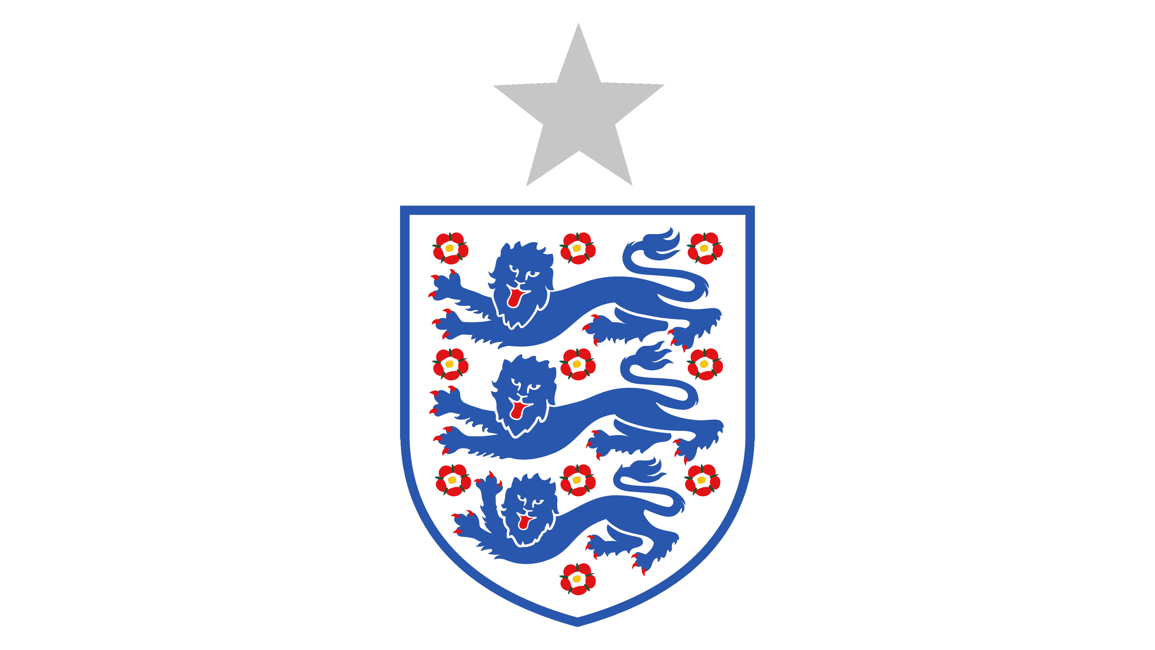
2013 – Today
![]()
The modern emblem of the England national soccer team is a refined version of the logo from the 1950s. It fully repeats the emblem, introduced in 2009, with just a classy coat of arms featuring three lions and ten red roses.
Font and color
The official emblem of the England National Football Team is based solely on the traditional heraldic graphics, with no lettering, hence there is no particular typeface attached to the team’s visual identity. As for the color palette of the crest, it is a combination of blue, red, and white, with tiny green and yellow accents in the flowers.