Dove is a brand known for its soap, hygiene and beauty products. This trademark is owned by Unilever, a British-Dutch corporation that created Dove in 1957. One of the brand’s earlier products included a combination of soap and moisturizing cream in one bar, which made it a popular hygiene brand very soon.
Meaning and History
![]()
Dove is well-known as one of the earliest brands that combined hygiene and beatification solutions, often in the same product. This started with the Dove’s earliest soap products, which also acted as moisturizing agents (an unknown practice at the time). The brand was created in 1957 by Unilever. The name was chosen because of the existing association of dove birds with Aphrodite, the goddess of beauty.
What is Dove?
Dove is a brand of personal hygiene and beauty products created by Unilever in 1957. It’s a British brand, and currently one of the most prominent such trademarks in Europe and even abroad.
1957 – 1969
![]()
The brand’s logotype didn’t change much over the decades. The earliest logotype was used largely for decorating product packaging.
It includes the brand’s name, written in an elegant sort of font with fluid, sort features and a very artistic look. They were heavily tilted to the right, and the first ‘D’ letter was capitalized and a lot bigger than the other characters. They usually colored it white against the blue background.
The dove emblem was already in use, and it was actually very similar to the current design. This emblem was simplistic, using very loose, big shapes to depict a bird in flight. They used a curved generalized shape to depict the bird’s body, with a small extension for the head (the eye was colored in as a single blue dot). A similar shape at the top was connected to the body with a narrow bridge to depict the wings.
1969 – 2004
![]()
They’ve streamlined the existing elements in 1969, but the logotype was largely unchanged. The wordmark uses the same letters, colored dark blue this time. The dove element at the top right (where it was before, more or less) changed marginally – mostly in terms of the coloring.
It’s now gold, whereas it was white before. They’ve made it smaller, more simplistic, and the wing bit in particular was reduced in size and placed much closer to the body. This created a lot more streamlined image.
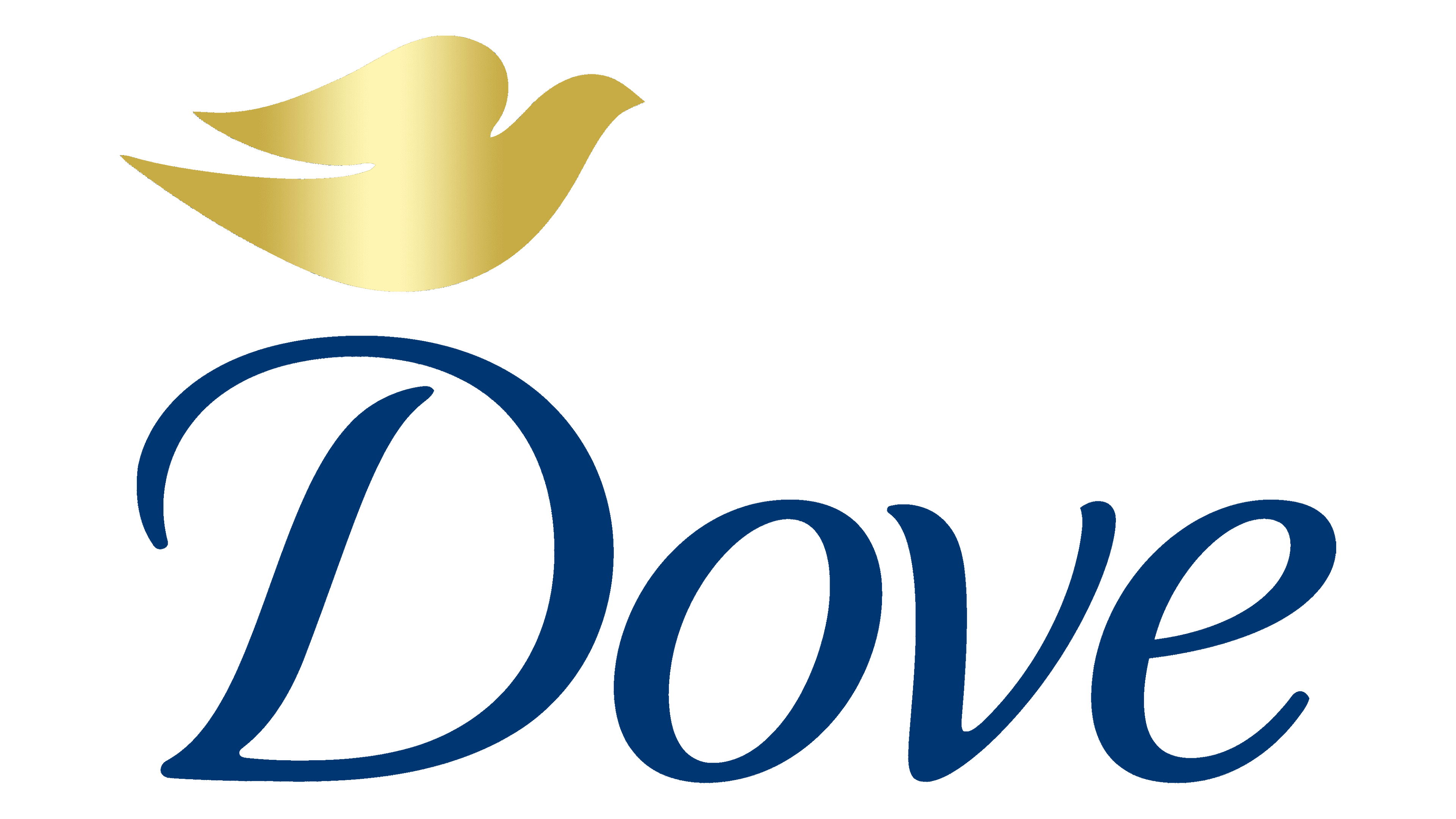
2004 – 2012
![]()
The next design uses mostly the same elements, although even simpler in appearance. The design of the written piece is mostly unchanged, except they’ve made these letters much thinner and, as a result, had to make them simpler, as well. The font and most elements are the same, however.
As for the bird bit, it’s mostly placed below now, whereas it was previously above and to the right. They’ve also changed its appearance a little, adding a lighting effect to it, making it anything but universal color-wise.
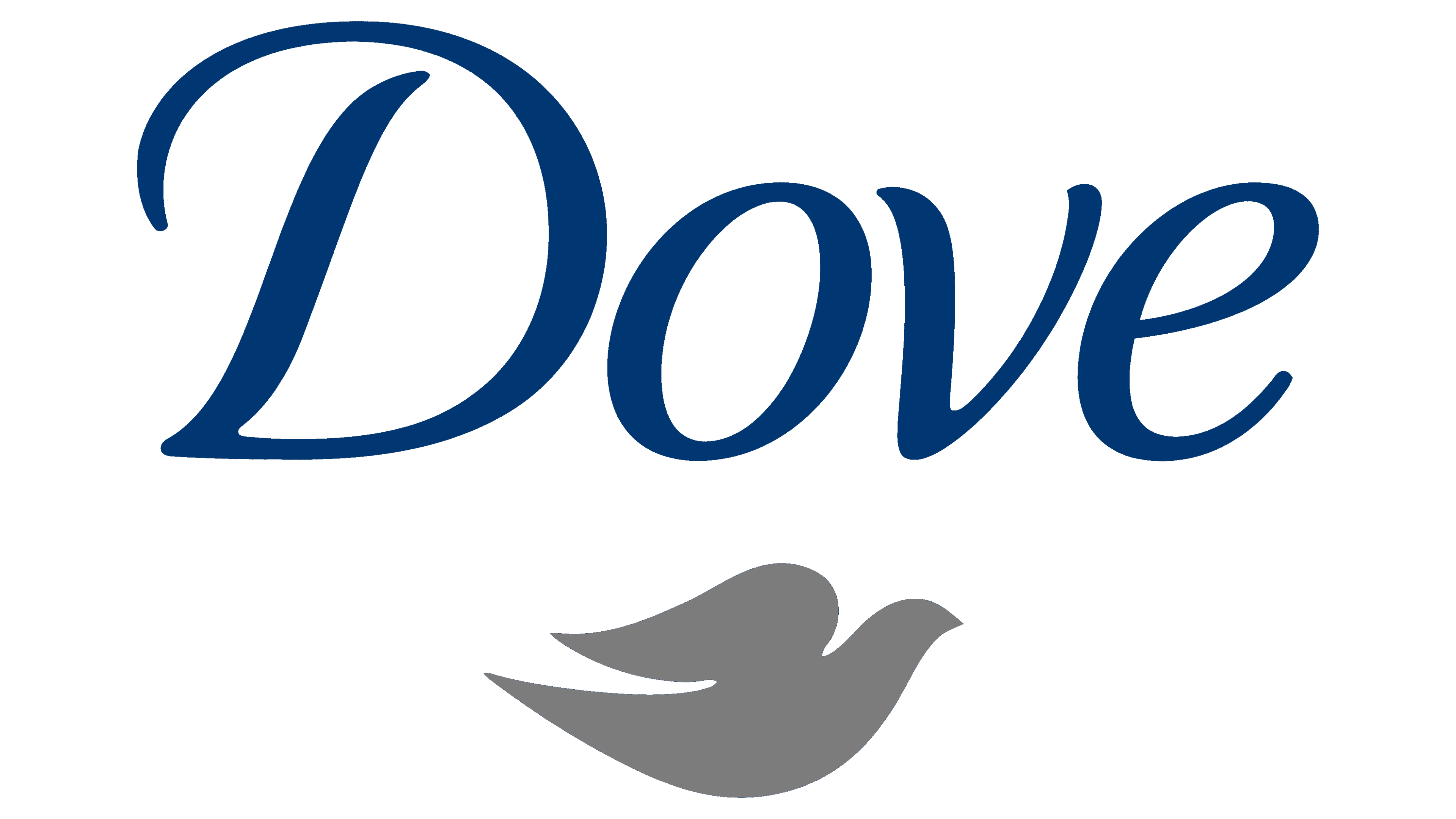
2012 – today
![]()
Dove doubled down on the simplification trend, making the letters even thinner. In terms of wordmark design, they didn’t change anything else. The bird piece was also updated, mostly in terms of its coloring. The lighting effect is still there, except it’s not as overwhelming in this version.
Font
Dove has been using largely the same font for decades. It’s a sans-serif font with an elegant, sophisticated look. They usually have soft forms, and the letters are tilted to the right to fit a free, elegant feel associated with the dove bird.
Color
The two colors Dove has in use for a long time are the dark blue and a golden yellow shade. The blue is used largely for the wordmark, whereas the yellow is largely utilized for the dove emblem. The latter isn’t the usual clean gold, it’s made uneven because of the lighting effect the past two logotypes have.