Discord Logo
Tags: application | messenger | USA
Discord is a service for online communication using video, voice, or text. It is especially popular among gamers, streamers, and e-sportsmen. With the advent of the pandemic, its features have become more in demand, and Discord is increasingly being used for education and work. Discord is not just a messenger. Its functionality allows one to stream and create rooms for communication or voice meetings.
Meaning and History
At first, programmer Jason Citron did not even think of creating a messenger – he dreamed of writing a computer game. In 2015, he struggled to get into the video game industry. A new multiplayer game he created with his development studio Hammer & Chisel didn’t catch on. Therefore, he minimized its functionality, leaving only a chat. Jason thought that Discord would become a popular messenger for gamers. Surprisingly, a third of its users had nothing to do with games. Discord’s transformation into a mainstream tool was an unexpected turn in Citron’s career.
What is Discord?
Discord is a free VoIP and videoconferencing messaging app, originally aimed at users of computer games. The messenger is used by gamers and music lovers, students, and crypto enthusiasts. The blue icon app is actually a great place for a team and any company to communicate effectively and conveniently using numerous features.
2015 – 2021
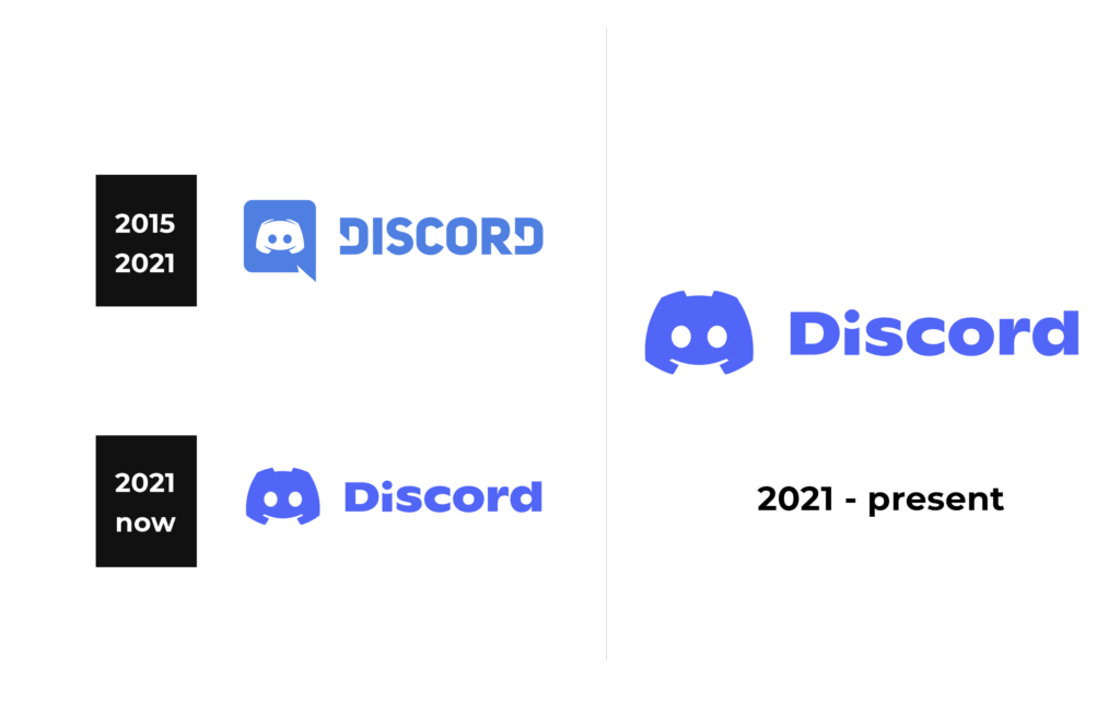
The inscription in the logo is based on Uni Sans Heavy font. The company added a stylish, sharp touch by cutting the vertical stroke of the “D”s diagonally halfway down. The name is accompanied by a small square i1con with a white gamepad in the center. The square icon has one pointed corner, which makes it looks like a message icon. Given that the service was developed for gamers, it is understandable why the logo has a gamepad.
2021 – Today
The logo was slightly redone in 2021. They preserved a blue color palette, which is often used in the communications industry. However, the new blue has a purple tint to it. The designers also changed the font and redrawn the gamepad. The latter was no longer on any base but rather got enlarged and matched the color of the lettering.
Font and Color
The company used blue color for both of its logos. It is a symbol of dependability, security, intelligence, and communication. At the same time, there is a tint of purple, which adds a touch of creativity, ambition, and elegance. The original logo features a modified version of Uni Sans Heavy font. The next emblem used a sans-serif font that is very similar to the TG Axima Heavy font.


