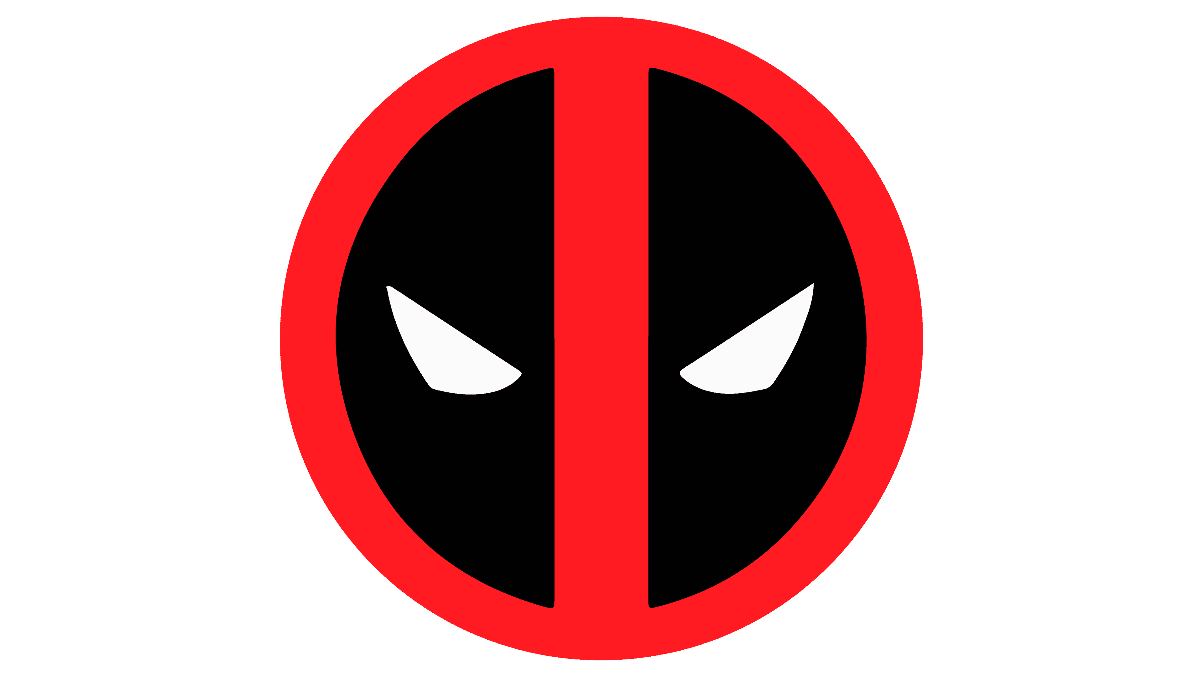
Deadpool Logo
Tags: fictional character | Marvel | red-and-white
Deadpool is a fictional character in the Marvel Universe. Equipped with two swords and a red-and-white outfit, he fights both good and bad guys, playing the role of an antihero who seeks only his purposes. Deadpool has first appeared in Marvel’s comic #98 of 1990, and since then become extremely popular.
Meaning and History
The creation and evolution of Deadpool’s logo have a unique backstory. Originally conceived as a caricature of DC’s Deathstroke, Deadpool didn’t have a logo for an extended period.
This omission was due to the character’s satirical nature, and originally, the antihero was introduced without the distinguished belt buckle symbol that Deathstroke sported. This version of Deadpool made his debut in The New Mutants #98.
It wasn’t until later, when artist Mark Brooks took the reins, that the character’s design received more attention. Brooks aimed to refine his appearance based on what he remembered from the character study.
However, during this process, he made a mistake by including a belt buckle with a logo that hadn’t been there before, unintentionally introducing a new emblem to Deadpool’s visual identity. This serendipitous error eventually became a lasting part of the character’s iconic design.
What is Deadpool?
Deadpool, a beloved Marvel character, is known for his red-and-white costume and dual swords. He defies traditional hero and villain labels, embodying the role of an antihero with unique motivations. Deadpool debuted in Marvel’s comic #98 in 1990 and quickly gained worldwide popularity.
1990s – today
The Deadpool logo is an iconic and distinctive symbol that carries a unique design. It takes the form of a ring that is split into two segments, formed with a vertical stripe and filled with white triangles. From one standpoint, the logo represents Deadpool’s masked face, capturing his likeness as illustrated in the comic books. While the size may be altered to align with the original art design, the essence of his character is preserved.
Font
The Deadpool emblem lacks any notes or text elements. The main focus is on the visual object, with the designers concentrating rather on its hues.
Color
The logo’s palette is a blend of red, black, and white, mirroring the hues of Deadpool’s costume and creating a visually striking and recognizable brand identity.


