Cinar Logo
Tags: animation video | Canada | children’s content
Cinar, a Canadian media and entertainment company established in 1976 by Ronald A. Weinberg and Micheline Charest, primarily focused on creating educational and children’s content. Notably, their animated series ‘Caillou’ and ‘Arthur’ gained global popularity and acclaim.
Meaning and History
Despite early success, Cinar faced a tumultuous period in the late 1990s and early 2000s, marred by financial scandals and copyright disputes. This controversy led to a change in leadership and a rebranding as Cookie Jar Entertainment in 2004, marking the end of Cinar’s presence in the animation industry.
Cinar’s history is characterized by a mix of triumphs and controversies, from award-winning animation to financial mismanagement. Ultimately, the company’s legacy continues through its contributions to the animation world, even as it underwent significant transformations and was rebranded as Cookie Jar Entertainment in 2004.
What is Cinar?
Cinar was a Canadian animation video-manufacturing company specializing in educational and children’s content. The company has been prospering throughout the 80s and 90s, but a series of financial challenges led to various struggles. Eventually, the company went out of the animation market, rebranding as Cookie Jar Entertainment in 2004.
1984 – 1997
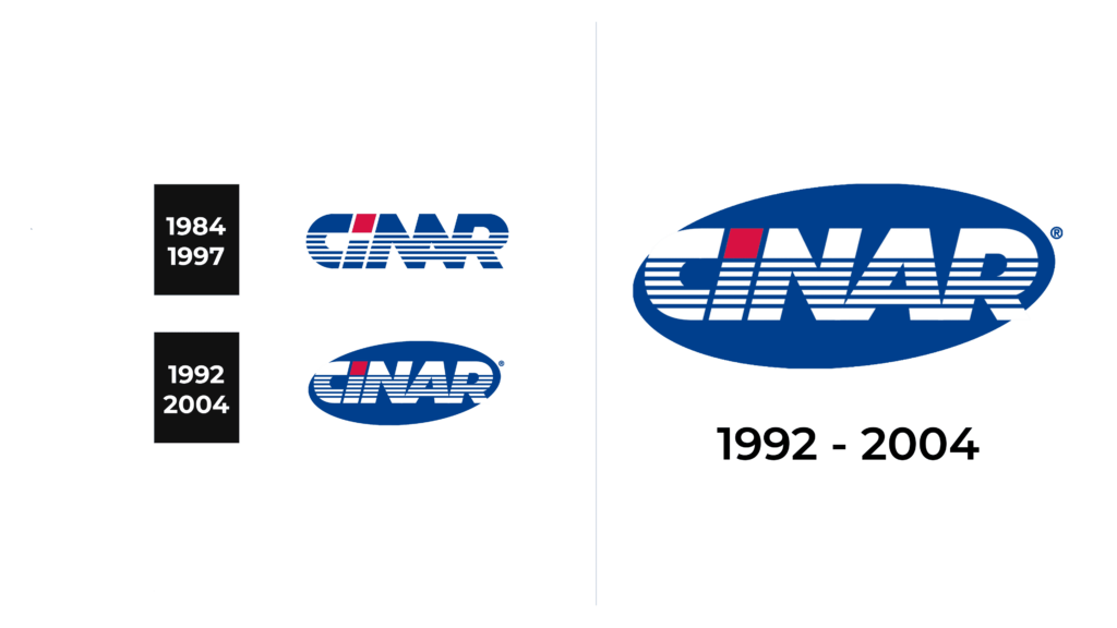
The first iteration of Cinar’s lning from 1984 to 1997, features the company’s name in a stout, sans-serif typeface. Blue dominates the palette, with the presence of horizontal stripes suggesting motion or broadcast signals, aligning with the company’s media and entertainment identity. Atop the ‘I’, a block of red punctuates the blue, drawing attention and perhaps signifying a point of focus or importance within the name.
1992 – 2004
The logo has retained its core elements but is now enclosed within an oval shape, hinting at global aspirations. Blue shifts to the backdrop, setting off the white lettering in stark relief, with the stripes preserving the motif of motion. This rendition is sleeker, giving a more contained and corporate appearance. A registered trademark symbol is added to the right of the logo.
Font
The typeface utilized in both iterations of the Cinar logo is sans-serif, conveying a modern and clean look, typical of the late 20th-century corporate branding. In the 1984-1997 logo, the font is bold and wide, with even weighting in the strokes, giving it a grounded and authoritative feel. The letters are stylized with horizontal lines, adding texture and a sense of movement.
In the 1992-2004 version, while the typeface remains sans-serif, the letters now reside within an elliptical shape, which suggests inclusivity and a global perspective. The font in this later logo appears slightly narrower and the horizontal lines less pronounced, aligning with a trend towards more streamlined corporate designs of the 1990s.
Color
Color-wise, the first logo presents a striking contrast between the deep blue of the lettering and the singular red block above the ‘I’, creating a visual anchor and a point of emphasis. This use of red against the predominantly blue text adds depth and a focal point to the design. In the subsequent iteration, the blue becomes the background color within the ellipse, enveloping the white text that stands out sharply against this darker hue. The red block above the ‘I’ is maintained, preserving the visual interest and continuity between the two designs.


