Canada Goose Logo
Tags: Canada | climbing equipment | street clothes
Canada Goose is a worldwide known brand of street clothes whose main niche is cold-resistant uniforms, climbing equipment, wears for winter, and related products. It appeared in 1957 as Metro Sportswear Ltd thanks to San Tick, but changed its name to Canada Goose in 2000. The brand’s products are available through various channels, such as authorized retailers, brand stores, and digital marketplaces.
Meaning and History
![]()
Canada Goose was established in the mid-50s as Metro Sportswear created clothing lines under this moniker for the rest of the 20th century. In 2000, the brand underwent a major restyling, bringing the new logotype and name, which has become synonymous with premium quality.
It has received worldwide consideration due primarily to the outdoor wear, suitable for those who work n hard in weather conditions and ordinary customers. It was achieved due to the use of premium materials, including down insulation and coyote fur trim.
The brand actively supports environmental and social activities and collaborates with organizations fighting for wildlife conservation.
What is Canada Goose?
Canada Goose is a fashion brand that speciflizes in winter wears for workers, climbers, ordinary customers, and others. It was founded in 1957 as Metro Sportswear, and came to the current name in 2000.
1957 – 1985
![]()
The original Canada Goose logo, unveiled in 1957, had a cheerful and playful design. It featured a hand-drawn brown bear against a backdrop adorned with the iconic maple leaf from the Canadian flag. The image was complemented by a title case texting colored black and positioned on both sides and beneath the illustration. The bottom of the text was accentuated with a thick red underline.
1985 – 2000
![]()
In 1985, Canada Goose remade their logo, bringing a more refined and sophisticated appearance. The badge displayed golden lettering above two geese, shown in white contours. These components stood on a brown backdrop, creating a professional appearance. The logo was later decorated by underlining with the company’s full name caption and address.
2000 – 2000s
![]()
The 2000 logotype depicted a single goose, stretching its wings above the lettering ‘Canada Goose’. The bird is shown in golden contours over a brown backdrop. Below the firm’s name, there is a tagline ‘Expedition Clothing Outfitters’.
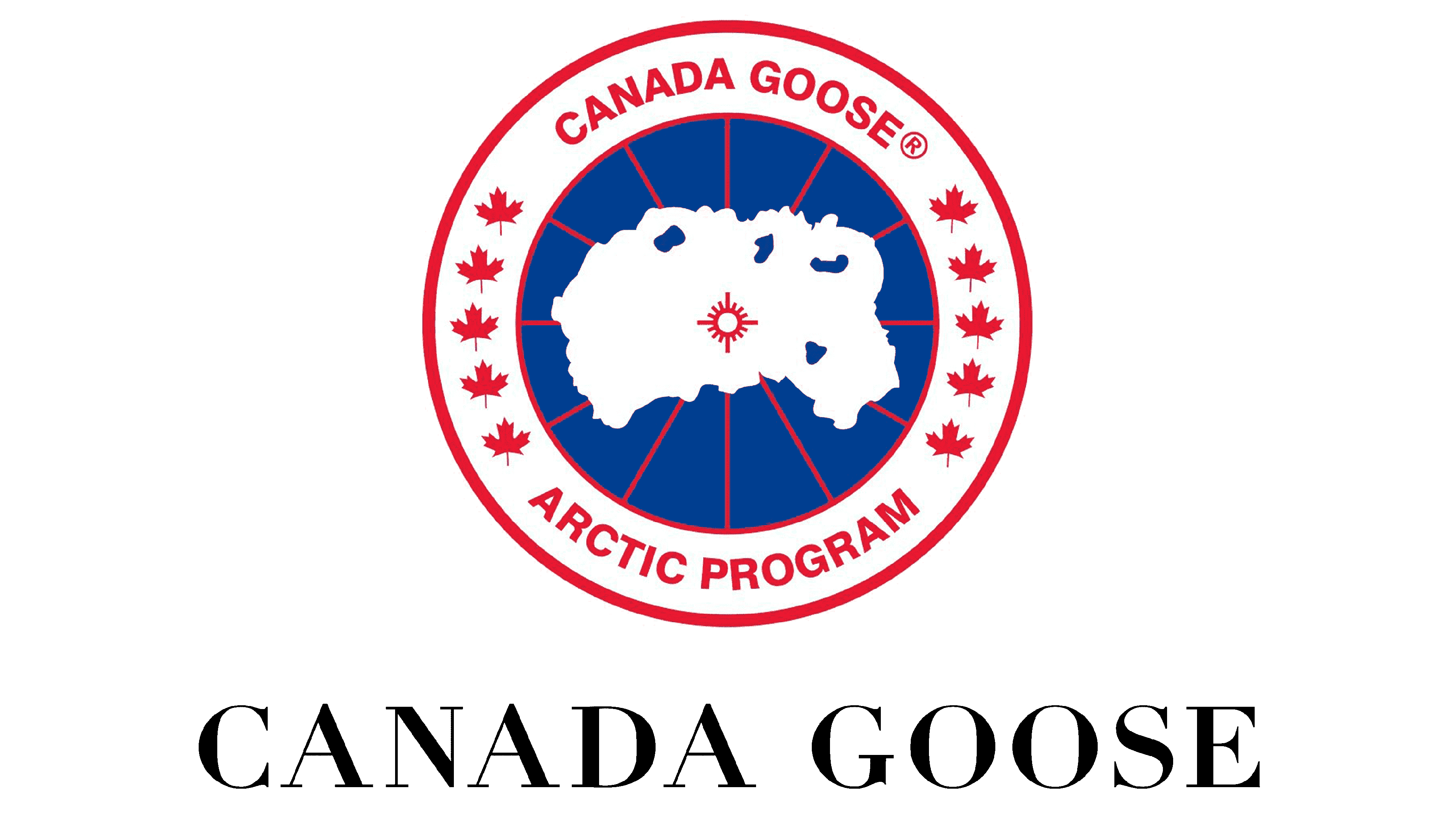
2000s – today
![]()
Currently, Canada Goose uses a design that features a roundel with white, blue, and red elements encased in a bold framing and red contour. Uppercase lettering surrounds the badge, separated by solid red maple leaves. The central part of the logo showcases a white silhouette of Canada with blue accents against a blue and red backdrop.
Font
Both logotypes made by the brand in the 2000s feature the names written in a standard uppercase typeface without serifs.
Color
The Canada Goose logo incorporates a color palette consisting of red, white, navy blue, and light blue. The navy blue color is used for the background, while the islands within the logo are depicted in a lighter shade of blue.