Buffalo Bills are a professional rugby team, which has been widely known to the public since the 1960s. The club was established in 1959 and named after the city it was born in. Today they are headquarters in New York and owned by Kim and Ter-ry Pegula, with Sean McDermott as the head coach.
Meaning and history
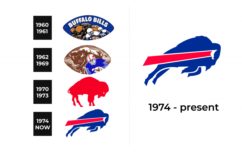
The visual identity history of the Buffalo Bills can be divided into two main periods — the 1960s and the modern one, which started in the 1970s. These were two completely different design concepts, which brilliantly reflects the progress and de-velopment of the team.
1960 – 1961
The initial logo for Buffalo Bills was designed in 1960, one year after the team’s es-tablishment. It was a football-shape medallion with an image of the huge Buffalo and two rugby players. The “Buffalo Bills” wordmark in white was placed on the top of the ball, on a blue background. It was a simple and naive emblem, yet it reflected the spirit of the team and was pretty memorable. The very first logo of the Bills only stayed with them for a year.
1962 – 1969
The image inside the football was redrawn in 1962. Now the sepia-Brown Buffalo on the background of the same color was accompanied by a bright and colorful rugby player in a blue, white and red uniform. The white helmet was decorated with a solid red Buffalo. It was a mix of the teams’ roots and heritage with the progres-siveness of its play strategy and power. This logo stayed with the Buffalo Bills for another seven years.
1970 – 1973
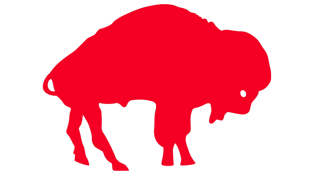
A completely different design concept of the team’s logo was introduced in 1970. The red Buffalo, first seen on the player’s helmet from the previous logo, now be-came the only hero of the Buffalo Bills visual identity. Placed on a white background, the animal looked powerful and stable, evoking a sense of respect and reliability. This logo only stayed for three years but is a truly outstanding design for a sports team emblem, which has its place in the world’s rugby history.
1974 – Today
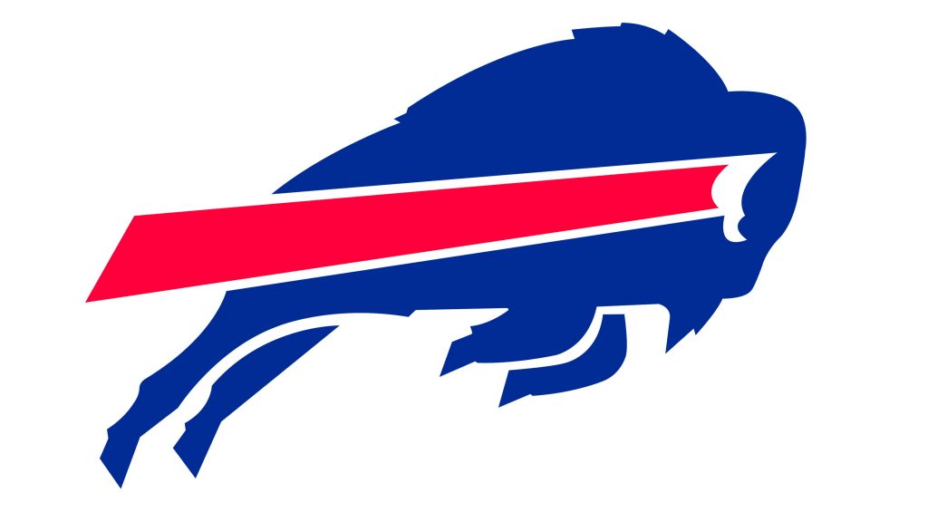
The most famous logo, which has become iconic, was designed for Buffalo Bills by Stevens Wright in 1974. It is jumping or even flying blue Buffalo with a wide red stripe coming out of its horn. The image looks powerful and dynamic, staying mini-malist and modern at the same time. The logo is definitely a masterpiece, which is instantly recognizable across the globe and loved by all team’s fans.
In 2002 there was an attempt to change the logo, but the audience voted for bring-ing the blue bison back, so it is still in use by the team today. The iconic bison is one of the most long-lasting logos in the history of American football and is one of the emblems, which doesn’t need any changes to stay actual and remarkable.
Symbol
The minimalist flying bison has been the symbol of the Buffalo Bills for more than 40 years. Its blue, red, and white color scheme is one of the most traditional combi-nations, reflecting professionalism, reliability, and loyalty, while the smooth clean lines and modern shape add a sense of progress, power, and dynamics.
Emblem
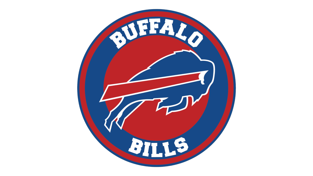
The Buffalo Bills emblem is the famous bison in a white outline, placed in a blue background. The use of the same color for the animal’s body and the square it is placed on, makes the emblem look contemporary and sleek. At the same time, it adds brightness and intensity to the red stripe, standing for power and passion.
The emblem is sometimes accompanied by a wordmark in the same color palette. The capital letters in a custom serif typeface look bold and solid, perfectly balancing the emblem and adding confidence and stability to the whole image.
Helmets
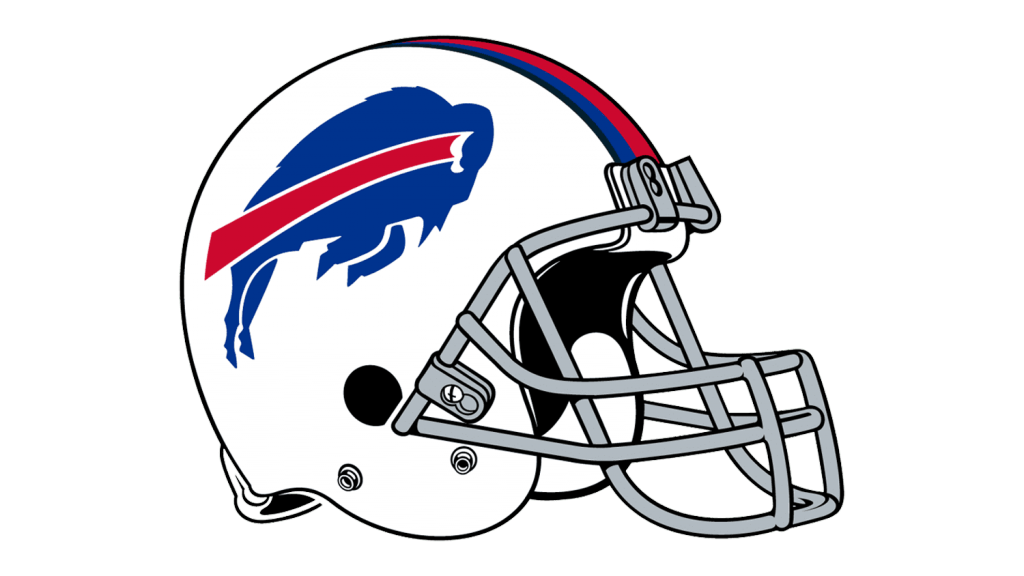
The design of the Buffalo Bills helmet is stylish and outstanding. The blue and red bison is placed on a white background, while the plain white surface of the helmet is also complemented by red and blue stripes coming through the middle of it. The grill is in light silver, adding freshness and lightness.
The current helmet design was introduced in 2011, and before that, the team has been using red helmets with blue or white grills.
Uniforms
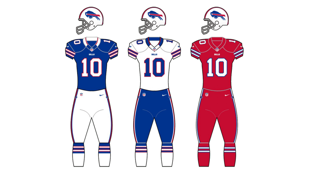
The home uniform of Buffalo Bills is composed of a bright blue jersey with white numbers in a red outline, and white pants with blue and red stripes, just like in the helmets. The uniform looks fresh and bright, making the team instantly recognizable on the field.
For the road uniform, the team chooses a white color for both jerseys and pants, with blue and red details.

