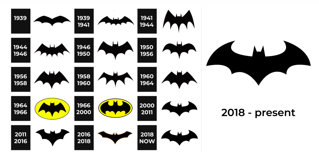
Batman is a resident of the fictional Gotham City. By day, he is a millionaire Bruce Wayne. He became a fighter against evil after his parents were killed in front of his eyes. The main motivation for all his good deeds, at least in the beginning, is the desire to avenge the death of his parents. Batman, however, unlike other superheroes, does not have any superpowers. He relies on his physical preparedness, finances, and innovative gadgets.
Meaning and History
For the first time, the world met the Batman hero in 1939, when it was published in Detective Comics. The Batman saga gained wide popularity in the 1940s with the Batman series of comics. In 1966, Warner Bros. bought film rights. The new “Batman” movie was released only in 1989 and was a success. Simultaneously with the blockbuster “Batman Returns”, the cartoon “Batman” series for kids were launched three years later. More movies and cartoon series have been made over the years. The Batman character himself was created by American artist Bob Kane. He used the movie “Zorro” and adventure magazines of the 30s to create Birdman, which was not very unique. It was redrawn to resemble a mysterious bat and not just a flying man. As a result, the creators changed the name to Batman instead of Birdman.
What is Batman?
Batman is a comic book character created by DC Comics, a superhero who fights evil. Under the mask is a hero named Bruce Wayne. Among other superheroes, Batman has proven to be one of the most popular. The image of the character appears in comics, feature films, cartoons, and computer games.
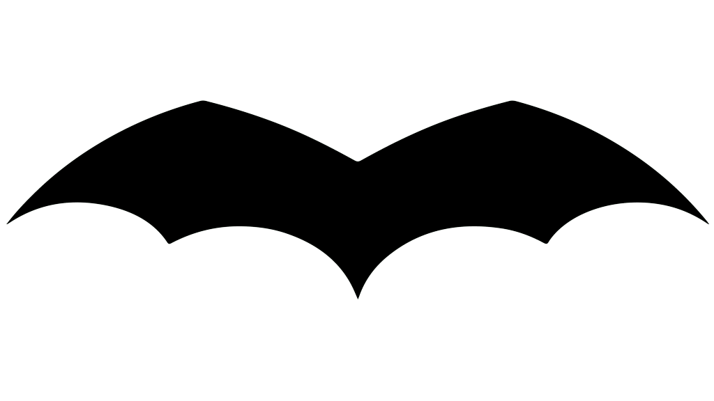
1939
A simple image of a bat or rather its wings has served as the first representation of the character. The wings were stretched out wide horizontally with four smooth arches at the bottom. It was also quite small.
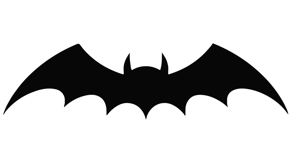
1939 – 1941
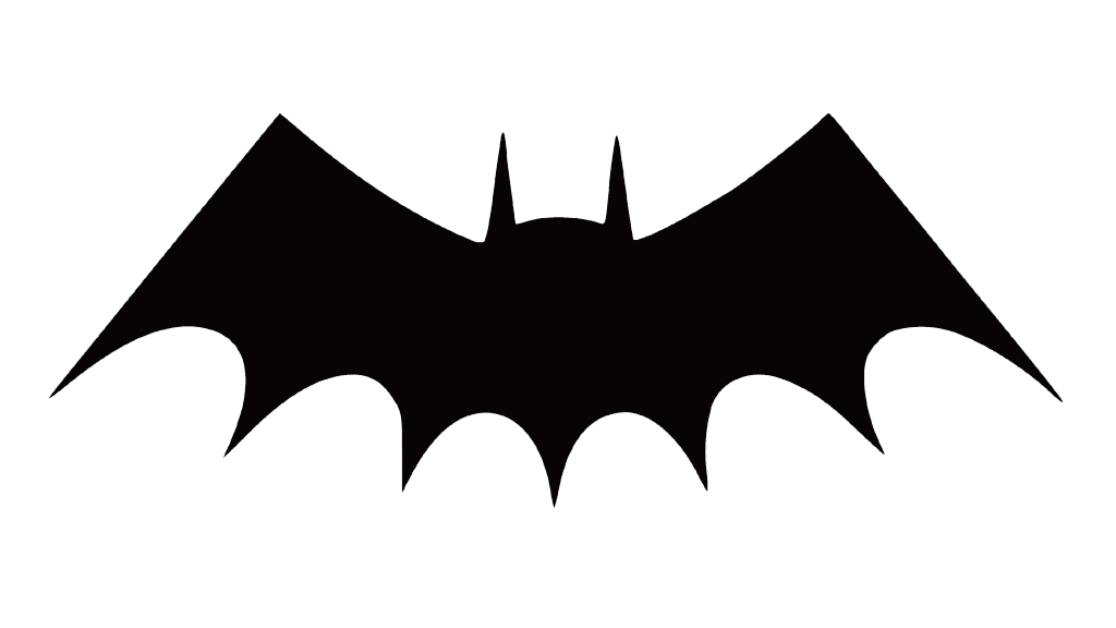
The most noticeable change is a small head and two ears that were added to the emblem. There are also now four wing points and a tail which are spaced closer together, creating higher web arches. The outer wing ends are quite pointy. It is still much wider than it is high.
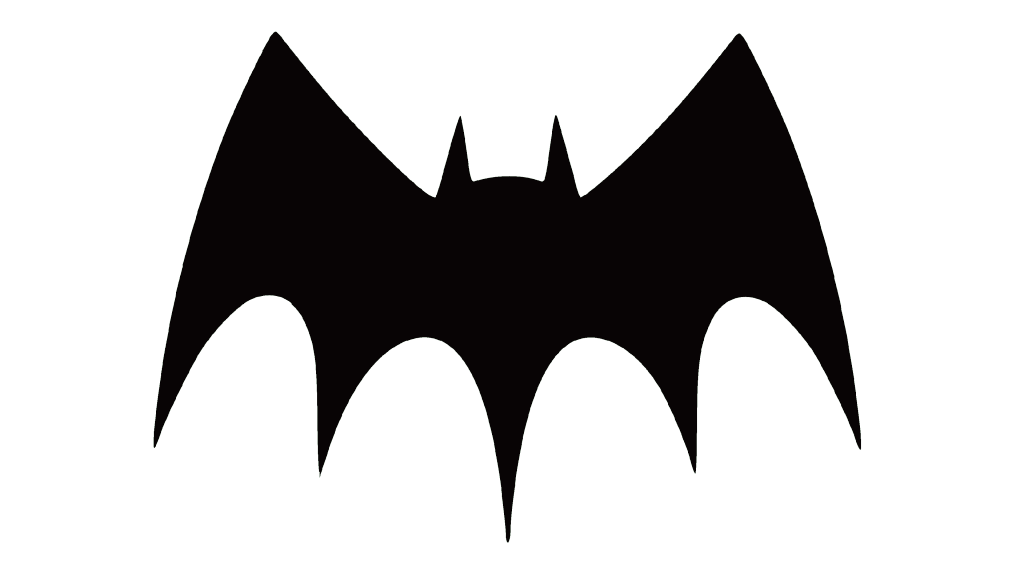
1941 – 1944
The number of webs has been changed back to the original. However, the wings were now stretched out and had very long, pointy ends that match the length of the tail. The top of the wings also got sharper, while the ears are no longer rounded to match the rather straight lines of the wings. It looked more powerful and with some gothic notes.
1944 – 1946
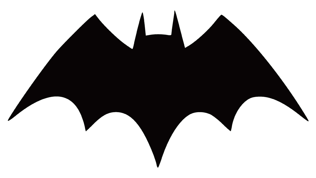
This Batman emblem looks like a mixture of the two last versions, featuring higher, pointy wings with six webs. The logo designers never seized to experiment with a new look.
1946 – 1950
The bat not only got fewer wing tips but also a bigger head. Its wings were still relatively high. The tail is longer than in the previous version, which creates a V-shaped bottom.
1950 – 1956
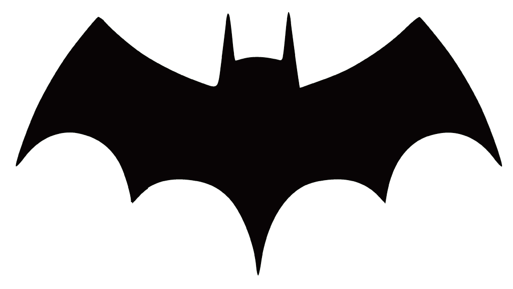
Although the head, tips of the wings, and the number of webs did not change, there was one major modification. It was for the first time that the top of the wings was rounded instead of sharp. Thanks to this move, the bat could be made larger on the character’s costume.
1956 – 1958
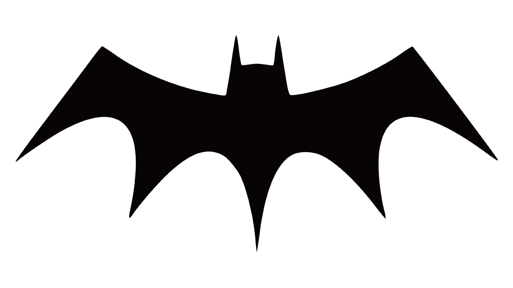
The emblem looks very pointy, with angular wing tops and ears. It is almost as high as it is wide. This is another great emblem of a hero.
1958 – 1960
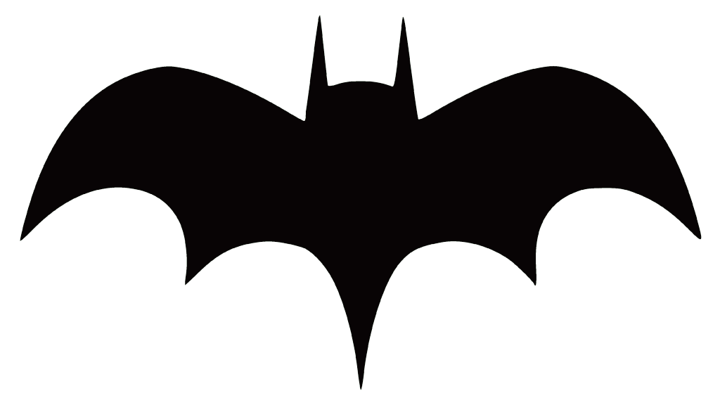
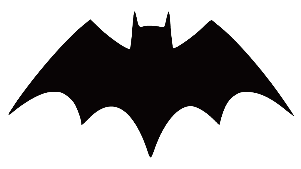
This Batman emblem does not look like anything seen before. The head sticks much higher while the wings form a very smooth curve at the top. The tail and wing tips are of the same length and width apart. It is wide and rather flat again.
1960 – 1964
This version looks a lot like the one introduced back in 1956. There are only very minor modifications.
1964 – 1966
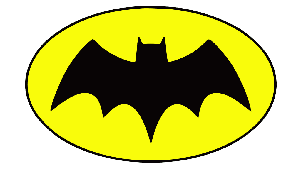
A bright yellow oval shape with a thin border now served as the base for the bat. There is no clear answer as to why Carmine Infantino decided to add more color, but it is obvious that he wanted to somehow mark a new landmark in the history of Batman. The goal was successfully achieved and viewers were intrigued by what was going to happen to the character himself. The shape of the bat reminded of the one seen in the late 1940s.
1966 – Today
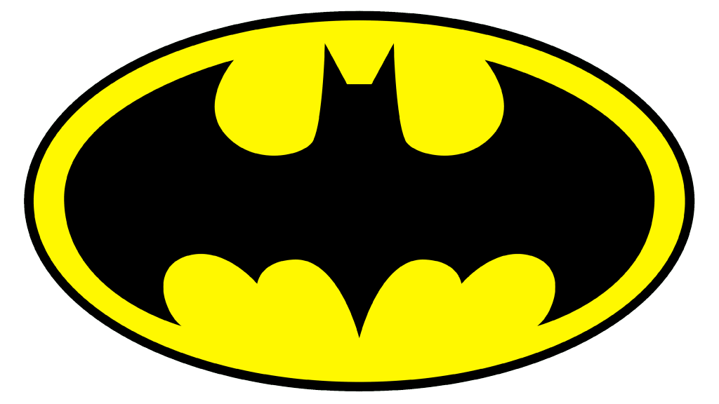
Artist Neal Adams worked with the writer Dennis O’Neil to give a completely new spin to the emblem. The bat’s wings now repeated the shape of the oval, leaving only a thin yellow line to outline them. The body of the bat also got more defined. The logo has been used for over fifty years and is still in use.
2000 – 2011
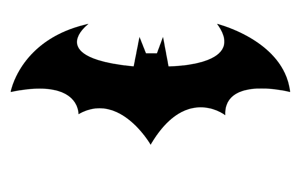
With the appearance of new Batman comics, the logo lost its yellow background. The Batman symbol had a classic appearance with beautiful curves and pointy ends. The ears had a triangular shape and the head was prominent.
2011 – 2016
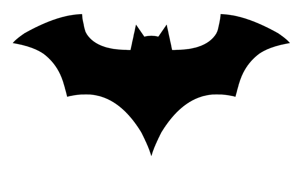
The release of New 52 led to a new symbol, drawn by Jim Lee. Thanks to a longer tail and raised wings, the bottom formed a “V”. The head of the bat got rounder and the tips of the wings on the top were no longer as sharp and long.
2016 – 2018
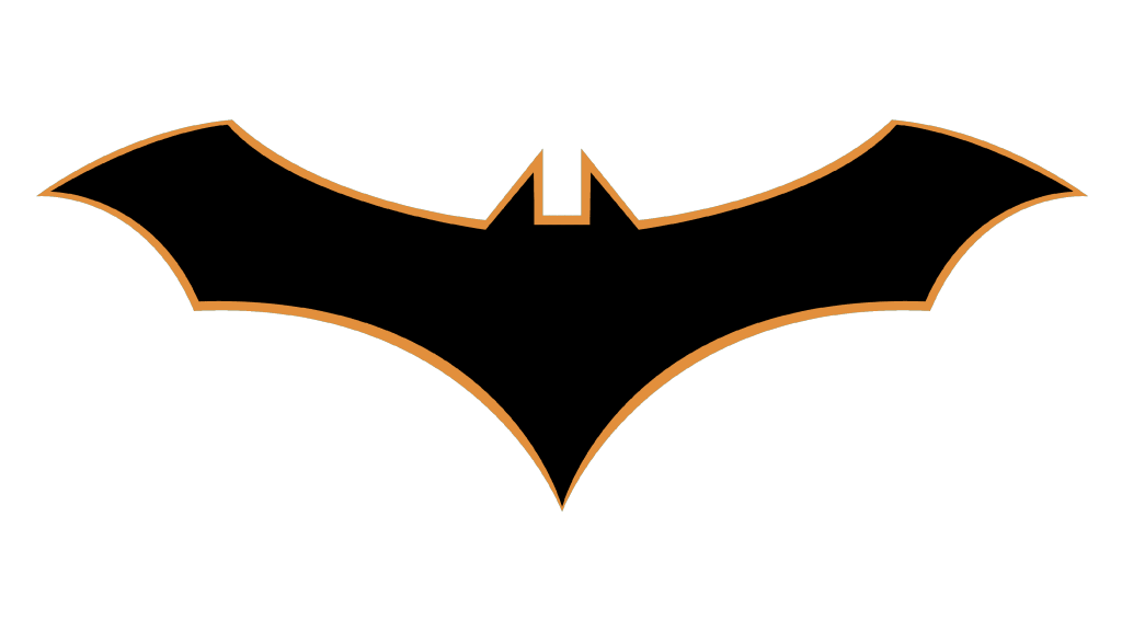
The Rebirth required a new Batman emblem, but it was not the classic logo its fans expected. Instead, Greg Capullo drew a different image of a bat with an orange outline. In a way, it resembled the original one as the head was not visible, only the ears. This logo was not used for very long.
2018 – Today
The bet emblem introduced at the beginning of the new century has been in use again since 2018. Without a doubt, the Batman symbol has undergone important changes throughout its history, and best of all, it does not end there.
Font and Color
The color palette was very consistent throughout the years, as the emblem was done only in black. there was an almost 30-year period though when a bright yellow was added to the color palette. In addition, some versions were seen with blue and red accents. There were no inscriptions attached to the emblem.

