Baltimore Ravens are a member of the North Division of NFL, established in 1996 in Maryland. One of the youngest teams in American Football, Baltimore Ravens were created by the owner of Cleveland Browns, the rugby legends with a rich his-tory. Today the team is owned by Steve Bisciotti and has John Harbaugh as the head coach.
Meaning and history
The Baltimore Ravens are a relatively young team, it is not surprising, that their vis-ual identity history is not very colorful. There has only been one major redesign since 1996, but the team still uses the color palette from the original logo version.
1996 – 1999
The very first logo for Baltimore Ravens depicted a shield with two wings, pointing up. It was a simple graphical representation of the team’s name, with the big letter “B” in the middle and the word “Ravens” in capitals on the top of the shield. The color palette consisted of three main colors — black, purple and dark yellow, and one additional — white, for details and accents. The wings symbolize the raven, a strong and dangerous bird, which perfectly reflects the character of the team. There was also one additional heraldic detail in the bottom part of the shield — a golden cross.
There was also two additional versions of the logo created during the same time period — a classic shield with no wings and four compartments — upper right with the letter “B”, bottom left with the letter “R” and two more with heraldic patterns — one was in red and white, and another one — in dark yellow and black. This logo was used as the main one for almost a year — in 1999.
Another version was much more ornate and had an enlarged “Ravens” wordmark as the main element. There were two wings coming out of the inscription’s back-ground, and ahead of the raven under it. The color palette repeated the main theme — black and purple, but here white was the third main color, while yellow was used only for details.
1999 – Today
At the end of 1999, a completely new style of The Baltimore Ravens’ visual identity was introduced. The head of the bird in profile, watching right, executed in purple and white, with the gold outline and black accents, is the logo we all know today. The gold letter “B” in a white outline is placed on it, celebrating the name of the team and the city of its origin.
The direction of the eagle reflects the progressive approach and energy of the Bal-timore Ravens, while the color palette of the logo represents the team as a profes-sional and powerful one.
Symbol
The Raven’s head is the main symbol of the team, which appeared on various al-ternate logos and on the official one since the end of the 1990s. This bird symboliz-es wisdom and clarity, while in the sports segment it is also a representation of strength and confidence. The three main colors — purple, black and white, work brilliantly together to reflect the main values of the team — professionalism, reliabil-ity, and power, while the gold outline adds some sophistication and style, making the symbol instantly recognizable.
Emblem
In addition to the main logo, the team also uses a “B” emblem in its visual identity and advertising campaigns. The stylized letter “B” is executed in the same style as on the main logo, but with smoother and sleeker lines and a sharp tail. As for the color palette — its main color is gold, with a double white and purple outline.
Helmets
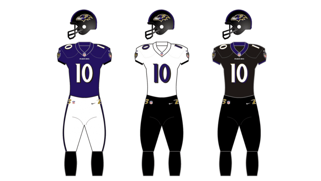
The Baltimore Ravens helmets design is modern and sharp — the purple and gold eagle’s head is placed on the side of the black helmet with the black grill. It looks bold and strong, evoking a sense of danger and fighting spirit.
Uniforms
The main color scheme of the Baltimore Ravens uniform was changed many times throughout the team’s history, but the current design was introduced in 2013 and is still in use — the dark purple jerseys with white players’ numbers and white pants with black stripes on the sides. This combination looks great with the black team’s helmets.
As for the road uniforms, The Ravens have monochrome ensemble — white jer-seys with dark numbers and details, and black pants.


