American Express Logo
Tags: banking | creditcard | USA
Established in 1850 as a distinguished financial establishment within the United States, American Express has transformed into a global leader in providing card payment services. Its reputation stands as an eminent and indispensable brand, revered internationally for its unwavering credibility.
Meaning and History
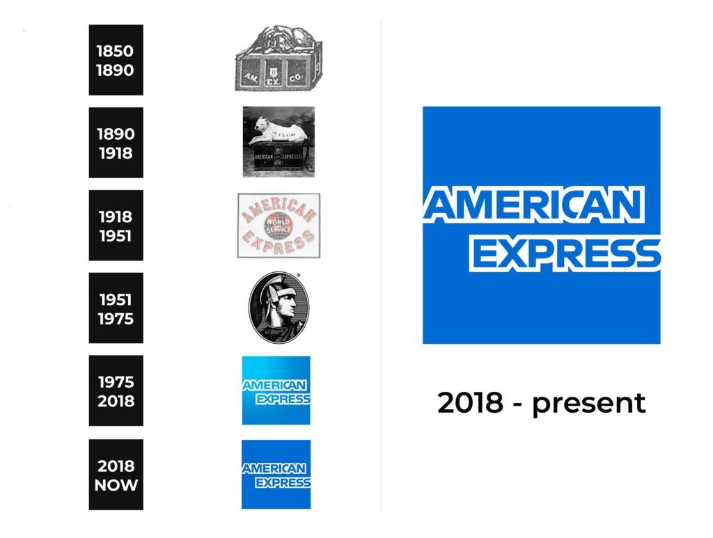
While the origins of this iconic American financial institution date back to the mid-19th century, its visual identity has undergone a measured evolution throughout the years. The American Express logo has seen just three iterations, with the present rendition closely mirroring the emblem introduced in 1974.
What is American Express?
American Express ranks among the top twenty largest banks in the United States and has secured a position within the top thirty most valuable global brands. Established in 1850 originally as a shipping company, American Express has evolved over the years to encompass a robust financial services division alongside its initial operations.
1850 – 1890
The inaugural emblem of American Express emerged in 1850, enduring for a span of four decades. This monochrome symbol showcased an elaborate chest adorned with prominent uppercase white lettering spelling out “Am. Ex. Co.” A dignified black canine companion graced the emblem, reclining atop the chest, emanating an aura of tranquility and sophistication.
1890 – 1918
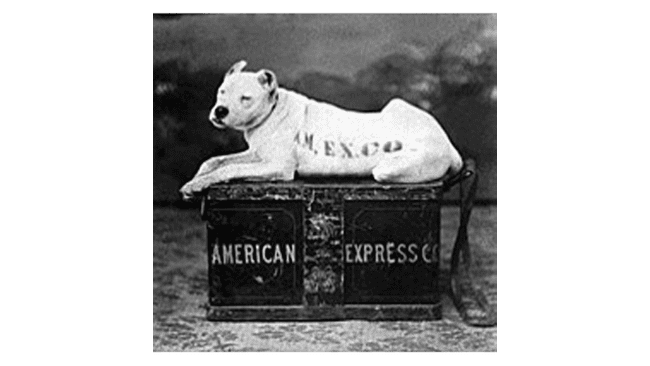
In 1890, a redesign introduced a shift, replacing the black dog with a white bulldog bearing the capitalized “Am. Ex. Co.” inscription. The chest itself bore an inscription, featuring a narrowed uppercase “American Express Co” wordmark, diverging from its previous iteration.
1918 – 1951
The year 1918 witnessed the introduction of a distinctive concept for the American Express emblem. This iteration showcased a globe adorned with vivid blue and red tones, accentuated by pristine white meridians. A prominent white uppercase “World Service” inscription adorned the central area, flanked by graceful arched lines displaying the lettering “American” at the summit and “Express” at the base. These letters were elegantly rendered in red, accompanied by white and blue outlines.
1951 – 1975
In 1951, the company adopted a portrayal of a Roman Gladiator gazing rightward, as the logo. It was placed within a vertically oriented ellipse medallion. Executed in a monochromatic palette of black and white, enhanced by fine horizontal stripes, the emblem radiated strength and professionalism.
1975 – 2018
In 1975, a rejuvenation of the logo took place, introducing a new design. It was a blue square with gradient shades, added to the blue squarish background. The nameplate found its place at its center. It was executed in the outlines of the letters. This dynamic addition infused a sense of motion and depth, elevating the bank’s visual identity.
2018 – today
In 2018, the esteemed design agency Pentagram undertook the task of refining the American Express logo. While preserving the essence of the 1974 design, they refreshed the contours of the inscription and intensified the hue of blue.
The contemporary logo features the letter “C” overlapping the succeeding “A,” introducing a touch of modernity. Graceful diagonal incisions decorate the letter ends, radiating elegance and flair. The deeper blue hue imparts enhanced confidence and reliability to the company’s image.
Color
The entire square expanse is bathed in a vibrant blue shade, save for the crisp white lines that elegantly delineate the contours of the company’s name.
Font
The nameplate itself is presented in a bold, all-caps sans-serif typeface, imbuing it with a sense of modernity and clarity.


