Meaning and History
Zotye Holding Group was founded in 2003. At that time, he was engaged in the assembly of engines, transmissions, and other units for cars. The automotive industry itself, called Zotye Auto, was founded two years later on January 14, 2005.
2005 – 2018
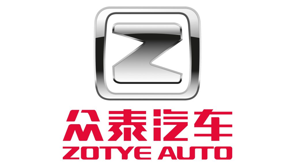
The original emblem was accepted in 2005 represents a capital letter “Z” placed in a frame. Both the letter and the frame have rich silver color, while the shade adds volume to the figure. The letter itself doesn’t have a deep meaning, but just the first letter of the brand’s name.
Under the Badge could be seen the full name of the company – “Zotye Auto”, written both in Chinese and English letters. Both inscriptions have red color, which symbolizes the power of the company.
2018 – today
The current logo of the company was designed in 2018 and is still used effectively. In fact, designers just made some changed the old one and the logo concept remains the same. However, now the letter “Z” became a little bit thinner and touches the edges of the frame. Also, the shadow was changed, now it makes the frame and letter volumetric. What concerns the inscription under the frame, it also undergoes several changes. First of all, designers decided to remove the Chinese hieroglyphs. Secondly, they shorted the name of the company, leaving only the word “Zotye”, which also gained the silver color.
Emblem and Symbol
Despite the apparent simplicity, the emblem perfectly reflects all the main values of the company. In general, the group adheres to the principle of humble integrity, innovative pragmatism, pursuing excellence, giving back to society. And according to their latest accomplishments, they match their foundations perfectly.


