Zenos Logo
Tags: British Car | cars | cars that start with z
Meaning and History
![]()
The company was founded in Norfolk in 2012 by two friends Ansar Ali and Mark Edwards. The company produces sports cars that are hand-assembled at the company’s factory in Wymondham, UK. It is said, that the name Zenos is a combination of two Latin words “zen”, which means purity, and “os”, which could be translated as ‘vertebra’ or spine. Founders chose them to reflect one of the key architectural elements of the company’s products.
2012 – 2016
![]()
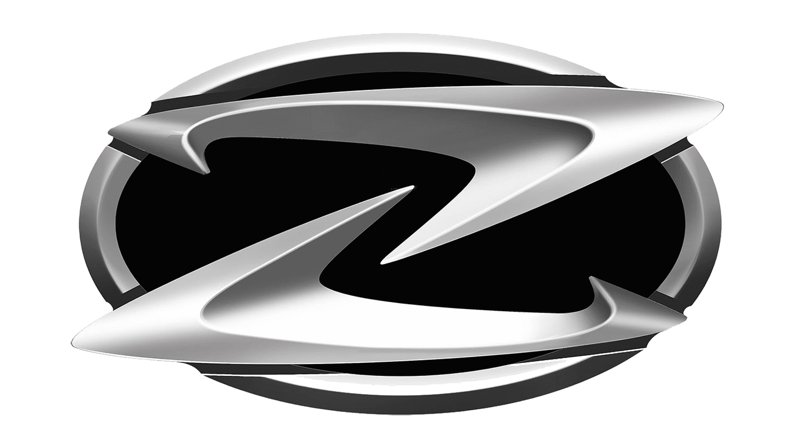
The original logo was accepted in 2016. It represents a capital character ”Z” framed with a round oval. The letter consists of two halves (upper and lower) that are not connected to each other and seem to hang in the air. Both the frame and the inscription have a beautiful silver shade.
2016 – today
![]()
The logo went through modernization in 2016. The designers gave the “Zenos Cars” inscription a new look by changing the font and the color to black. They used an italicized sans-serif font that was very close to Vipnagorgialla Semi Bold Italic by Typodermic, but with the “n” being one continuous line and the “r” curving a bit down. In addition, all the letters were now lowercase. This change alone gave the logo a more modern and serious appearance. The designers did not stop there and worked on the coloring of the emblem above, adding shadows and highlights that gave the sign a sleeker appearance. Finally, it is worth noting that the letter “Z” was now inside the oval frame rather than peeking slightly beyond it.
Emblem and Symbol
In general, the emblem of the company looks very modern and stylish. Sophisticated forms, sloppy lines, and such incompleteness remind of great speed, which is the main quality of the brand.