Xpeng Motors, founded in 2014 by He Xiaopeng, is one of the most promising and exciting electric vehicle manufacturers in China. Interesting that the original name of the brand is “Xiaopeng Motors”. However, this full name is used only in China. For the overseas market, Xiaopeng was reduced to Xpeng. The company released its first electric car the Xpeng G3 crossover in 2018. The second electric car has been produced since 2020 – the Xpeng P7 sedan.
Meaning and History

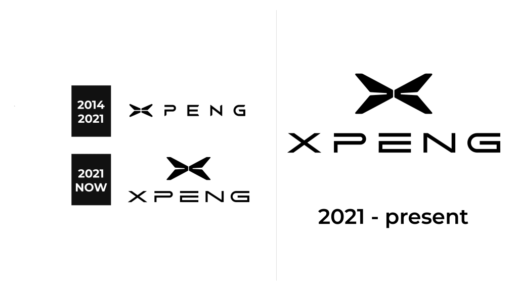
The logo of the company, adopted in 2014, consists of an emblem and a wordmark. All elements are made in a futuristic style, are stylish and memorable.
2014 – 2021

The original logo was accepted in 2014. This emblem, which is also used as the badge on the company’s cars, looks like a stylized signature “X” and replaces the first letter of the brand’s name.
The letter “X” consists of four equal parts, which seem to be suspended in the air and do not touch each other. What concerns edges, they are smooth and sleek and resemble a boomerang. The emblem is usually located on the hood of the car and has a stylish silver tone. However, it is easy to find a logo in red or black, which is mainly used for advertising or documents.
To the right of the Xpeng icon is usually the brand name. The wordmark has capital letters and a custom sans-serif typeface, which is based on a traditional geometric font but has its edges cut diagonally, which adds a sense of progress and innovations. One more detail of the inscription is the absence of the vertical bar in the upper part of the letter “P”, which evokes a sense of speed and motion.
2021 – now

The new design not only made it more clear what the name of the company was but also made the logo look bolder and more stylish. The company preserved the style of the original logo, but moved the stylized “X” above the name, making it larger to create a more balanced image. The new font also looked very similar to the previous one thanks to the use of an open “P”. The letters, though, look significantly wider and almost squarish. The font resembled Sawah font but with straight cuts instead of diagonal ones. The company put a lot of meaning behind this logo. The “X” is meant to symbolize the word “explore” and the brand’s effort to explore new technologies.
Emblem and Symbol
The simplicity of the Xpeng logo elevates it and makes the brand stand out. It perfectly represents the nature and essence of the company, accenting its attention to detail and value of style and comfort.

