WWE Logo
Tags: live events | TV company | wrestling
WWE, an acronym for World Wrestling Entertainment, is a prominent American sports and entertainment TV company. Engaging in a diverse range of activities, from wrestling matches to games, competitions, music, films, and more, WWE has evolved into a multifaceted entertainment powerhouse. The company is the result of the merger of two specialized firms, Titan Sports, Inc. and Capitol Wrestling Corporation Ltd., both founded by members of the McMahon family.
Meaning and History
The origins of WWE trace back to the establishment of Capitol Wrestling Corporation in 1953, initiated by figures such as Toots Mondt, Jess McMahon, and Vincent J. McMahon. Over the years, it has become the leading organizer of live wrestling events, hosting more than 500 programs annually. In 1980, Titan Sports, Inc. was founded, and in 1982, it acquired Capitol Wrestling Corporation Ltd. Subsequently, Capitol Wrestling Corporation became a part of the National Wrestling Alliance (NWA).
The company has undergone several name changes throughout its history. It transitioned from being the World Wrestling Federation in 1998 to World Wrestling Federation Entertainment in 1999, finally adopting the name World Wrestling Entertainment in 2002. However, the abbreviated ‘WWE’ became the most widely recognized name, remaining unchanged legally since 2011.
What is WWE?
WWE acronym stands for World Wrestling Entertainment, a global media conglomerate that specializes in wrestling-related shows, games and movies, as well as music. The company has regional branches across Europe, Middle East, America, and Asia, but the main one is based in Stamford, Connecticut.
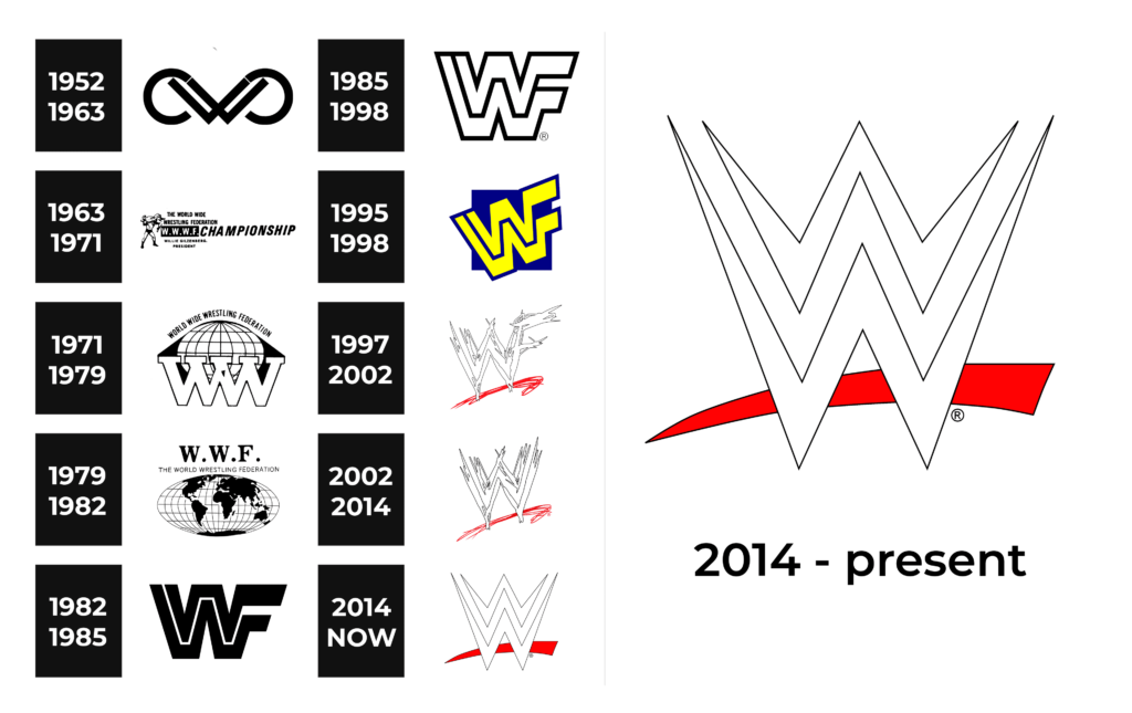
1952 – 1963
The earliest logo features the abbreviation ‘CWC,’ stylized with sharp horns, representing Capitol Wrestling Corporation. It exudes a rugged and distinctive appearance.
1963 – 1971
As the organization becomes the World Wide Wrestling Federation (WWWF), the logo showcases two wrestlers in action, emphasizing the wrestling aspect.
1971 – 1979
This period features a graphic logo with the organization’s name displayed above a globe, highlighting its global reach. The ‘WWWF’ abbreviation is retained.
1979 – 1982
The logo sees the abbreviation for World Wrestling Foundation, ‘WWF,’ replace ‘WWWF,’ and the globe becomes more detailed, incorporating continents.
1982 – 1985
A simplified version emerges, featuring the ‘WWF’ abbreviation on a white background with bold black lines.
1985 – 1998
During this period, two versions of the logo are utilized, one predominantly black and the other predominantly white, both featuring a simple, geometric “WWF” design.
1995 – 1998
An iteration in neon yellow and cobalt colors is introduced, presenting a vertically oriented ‘WWF’ logo with a leftward slant.
1997 – 2002
The Attitude Era logo features the letters ‘WWF’ with sharp, hastily drawn strokes.
2002 – 2014
The company adopts “World Wrestling Entertainment” as its official name and introduces the ‘WWE’ logo. This logo features a single ‘W’ outlined with uneven strokes.
2014 – today
The current logo, designed by John Lefteratos, features two prominent ‘W’ letters shaped like lightning bolts, with a red line running diagonally below the letters for added emphasis.
Font
Since the logotype is based on one letter, there is not much typeface to discuss. However, the latter version depicts extra sharp edges of the ‘W’, executed with no serifs.
Color
WWE’s corporate color palette has generally adhered to classic and restrained tones. The prominent colors used in their branding are black, white, and red.


