Visual Studio Logo
Tags: apps | mobile apps | web services
Visual Studio, a Microsoft creation, serves as a robust software tool tailored for website and mobile app development. Introduced in 1997, it supports over 30 programming languages and is accessible in 13 languages.
Meaning and History
Visual Studio facilitates programmers in assembling program components like buttons, text, and actions effectively. This allows them to craft software, apps, and websites much like constructing impressive LEGO structures following a clear guide.
What is Visual Studio?
Visual Studio, by Microsoft, empowers diverse program creation—websites, web apps, web services, and mobile apps—using Windows API, Windows Forms, Windows Presentation Foundation, and more. It generates native and managed code, enabling versatile software development.
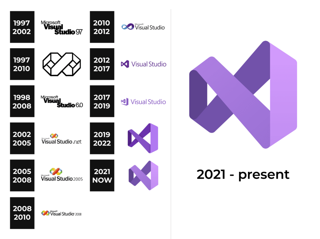
1997 – 2010
The original logo featured a vibrant orange and yellow infinity sign with a bold “X” at its center. Green and blue accents added flair, remaining iconic for 13 years.
1997 – 2002
A refined version with indented two-line text showcased bold sans-serif letters resembling ATF Franklin Gothic Black. The minimalistic design retained Microsoft’s familiarity.
1998 – 2008
The logo subtly changed to reflect a software version shift, transforming “97” into “6.0.”
2002 – 2005
Retaining the essence, Visual Studio 6.0 updated only the version number, enhancing the emblem’s color vibrancy.
2005 – 2008
A 2005 redesign featured single-line, large black lettering. The colorful infinity symbol was repositioned above the text, with a “Microsoft” caption.
2008 – 2010
Further refinements in 2008 reinstated emblem size and embraced an elegant typeface, aligning with Microsoft’s visual identity.
2010 – 2012
2010 marked a smoother emblem with a gradient blue and purple palette, adding sophistication.
2012 – 2017
The emblem transformed angularly in 2012 while maintaining the purple hue.
2017 – 2019
A 3D purple infinity loop emerged in 2017, positioned beside purple lettering, conveying dynamism.
2019 – 2022
A significant redesign in 2019 softened angles in a 3D emblem, retaining elegance.
2021 – today
The 2021 refinement focused on professionalism, lightening the purple infinity sign and minimizing the perspective effect.


