Tennessee Titans Logo
Tags: Mike Vrabel | NFL | South Division NFL | USA
Tennessee Titans are a professional rugby franchise from the South Division of NFL, which was established in 1959 in Houston and moved to Tennessee only in 1997. Today the franchise is owned by KSA Industries and has Mike Vrabel as the head coach.
Meaning and history
The team, established in Houston, was called The Houston Oilers until 1997 when they moved to Tennessee. The “Oilers” part was changed to “Titans” only at the end of 1999, and the logo, designed for the new name has never been changed again.
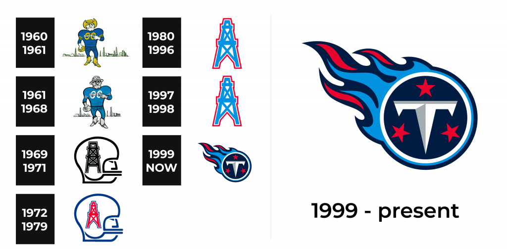
1960 – 1961
The initial logo for the Houston Oilers comprised an image of a funny cowboy wear-ing a gold hat and boots. The cowboy was wearing a blue rugby uniform with the “Oilers” wordmark and had a golden football in his hand. The background featured several oil rigs, celebrating Houston, the mother city of the rugby club.
1962 – 1968
With the redesign of 1962, the cowboy’s hat was replaced by the oil helm, and the yellow color of the palette — by the light gray, close to silver. The silhouette of the man and the background remained untouched, as well as the main blue color.
1969 – 1971
The new concept was created for the team’s visual identity was created at the end of the 1960s. Now the logo was composed of a white helmet in a thick black outline with the geometric image of the black oil rig on it. The stylized abstract profile of a man can also be seen.
1972 – 1979
The color palette was switched from the monochrome to blue and red, where the helmet’s contour and the man’s profile were executed in thick blue lines, and the oil rig became bright red, featuring a thin blue outline.
1980 – 1996
The rig from the previous logo now became the main hero of the new team’s visual identity. The color palette was changed to light blue and a thin red outline, the im-age was mainly placed on a white background, which made it look bright fresh and very modern due to the geometric silhouette and straight lines.
1997 – 1998
The team relocated to Tennessee and changed its name to Tennessee Oilers in 1997. The logo remained almost untouched, only the contours were modified, mak-ing the image look thinner and more elegant.
1999 – Today
The new name and the new logo appeared in 1999. The recognizable today symbol of Tennessee Titans is composed of a deep blue circle in a white and light blue out-line, with the stylized sharp letter “T” surrounded by three red stars. The circle re-sembles a comet, having blue and red flames coming out of its frame.
Emblem
The iconic T-circle is usually placed on a red or blue background for an emblem. The shape of the letter “T” and its two-shade execution makes it look like a short knife or sword, pointing on the brutality and power of the team, while the red, blue and white color palette is a celebration of patriotism and national spirit.
Helmets
Until 2017 the main color of the Tennessee Titans helmets was white, but now the team uses navy blue background, where the tricolor comet emblem is placed. The delicate light stripe complements the stylish and sleek look.
Uniforms
For the main uniform, the team uses a navy-blue jersey with a bold white player number and thin delicate white and red details on the shoulders. The pants are snow-white with several diagonal lines on the sides. The absence of thick vertical side stripes makes the Titan’s uniform unique and instantly recognizable.
The road uniform of the team consists of a white jersey with a navy-blue number and red and blue shoulder panels. The pants of the road uniform are executed in dark blue with thin white diagonals.


