On the Japanese market of automobiles, Suzuki is one of the lesser members. They sell a lot less than Mitsubishi or Honda, but still hold a prominent place within the niche of light cars and motorcycles. They are also one of the newer additions to the industry, having only started making cars in the 1950s.
Meaning and History
There’s no any deep meaning or history behind the brand. Their logotype is pretty much just a reflection of their name. Suzuki, in turn, is a family name of the company’s founder Michio Suzuki. Notably, the company is using the red color from the Japanese flag for their, like the majority of other Japanese companies in this field.
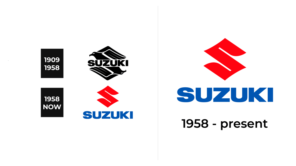
1909 – 1958
Initially, the logo was black. Still, it was the letter ”S”, taken from the Latin alphabet, stylized as kanji hieroglyphs. It was presented in the form of an eagle’s head and its reflection.
1958 – now (emblem)
Suzuki exists since 1909, but they didn’t start seriously developing automobiles until the 50s, when their initial business – loom making – stopped being profitable. They don’t seem to have any logos before 1958, 3 years after the creation of their first motorcycle.
By that time, the Japanese economy was already heavily tied to the western markets – primarily in America. It’s for this reason they decided to design their very first logo in the western style, although they still retained some eastern aesthetic.
The main part of the emblem was the letter ‘S’ from the brand name. Its first color was black, but then was changed to red, which is a reference to the Hinomary, the sun from the flag. The way the letter is drawn also sends you back to the Japanese hieroglyphic alphabet.
The letter is written in several straight strokes, although it’s also given a lot of volume. The emblem is also squared in several places, which gives it a very linear look – much like the usual Japanese characters. As a consequence, some corners of this letter are very pointy, while ends of the letter are noticeably rounded to make it appear softer.
It’s also a car badge used by the company for its products. Like other car badges, Suzuki makes theirs out of metal and gives them a lot of chroming. There are usually no other elements around or beneath the Suzuki badges, just the standalone ‘S’ letters.
1958 – now (text)
Simultaneously, the company developed a universal look for their brand name to appear next to or below the actual logo (they are rarely separated).
Unlike the emblem, the text is actually very simply designed. It doesn’t have notches, sudden changes or additional appendages. The majority of these letters can be enclosed in simple squares. It makes the entire text very standard, but also distinct (which can’t be underestimated).
As for the color, it was first black, and later changed to dark blue alongside the emblem. However, company can change the palette of this word, alongside the coloring of the emblem, for different occasions. For instance, sometimes they can both be black or red. However, the red and blue combination is the usual.
Symbol and Emblem
The company didn’t really change its logo at all since its creation back in 1958. However, it doesn’t mean they can’t add the details there and then. It makes the history of this brand a bit complicated, because there’s no official record of any other version of their current emblem.
It seems that, in the past, they’ve used special variants of their logotype on different unrelated to each other occasions. For instance, the black logo used in the first years of the company’s auto career could sometimes be accompanied by a line with four tilted rectangles in the middle to symbolize the wheels.
This little detail was sometimes used in the colored version as well, but there it would have light green and blue colors to match the bright palette of the logo itself. It’s not really clear when and why these versions were used.
The Legends
Suzuki didn’t create a lot of ground-shaking cars, but they did create a lot of cars with incredibly ridiculous names, which is the subject for many conversations even more. It’s mostly because they reminded everyone about this habit of theirs after creating a SUV crossover named Hustler in 2004. It raised a lot of questions.
Other consequences of Suzuki’s ridiculous naming policy are 1991 mini called Cappuccino, 2019 crossover called S-Presso, 1983 coupe Mighty Boy and more.


