Shell Logo
Tags: gas | Great Britain | oil
Shell is a transnational from the Netherlands. Their main activities are targeted toward the search works, manufacturing, and spreading of oil and gas and adjacent goods. The firm was set up in 1907, and today, Shell is among the most significant petroleum companies with facilities in over 70 countries.
Meaning and history
The brand’s history traces back to a line of mergers and purchases, which joined the two firms having different backgrounds and cultures.
Royal Dutch Petroleum appeared in The Hague, Netherlands in 1890. 7 years later, Shell Transport & Trading was launched in London. In 1907, these two businesses became a joint venture known as Royal Dutch Shell, initially headquartered in both cities. This joint venture would evolve into a considerable player in the planet’s gas and oil market.
As time went on, Shell participated in a multitude of projects. These include the natural gas discovery in the Netherlands (1959), and the construction of the first commercial facilities in an offshore oil field in the Mexican Gulf (1947). They’ve also met various controversies, touching on abusive working conditions in the countries where they had a presence and the environmental issues.
After 100+ years, Shell is still a powerhouse in the petroleum market, manufacturing products in numerous areas. They also invest in projects on revolving power sources like solar panels or wind generators. They adapt to inconsistent conditions of the world, meeting today’s energy needs responsibly.
What is Shell?
Shell is a global petroleum corporation that has been propelling the globe’s transport progress for over a century. The brand has a rich history of innovative solutions and a commitment to sustainability, making it highly significant in the market.
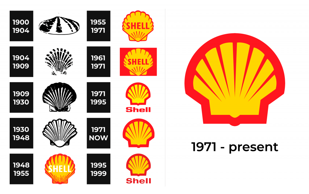
1900 – 1904
Shell Transport & Trading’s symbol was a clamshell. It had a distinctive look: oval, with a raised center. The creators made a rugged texture with contrasting black and white dots and alternating ribbed stripes. An abrupt black line outlined the edge.
1904 – 1909
Shell’s logo transformed in 1904, as the brand designers opted for a new shell – the scallop. It was characterized by ribbing and alternating strokes. The ribbing, narrower than previously, is also visible on the transverse lines.
1909 – 1930
Shell’s redesign brought a bolder and more defined emblem with an accentuated scallop in monochrome. Its fan shape is stretched vertically with black stripes, revealing the ribbed pattern. The contours of the shell were slightly wavy, and the white color was reduced to vertical elements, enhancing the symbol’s sophistication.
1930 – 1948
The following logotype was rather a modification of a previous one. Its contours became more distinctive, so one could easily recognize the shell’s edges and angles.
1948 – 1955
The year 1948 saw a turning point in the brand’s graphic identity. For the first time, they added bright colors to their visuality. The shell’s edges became red, while its inner part got yellow. Additionally, for the name in the center to be more distinctive, the designers disintegrated the ribs inside, leaving some on the contour and the bottom.
1955 – 1971
This design was later made more minimalistic. The lower ribs disappeared, and six diagonal lines took their place. The shell’s scallop was made into a rectangle partially hidden behind it. The orange name showed up at the center of the shell in capitals.
1961 – 1971
In the 1961-1971 period, they used a yellow shell on a backdrop colored red as the logo. The name caption and the stripes materialized on the shell in red.
1971 – 1995
The 1971 logotype displayed a shell looking like it was a rectangle with 8 diagonal stripes coming out of it. The backdrop came along the shell’s contours. The nameplate was placed below, and it had gotten a new script with angular lowercase letterforms. The ‘s’ still had the title case.
1971 – today
Alongside the logotype with the inscription, they approved an emblem-only version in 1971. It’s still used, which is not relevant for the inscription version, though.
1995 – 1999
In the late 90s, Shell used a logotype with the familiar emblem above the lettering in a special sans-serif script.
Font
Shell’s current symbol is textless, but it wasn’t always this way. Previously, the emblem featured the term “Shell” in thick letters without serifs. In the decades that followed, the brand experienced several logo modifications, including renewals in capitalization, typeface, and even the forms of letters. The latest iteration features circled edges, which first showed up in 1995.
Color
Shell’s chromatic code has remained unchanged since 1948 when creators added vibrant hues to the original monochromatic logo. The mix of yellow and red is believed to be inspired by the national colors of Spain, which once ruled over California, the area where the firm’s earliest locations were built.


