Saab (Svenska Aeroplan AktieBolag), like a large number of modern car brands, started its activity in a completely different field. The company, founded in 1937, manufactured airplanes. And only after the Second World War, a department dealing with car production – Saab Automobile AB, was established in the concern.
Meaning and history
![]()
Throughout its history, the company changed many other logos until it borrowed the griffin from the emblem of its parent company. Scania has used this griffin logo since the early 20th century.
1891 – 1900
![]()
The first logo of the company was in the form of a metal oval, inside which the name ‘Vabis’ was inscribed in black.
1900 – 1911
![]()
In 1900, the logo took on the shape of a circle, which was located on a shape similar to the letter Y. Inside the circle was ‘Scania Maskinfabriks Aktiebolaget’. In the letter Y was a red griffin with a crown, and above it was the inscription ‘Malbo’.
1911 – 1937
![]()
In 1911, there were some changes to the previous logo. The image of the griffin was sharper and depicted in the letter Y with a blue brick background. The circle now contained ‘Aktibolaget Scania-Vabis’. The entire logo was now surrounded by a white circle.
1937 – 1946
![]()
The emblem was a twin-engine aircraft with propellers, front view. The SAAB lettering was placed under the fuselage and unfolded wings.
1946 – 1947
![]()
After the Second World War, the Swedes began to manufacture cars, at the same time the logo was changed. In 1946 it was a red nameplate in the form of the coat of arms.
1949 – 1963
![]()
Saab lettering was positioned on a blue background in a square with rounded corners, and two stylized chrome aircraft wings appeared below the lettering.
1963 – 1965
![]()
The 1963 emblem was identical to the previous one, but was depicted on a red background.
1965 – 1967
![]()
The logo resembled a version from 1937, but the text was located above the plane and the logo itself was thicker.
1967 – 1969
![]()
The logo is reintroduced with a twin-engined aircraft, which, together with the ‘SAAB’ lettering above it, is placed on the familiar blue rounded rectangle.
1969 – 1974
![]()
But since 1969, the logo has only been written in a traditional script.
1974 – 1996
![]()
In 1974 the company presented a completely new logo with a crowned red griffin, a mythical creature with the body of a lion and the head of an eagle. Griffin was intertwined in two circles. The first had ‘SAAB’ inscription, and the second – ‘SCANIA’.
1995 – 2000
![]()
In 1995, ‘Scania’ inscription was replaced by ‘Technologies’, and ‘Saab’ was now positioned on the right side of the whole logo and was in blue color.
2000 – 2012
![]()
The logo had a circular shape and blue color, inside which was a red griffin with a gold crown. The name of the company was placed under the griffin.
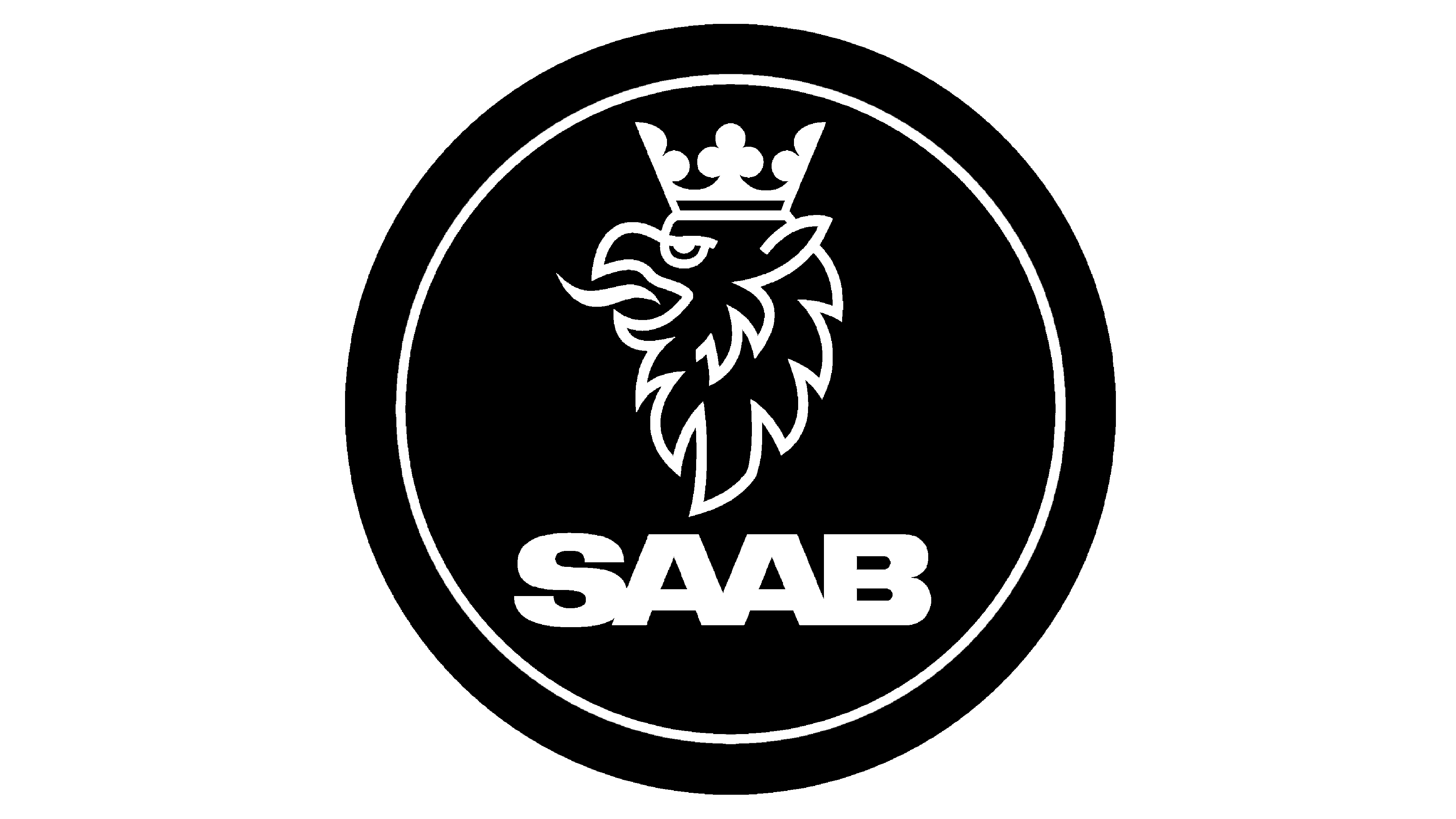
2012 – 2014
![]()
The logo of those years became the most modest in history. It was just a brand name written in capital bold blue letters.
Emblem and symbol
The mythological griffin on the company logo is a creature with the head and wings of an eagle and the body of a lion; the mythical beast, combining the qualities of the king of beasts and the king of birds, signified strength and vigilance.