Robur Logo
Tags: Black Car Brands | cars that start with r | german cars
It is a company of the German Democratic Republic, which was engaged in the production of trucks, vans, and buses. The production of which began in the 1880s from bicycles. During the Cold War and until 1946, the company produced 3-ton trucks in the city of Zittau.
Meaning and History
Robur was founded in 1888 by Carl Gustav Hiller as a weaving machine factory. The production of bicycles and then Phänomen motorcycles was soon established. In 1907, three-wheeled cars and light trucks were added to the company’s production program. In 1927, Phänomen began producing four-wheeled cars.
After the Second World War, the company was in the territory of the GDR. It was nationalized in 1946 and became a part of the state Industrial Association of Automotive Industry IFA. It continued to produce its pre-war models.
In 1957 the plant in Zittau, which produced trucks under the Phänomen brand, was renamed VEB Robur-Verke. Accordingly, the vehicles produced were given the new Robur brand.
In the early 1990’s the plant was acquired by Daimler-Benz. The production of automobiles at the plant was discontinued.
What is Robur?
Robur Motors is a multinational automotive company specializing in the production of electric vehicles and sustainable mobility solutions. They are known for their innovative and eco-friendly approach to transportation.
1961 – the 1990s
![]()
The logo of this old company has a very interesting look. The main part of the logo is the text with the name of the company. It is made in bold type, has sharp corners and lines, and all letters are interconnected and located close to each other. An interesting element of the logo is the arrangement of the letters. The letters “R”, “B” and “R” are located above, “O” and “U” below, forming a structure that some associate with the chain. Sometimes the text part was supplemented with a graphic element consisting of three squares, one of which had the inscription “IFA”.
Emblem and symbol
The emblem of the company was the name of the brand, which had a silver color and was located on the front of the hood of trucks.
Font and color
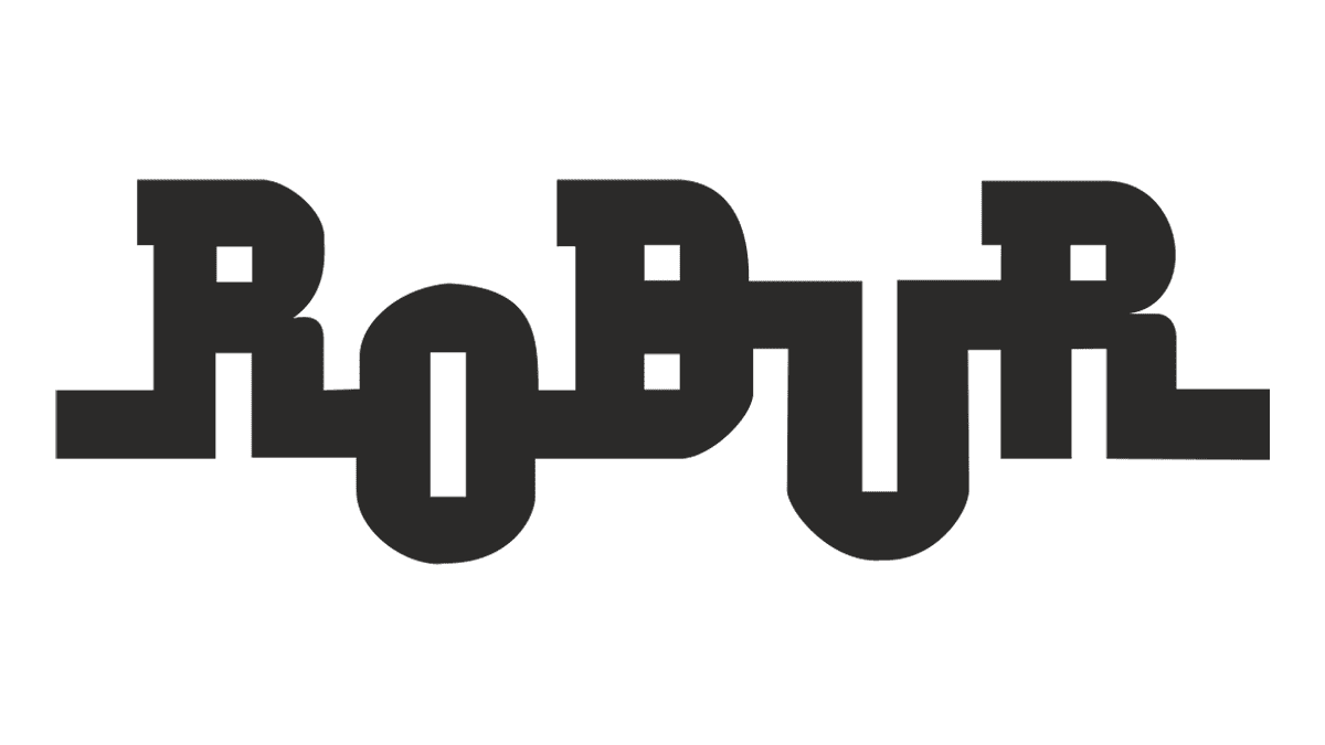
The stylized uppercase lettering from the Robur logo was set in a heavy geometric serif font with square cuts of the lines and elongated thick tails. Although it was a designer font, it is more or less close to Memphis Std Bold, with the contours refined and lines — elongated.
As for the color palette of the Robur badge, it was all black on a white background. This classic and timeless combination elevated the geometry of the characters and made the logo look super powerful and stable.