It is a British rock band from Oxfordshire. The band was founded in 1985, and its composition has not changed since that time. The Radiohead’s style is traditionally defined as alternative rock, although at different stages the sound varied from brit-pop to art rock and electronic music.
What is a curious fact about Radiohead?
This is a grandiose and really quite significant band not only for the 90s, but also for the entire modern world music industry. Despite the relative youth of the group, it has already become a living legend, a classic for certain genres and directions. Radiohead is a band that has gone a long and extremely interesting way, arranging one revolution in the world of music after another along the way. At the same time, Radiohead is also an eternally young band, always experimenting, looking for something; each of their albums is not like the previous one, each new song is a new world.
Meaning and History
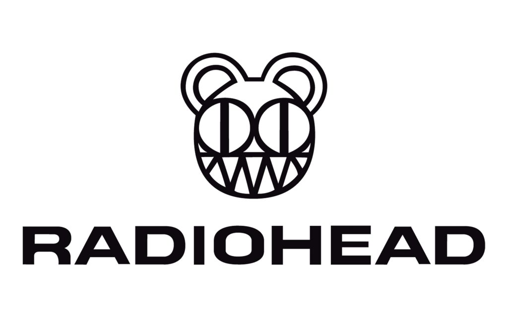
The Radiohead logo is the head of a toy bear. It’s almost a child’s drawing. For the first time, the artist Stanley Donwood, who regularly works with the group, painted it for his daughter when she was about a year old. One day at five o’clock in the morning, being terribly tired, he told her a story about forgotten toys that wake up in dusty boxes. And they go to eat boring adults who have abandoned them. In the meantime, he was telling — he was drawing a bear with a toothy grin.
The leader of the group, Thom York, added that he and Donwood once worked on a cartoon about the birth of a monster. Both at that time were struck by the idea of genetically modified food. One of the episodes was about teddy bears that mutated and attacked children. And the bear we see on the logo was the very first.
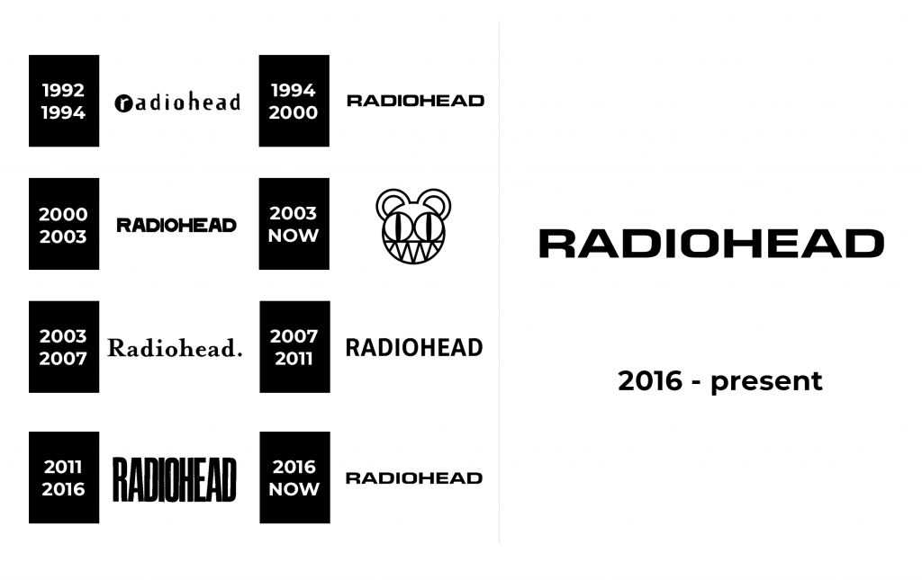
1992 – 1994
1994 – 2000
2000 – 2003
2003 – now
2003 – 2007
2007 – 2011
2011 – 2016
2016 – now
Font and Logo
There are no letters in the logo itself. Still, there is an interesting fact about the font in the history of the Radiohead band. Different Radiohead lettering is used on different albums of the band. On the debut “Pablo Honey”, R is highlighted in a circle, and on “Hail to the Thief” of 2003, a dot appeared after the name. Still, it is the bear from the time of “Kid A” (2000) that is associated with the group most of all.
This logo is black and white. It is minimalistic, simple and elegant.
