Python Logo
Tags: coding language | construct apps
Python is a coding language, as well as software that operates that language. It’s one of the most prolific and popular such products online, used to create applications, websites, other software, as well as conduct data collection and analysis. Python prioritizes reliability, meaning that it’s one of the least accident-prone coding languages. Instagram, Pinterest and Reddit are just some apps that use this structure.
Meaning and History
Python was released in 1991, and it’s still being updated even now. It was created by a Dutch programmer Guido van Rossum, and he remains one of the chief programmers in the company (Python Software Foundation). The name doesn’t suggest anything deeper than the superficial desire to have a curious, short and memorable name. Snake imagery is used in its branding since 2006.
What is Python?
Python is a high-class coding language used to construct apps, websites and other software with a focus on reliability. Reddit, Instagram, Pinterest and Uber are examples of the popular coding languages built on Python.
1997 – 2006
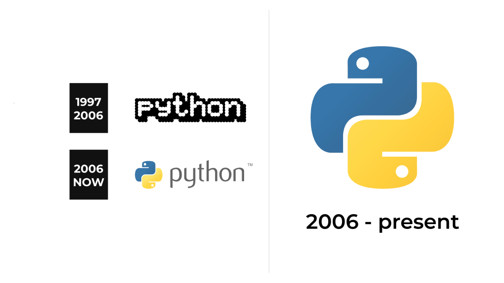
The brand didn’t have a logo for the first several years. Before that, the language used its own name, written in various bland, basic fonts. In 1997, they’ve finally introduced a uniform emblem. It also depicted the brand’s name, but written in a wholly unique and unusual design.
The letters used in this logo are seemingly upright sans-serif characters. They aren’t written in the usual way – with lines. Rather, they are a collection of white dots all of the same sizes. There aren’t any contours around them, meaning they merge one into another. This created a geometric look, in which letters looked like a bunch of pixels. It made it immediately recognizable as a computing brand.
These letters also had a fat, bold outline around them, colored in black. Obviously, this outline was also shaped like a bunch of little circles. These continued to extend below and to the right to create a sense of depth.
2006 – today
The 2006 logo came after the brand became a globally recognizable name. They didn’t need the pixelated look anymore, telling people that it is a coding language. Instead, they capitalized on the snake imagery to play off their own name. This particular logo consisted on an emblem and a name part.
The emblem has a general shape of a plus sign. That’s partially a hint towards mathematics and coding, but it’s also a symbol of general positivity. It’s not a plain symbol, though, because it’s comprised of two snakes shaped like the letters ‘P’. The left and top quarters are occupied by the blue snake, and the rest – by the yellow one. They are designed in a very simple manner: simple colored bits with a dot and a line for an eye and a mouth, respectively.
The text part is located immediately to the right. It was updated, naturally. They now use fully lowercase letters, written in a typical non-pixelated style. They are all grey, smooth, thin and mildly elegant.
Font
The font used in the latest logo by Python is a pretty normal sans-serif. The letters are not strict or very linear. They use a combination of smooth, rounded shapes. Their thickness changes all the time and there are plenty of simplistic design choices. It’s supposed to inspire friendliness and reliability.
Color
Blue and yellow are common colors found on wild pythons. Seeing how well-known these snakes are for their exoticism, the designers made sure to paint these a striking, unusual color to make sure you’d know they are pythons. But the more poetic reason is – in their words – to represent creativity and professionalism.


