Amidst the Detroit car manufacturers, Pontiac has been one of the most prominent. It was also one of the oldest producers in USA, all things considered. Created in 1926, it has been producing cars with the focus on power under the wing of General Motors all the way through the 20th century. In 2010, the company was discontinued.
Meaning and History
![]()
Pontiac has long been using Native American symbols to stand out as a brand. First, it was a depiction of a pop-culture Indian. In the 50s, it was dropped in favor of a not-so-obvious red-colored Indian arrowhead the brand had until its dissolution in 2010. The logo didn’t come through a lot of stages, it pretty much only had two.
1926 – 1930
![]()
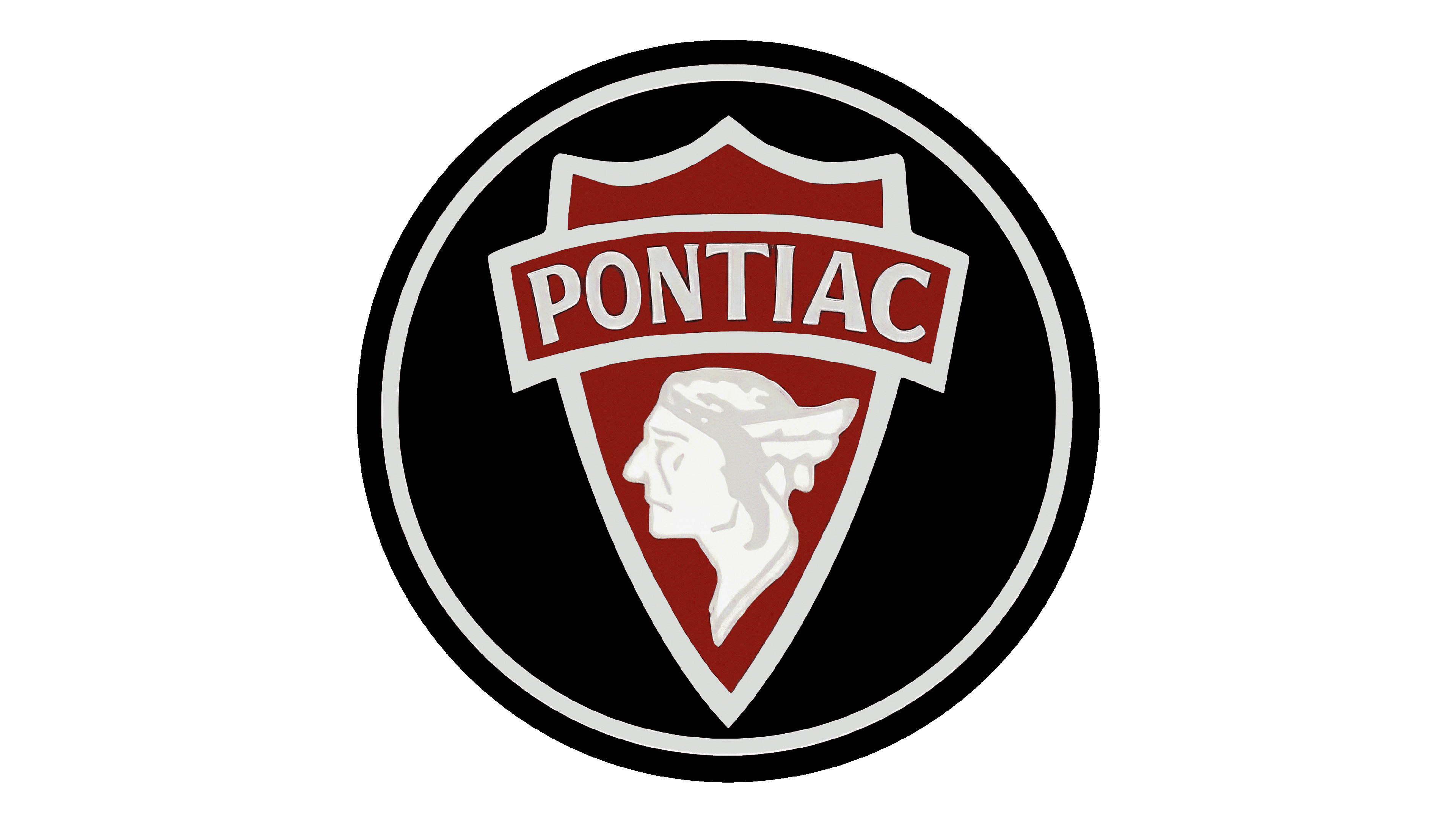
The very first logo Pontiac had depicted a head profile of an Indian wearing a type of the feather hat. It was white but had grey elements that highlighted hair and the face features. The image was located on a red badge surrounded by a white outline.
On top of the badge, you could see a similarly-styled red plague that said ‘Pontiac’ in white and thin capital letters. It was also outlined by a white border. The badge itself looked a lot like a sheriff badge, which might be an intentional detail by the designers.
The entire image was put in the middle of the black circle outlined twice – first by a white layer, and then by a black one.
1930 – 1959
![]()
A few years later, the logo became more minimalistic – probably due to the production costs of a previous version.
This one had the same premise – an image inside a red circle outlined twice by white and red. This time, however, the borders were a bit thinner. Everything on top of the circle was also white, which meant there were only two colors on the entire logotype.
The Indian head now bore a different headgear. The feathers became longer and more horizontal. The profile remained, but the head now looked right, not left. And there were no additional highlighting now, just solid white head. Above it was a word ‘Pontiac’ – now also written in lowercase with a peculiar Italic.
1959 – 2002
![]()
In 1959, the logo received its modern look. The late 20th century logo looked like a scarlet Indian arrowhead pointing downwards. As such, it had a wide v-like cavity on top and a thin shape.
In the upper part of the body, there was a white star that had a shape of a ‘+’ symbol, but the horizontal line was linger. The star appeared thicker in the middle, as they do whenever you look at them.
The arrowhead was outlined first by a white edge, and then by a black one, as was a circle on previous versions.
1981 – 2002
![]()
For a little over twenty years the previous emblem was accompanied by the company name. It was printed in semi-bold, sans-serif font that featured very fluent, smooth strokes. The lettering resembled Nulshock Regular font but with the letters “P” and “A” having their horizontal line cut before they reached the other vertical stroke. This gives the inscription some personality and creates visual interest.
2002 – 2004
![]()
On this stage the image found its final form. The double outline was scrapped in favor of one thick silvery frame. This frame is probably the homage to the older Pontiacs, which were notoriously lined in several places by silvery streaks.
Noticeably, the logo took on some volume. The frame now had some relief – it changed tilts in several places. Also, the lighting seemed to come from somewhere left and above, because of which the red part inside had a deep shade along the side of the frame.
2004 – 2010
![]()
In its final days, Pontiac decided to scrape the 3D elements and returned to the flat surface. The inner red space and the silvery frame now had a homogenous relationship. They were completely on the same level.
The lighting remained, but its source wasn’t apparent any longer. So, the badge had a strange round shape in the lower part of it and a few smaller shadows on the top.
The most noticeable change was the return of the text. Below (sometimes, on the right side of) the logo you stood a bold great and thin word ‘Pontiac’. Noticeably, it was inconsistent – some lines were thicker than the other, and some of them didn’t even meet (like on ‘P’ or ‘A’).
This variant was probably the best of the bunch. And it could’ve become better, because other logos took the same turns and most of them look good now. Sadly, in 2010 the entire company was scrapped.
Emblem and Symbol
The legacy of the first logos was brought forward by the fact that Michigan was once a prominent area within the Iroquois area of settlement, and they are a very popular cultural image for Americans. The red ‘arrowhead’ was a still the reference to the Indians, but it was also chosen for its convenient shape as a badge and its uniqueness.
The Pontiacs themselves are still viewed as the ‘patriotic’ cars, because of their ‘Indian’ descent and the emphasis on powerful and strong cars (for which the Americans are famous).
The Legends
When an American speaks about Pontiacs, they probably imagine two models: the Bonnevile and the Catalina. They had many generations since the 50s, but the first models are very famous.
The Bonevilles are those long round-eyed cars you see in the movies from 60s or 70s, and the Catalinas are sturdier autos with rectangle eyes. You can probably remember one or two instances of seeing these cars on screen. They have been heavily popularized by the cinema.