Pink Floyd’s music is very catchy. They conjure up a very unusual atmosphere of sensations and spaсes. The British rock band was founded in 1965 and is famous for its long compositions and thematic suites, songs, sound experiments, philosophical texts, album cover design and grand concert shows. It is one of the most influential and commercially successful bands in the history of world rock music. It has more than 250 million albums sold worldwide, including 75 million in the USA.
What is a curious fact about Pink Floyd?
The famous pig is a real long-lived Pink Floyd mascot. The story of the birth of the symbol began in 1976 while working on the album “Animals”. Pink Floyd founder and leader Roger Waters came up with the concept of the album cover: it was supposed to be a pig hovering over Battersea Power Station as a “symbol of hope”. To implement the idea, it took a whole team, which included a real sniper. The shooter had to shoot a huge inflatable doll with helium if the wind started to blow it away. The photographer and artist Storm Torgerson embodied the idea. It was not possible to make the right frame on the first attempt.. On the second day of filming “pinky”, it was decided to save the budget, and they did not hire a sniper. According to the law of unintended consequences, the doll irrevocably “flew away”, but the necessary frame was received. The mascot has two names, the official one is Algie and the fan name is Parvin.
Meaning and History
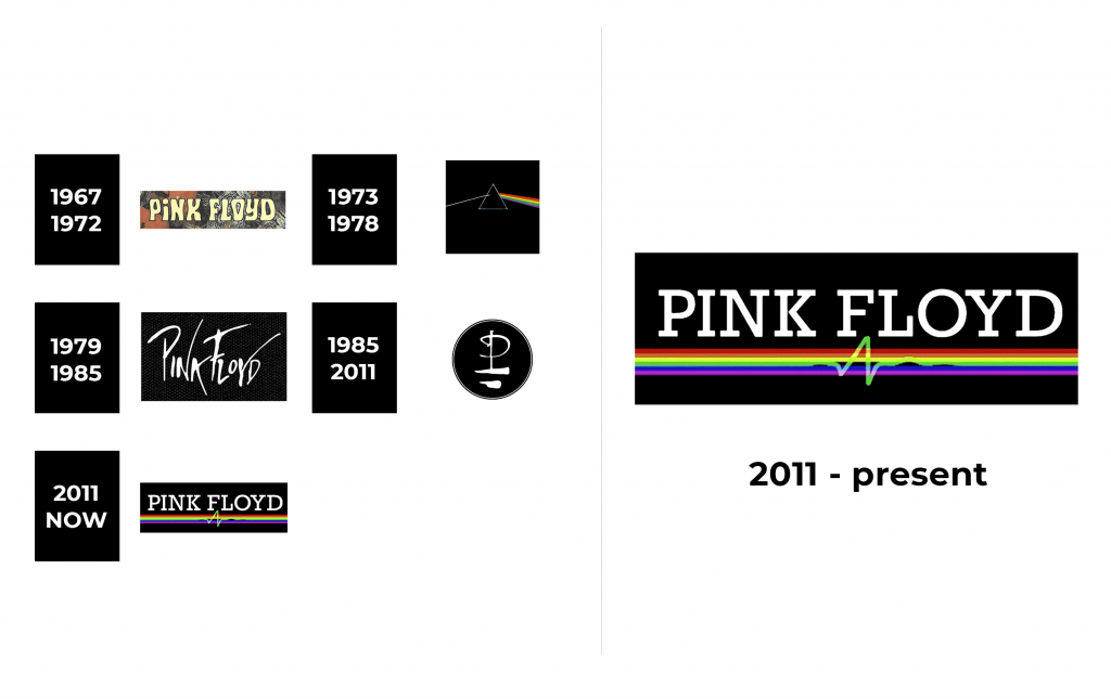
1967 – 1972
The very first logo appeared in 1967 and was used until 1972. It was the name of the group. The letters of light yellow color were written on a contrasting background. In fact, it could be a background of any dark color.
1973 – 1978
The next logo appeared in 1973 and caused a stir. The image depicted light passing through a prism. The famous prism was depicted on the cover of the most commercially successful album “The Dark Side Of The Moon”. Newton’s experiment was presented there: the decomposition of light into a spectrum due to dispersion when passing through a prism. The author was Storm Elvin Thorgerson, who was inspired by the incredible lyrics of the record. With his work, he paid tribute to the grandiose light shows of legends, as well as the creative genius of Waters. By the way, in the use of light Brit Floyd never lag behind the original, and often do even more amazing things with the help of modern technology. Visitors to the Brit Floyd show (and there are already more than 1 million of them around the world) note that not only the sound, but also the special effects of the show allow you to fully immerse yourself in the unique world of Pink Floyd.
1979 – 1985
In 1979, a concise black and white version of the Pink Floyd logo was created. He looked very strict and elegant.
1985 – 2011
The next time the logo was radically redesigned, it became an abstract stylized icon, which was introduced by Pink Floyd in 1985. It was a rounded monochrome emblem depicting a unique monogram with an inverted letter “F”. Two letters formed an image similar to a boat, with clear lines in the style of leeks, which gave this icon the nickname “Boatman”.
2011 – now
Font and Color
There are several versions of the Pink Floyd logo, each with a unique custom font.
The colors most commonly used in the Pink Floyd logo include black, white and pink. The contrast of black and white means elegance. The pink color gives a person hope and peace of mind, leaves a pleasant warm residue on the soul.


