The company was founded in 1989 by Dan Panoz. The firm’s headquarters are located in the small town of Braiselton, Georgia. In 1992 the first model of the company appeared. It was a small-scale Roadster powered by Mustang units. In 2000, the second model debuted – Esperante. Panoz also produces racing cars.
Meaning and History
The Panoz supercar brand was established in Ireland by Don Panoz, a son of Italian immigrants. The family originally ran a pharmaceutical business and owned a successful company called Elan. In 1988 Don’s son Daniel got a job in a small and almost unknown automobile company Thompson Motor Company. The design of the car produced by this company was based on the Lotus Seven.
In 1989, Thompson Motor announced its closure, and after its liquidation, Dan Panoz bought the rights to produce this car. It was decided to produce it in the USA, having created its brand for this purpose. Already in 1992, the world saw the first Panoz Roadster.
In 1996, Don helped to create a racing team and together with the British company Reynard Motorsports began to develop a car that would compete in the FIA GT championship. The model was named Esperante GTR-1. In 1998, Panoz introduced the world’s first hybrid sports car.
In 2000, the Esperante model was launched. The sports car with the engine located at the front, but within the wheelbase, was based on an aluminum chassis with steel subframes and was equipped with several variants of power units. The GTLM version appeared in Esperante closer to the mid-2010s, for the homologation of the track sports car.
What is Panoz?
Panoz is an American sports car manufacturer known for producing high-performance vehicles. The company is renowned for its innovative designs, advanced technology, and hand-built craftsmanship.
1989 – now
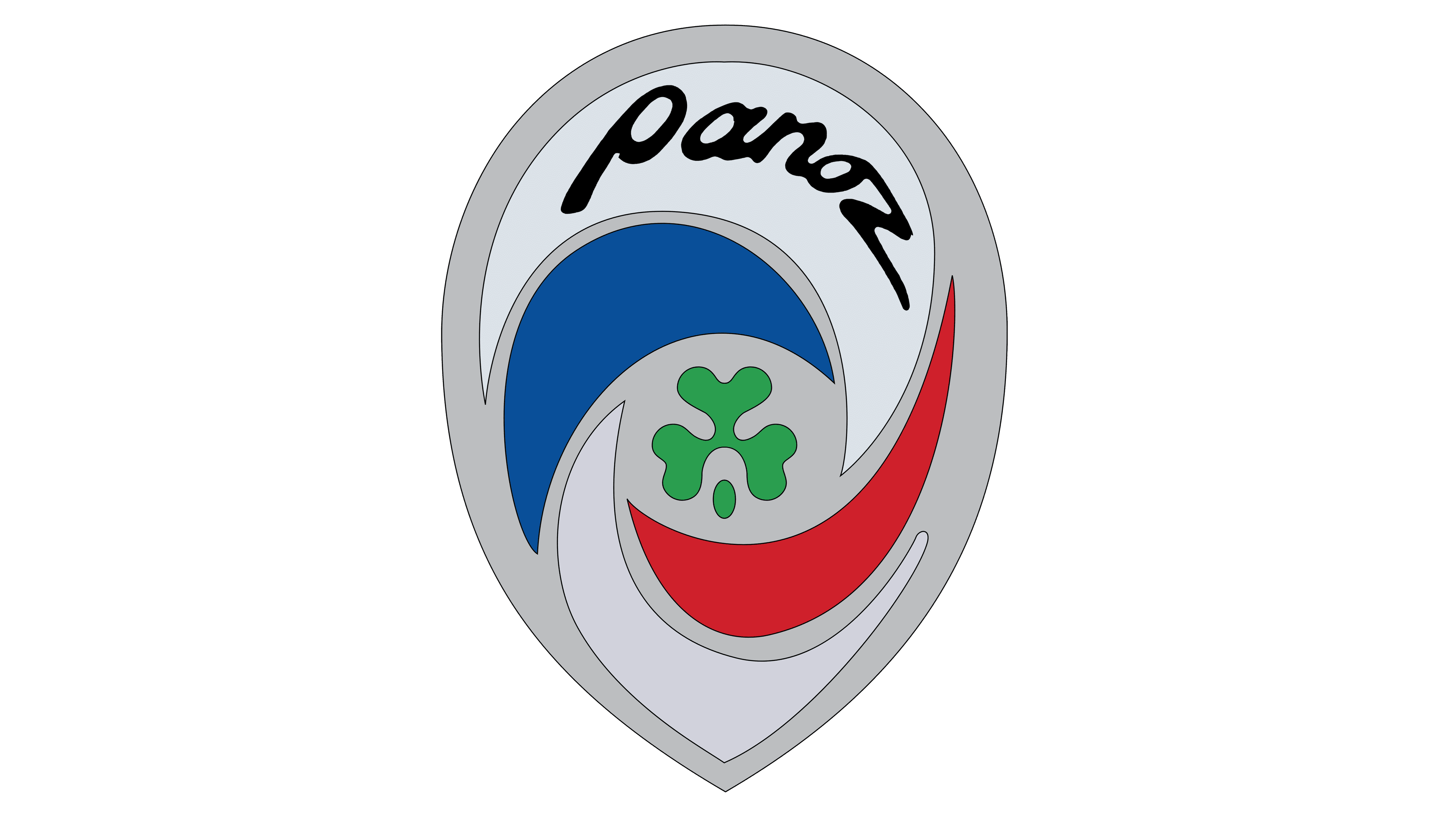
From 1989 to the present, the Panoz logo has a silver drop shape. In the middle, there is an image of a clover petal, and the entire area of the logo is filled with “waves” of blue, white, and red colors. One of the white “waves”, which is located at the very top of the logo, bears the company’s name in silver (sometimes black) lowercase letters.
Emblem and symbol
The company emblem, like the logo, contains 6 colors, which is too much for a simple logo. However, there is a justification for this decision. The silver color symbolizes nobility and aristocracy, white, red, and blue is a sign that the company is based in America, and green clover is a small note of novelty and freshness. The rounded top corner complements the sharp bottom corner nicely, while the handwritten font is a great finishing touch to the logo.


