NFL is an abbreviation for the National Football League, the main and most prestigious professional American football organization, which was established in 1920 and today consists of 32 teams from different corners of the United States, organized in eight divisions.
Meaning and history
NFL is a League with a very long and intense history. The most famous American professional sports organization in the world has had several redesigns of the logo throughout the years, but all of them were based on one crest, created in the first term of the 20th century. By today the crest hasn’t changed much, keeping its original color palette and style of the elements.
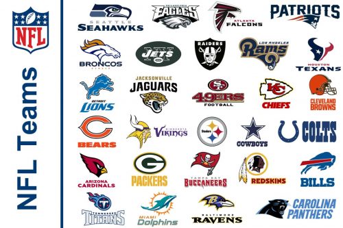
The NFL logo is like a corporate visual identity for all the teams of the league, though each of the clubs has its emblem, set in their uniforms and helmets. An interesting fact is that not all of the NFL teams have a logo on their helmet.
Which NFL Team Doesn’t Have a Logo on Their Helmet?
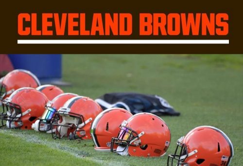
Cleveland Browns is a standalone NFL clubs in terms of logo usage. The team has never had any logo on their helmet, wearing a plain orange helmet with black and white vertical stripes in the middle.
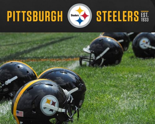
But there is also another club, which has to be mentioned here. Pittsburgh Steelers have its emblem placed only on one side of the helmet. It was an intuitive decision of the club’s leadership, which has never been changed.
Only one of 32 NFL teams does not have any logo on the helmet, and only one has it on just one side of it, though the rest 30 clubs have their emblems bright and enlarged. Some are very ornate and obvious, while others have hidden meanings and surprising solutions.
What Does “G” on the Green Bay Packers NFL Logo Stand For?
Green Bay Packers is the NFL team with most titles — it won the cup 13 times throughout the league’s history. Its simple logo is composed of a bold letter “G” enclosed into a horizontally stretched oval. The first thing that comes to mind when seeing it, is that “G” stands for “Green Bay”, though it is not. The green letter “G” on the Green Bay Packers emblem means “Greatness”.
NFL Logo History
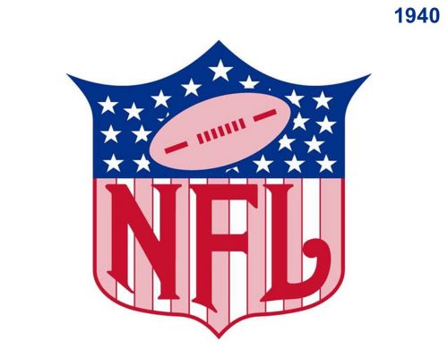
Unfortunately, the original version of the NFL visual identity, created in the 1920s, has not survived to this day, so the official history of the logo starts in 1940.
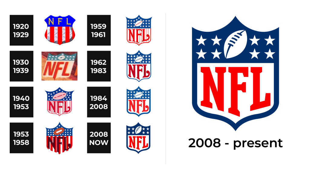
1920 – 1929
The very first logo for the National Football League was introduced in 1920 and featured quite a naive version of the modern badge we all know today. It was a classy crest with three peaks on top, horizontally divided into two parts — the solid blue top with the voluminous golden “NFL” lettering, and the body with marble-gray and red vertical stripes.
1930 – 1939
The redesign of 1930 introduced a badge that was already closer to the current version. The top part of the crest changed the shade of blue to a softer one, and now it was decorated by white five-pointed stars. The NFL abbreviation was moved to the bottom part of the composition, with a plain white background. The slanted lettering was written in red, in a bold sans-serif, with the elongated vertical bar of the “F”.
1940 – 1953
The emblem, used by the NFL for the decade in the 1940s — the 1950s, featured a wide elegant crest with sharp elongated lines on the top and bottom. The upper part of the shield was colored blue and has a pattern of numerous white five-pointed stars, repeating the square on the national flag of the United States. As for the bottom part, it was also a celebration of the USA flag, with a white and light red vertical stripes pattern and bold sophisticated lettering in dark red. The light red rugby ball in a darker outline was diagonally placed on the upper blue part of the logo.
1953 – 1958
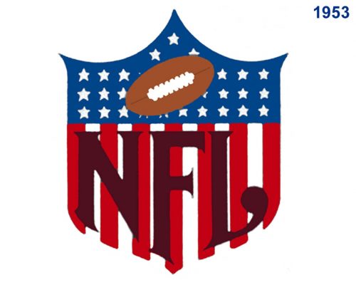
The redesign of 1953 switched the color palette of the NFL logo, making it darker and more intense. The new composition featured elevated shades of blue and red, with the lettering in dark burgundy and the football in solid brown with bold white stitched. The new version of the crest was drawn without any outline and the “NFL” inscription was enlarged.
1959 – 1961
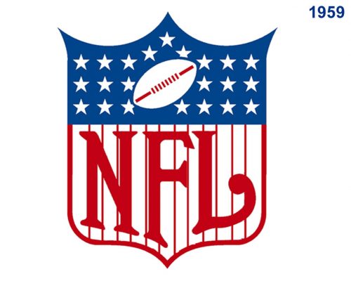
In 1959 the crest was redrawn again, in a light and elegant manner with wide red stations replaced by thin vertical lines on a white background. The lettering got thinner and finer, being written in a classic red shade again. The upper part of the logo was cleaned and modernized came with the rugby ball drawn in white with red details and a delicate outline.
1962 – 1983
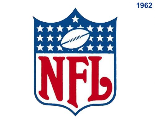
The vertical red stripes were removed from the NFL logo in 1962, and now the bold red inscription was set on a plain white background, under the blue starry fragment in the top part of a crest, outlined in blue. The football featured a white body with blue details and outline and looked modest yet fresh, reflecting the essence of the league.
1984 – 2008
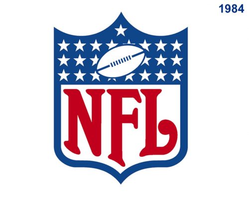
The redesign of 1984 made the blue on the NFL emblem lighter and calmer, which gave a fresher look to the whole image. The outline of the crest was emboldened, while the red “NFL” lettering hasn’t changed its thickness, just switched to a lighter shade of red, which added elegance and sophistication to the NFL identity. As for the upper part of the logo, it remained untouched.
2008 – Today
In 2008 the NFL logo is being intensified and modernized. Now there are only four five-pointed stars placed on the dark blue background in the upper part of the league’s logo, and the football was redrawn with bolder and sleeker lines, being placed more vertically than on all the previous versions. The lettering changed its style to a stricter and straighter one, changing the elongated and curved tails to square serifs. The new version of the NFL visual identity looks sleek and professional, evoking a sense of confidence and stability.
Font and color
The NFL lettering is the main part of the league’s visual identity, executed in bright red and placed in a white background, it is the most eye-catching element of the classy tricolor crest.
What Font is the NFL Logo?
The capitalized NFL inscription is executed in a custom serif typeface with thick lines and square serifs. The type of the league’s logo looks pretty similar to such fonts as Anicon Slab Extra Bold and Freshman, designed by William Boyd in 1993, but with some lines modified and the contours of the letters slightly stretched to fit the smooth shield frame.
The blue, red, and white color palette of the NFL visual identity is a tribute to the United States of America, the motherland of the league. The national flag of the country is executed in the same tricolor, which stands for purity, valor, and justice.
Though starting 2015 NFL is also using its logo in a gold color palette with whether white or black accents and additional elements.
Why is the NFL Logo Gold?
NFL started using a gold crest logo to celebrate the anniversary Super Bowl. The 50th main event in the American football world was a truly remarkable date, and the league decided to express its importance in its visual identity. The three-dimensional gold shield with glossy gradient texture looked sleek and exquisite, reflecting professionalism, precision, and power.
