New Orleans Saints Logo
Tags: Gayle Benson | NFL | Sean Payton | USA
New Orleans Saints are a professional rugby franchise, which was established in 1966, with their first game in NFL in 1967. Today the franchise is owned by Gayle Benson and the head coach of the team is Sean Payton.
Meaning and history
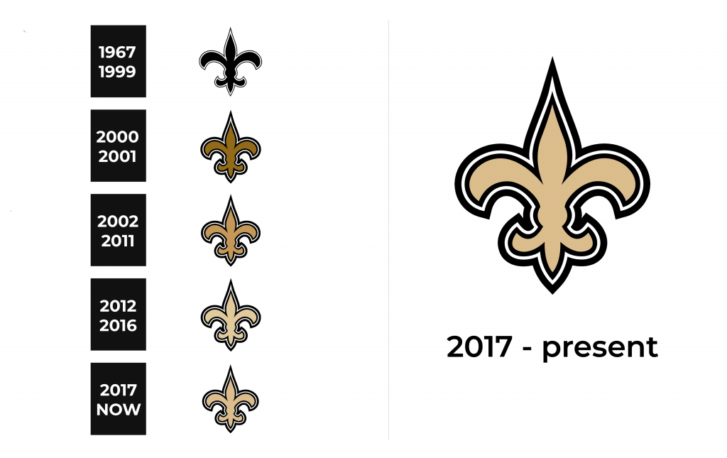
The visual identity of the New Orleans Saints is probably the most elegant and the least sporty among all the NFL team’s logos. The famous Fleur-de-Lys sign has been the team’s logo since its foundation and only changed the color scheme throughout the years.
1967 – 1999
The initial logo for the Saint was designed in 1967 and depicted a simple monochrome Fleur-de-Lys. The idea was taken from the symbol of New Orleans, the city where the franchise was born. The famous heraldic flower is also known to be the graphical representation of the Frances Royal Family.
2000 – 2001
The first time the logo got redesigned was in 2000. The original concept has been kept, just the contours have been modified and the color palette — switched. It was a bolder flower symbol in a dark gold color with a white and black outline. The symbol now looked luxurious and exclusive.
2002 – 2011
In 2002 the dark gold color was changed to a lighter shade, which made the whole logo look fresher and more modern.
2012 – 2016
2017 – Today
The redesign of 2017 was also about contours and colors — the gold shade became more beige in 2017, and got a slightly more intense color five years later, in 2017. As for the outline, the double black with a thin white line in the middle makes the Fleur-de-Lys symbol stronger and more confident.
Symbol
The most known symbol of the team is a two-colored shield with the Fleur-de-Lys on it. The design was created in the 1960s and was used by the team until the middle of the 1980s, but in 2009 the Saints start using it again. The dark gold and black shield with white “Saints” lettering in gothic all-caps is an instantly recognizable symbol among all the rugby fans.
Emblem
The emblem of the famous New Orleans franchise is Sir Saint, who was first introduced in the 1960s. The modern knight in the rugby uniform has the black and white symbol on his helmet, a football in one hand, and a shield with the team’s name and the Fleur-de-Lys in another.
Helmets
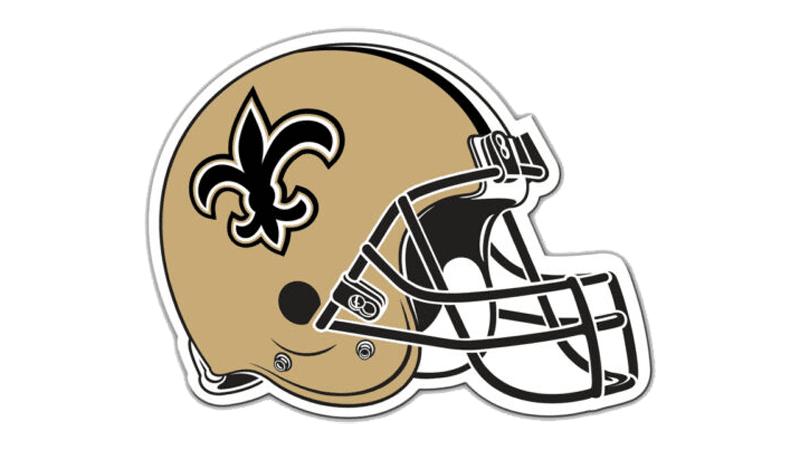
The elegant team’s logo is the main hero of the design of their helmets and it sets the tone and style. The black heraldic flower in a thick white and black outline is placed in the sides of a dark-gold helmet with three stripes in the middle — a thick white with two thin blacks. The grill of the helmets features strict black color, which adds a sense of seriousness, solidness, and professionalism.
Uniforms
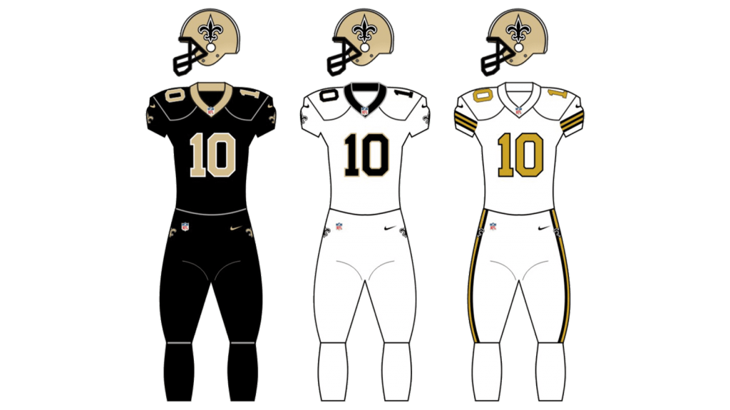
For their main uniform, the team uses black jerseys with gold players numbers and golden-brown pants with black wide side stripes. There are also thin and delicate white details.
As for the road style, it is composed of a white jersey with a black number, outlined in golden, and the same golden-brown pants as in the main uniform design.

