The company produces high-quality buses and is owned by MAN AG through its subsidiary NEOMAN Bus. Its history began in 1935 when Gottlob Auwarter opened his own bus manufacturing facility in Stuttgart. He used chassis from trucks as the basis, however, like most manufacturers of that time.
Meaning and History
![]()
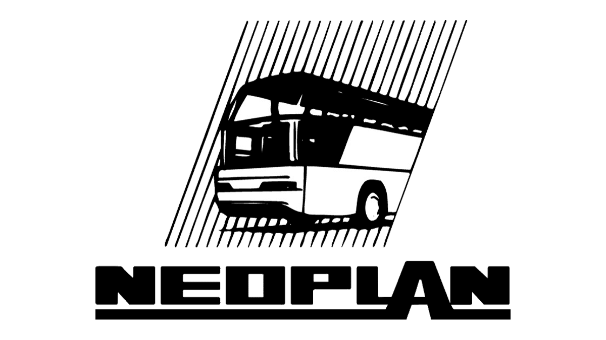
The logo of the bus company originally consisted of two elements: the text and the image of the bus, but now the company mainly uses the logo with the text part. It contains the company name in bold and in capital letters with rounding. The letters “L” and “A” are slightly different from the others. The bottom line of the letter “L” is the middle connecting element of the letter “A”, which is larger than the other letters. The two “legs” of the letter “A” continue to the left and right sides, forming an underline for the whole company name.
What is Neoplan?
Neoplan is a German bus manufacturing company that specializes in designing and producing luxury coaches and public transport vehicles. They are known for their innovative designs and high-quality craftsmanship in the transportation industry.
Emblem and symbol
As an emblem, the company uses the text part of the logo, which is usually gray or silver and is located on the front of the buses.
Font and color
The massive uppercase lettering is the main part of the Neoplan visual identity, and its signifier, which today is instantly recognizable not only in the motherland of the brand but worldwide. The heavy inscription is set in a custom sans-serif typeface, which is pretty close to such fonts as Podium Soft Heavy or Sneakers Max 400 Black, but with softened angles of the characters and a wider negative space of the “O”.
As for the color palette of the Neoplan logo, in the digital version, it uses just one color, black, with all elements located on a plain white background. However, when placed on the busses of the brand, black turns glossy silver, and the massive lettering starts looking more airy and even elegant.