Mr. Clean Logo
Tags: chemicals | cleaning | household products
The Mr. Clean product range spans from all-purpose cleaners and disinfectants to the innovative Magic Eraser, designed to make even the toughest cleaning jobs feel effortless. With its iconic bald, muscular mascot symbolizing strength and reliability, Mr. Clean has built a reputation as a trusted brand that delivers exceptional results in every corner of the home.
Meaning and History
Mr. Clean is a super popular household cleaning brand that has been trusted by consumers for over six decades. Launched by Procter & Gamble in 1958, the brand quickly became synonymous with tough cleaning power and reliability.
Mr. Clean products offer a wide range of solutions for various cleaning tasks, from multi-surface sprays and magic erasers to floor cleaners and disinfectants. Known for tackling stubborn dirt, grease, and grime, Mr. Clean’s products have gained a loyal following, celebrated for their almost miraculous ability to remove marks and stains with minimal effort. The brand continues to innovate, expanding its line to meet evolving consumer needs, offering eco-friendly solutions while maintaining its commitment to quality and effectiveness.
What sets Mr. Clean apart is not only its powerful cleaning performance but also its brand identity. The strong, reliable Mr. Clean character is designed to invoke a sense of trust and dependability. Over the years, the brand’s advertising has played a key role in cementing its place in popular culture, with its mascot becoming a household name across generations.
What is Mr. Clean?
Mr. Clean is the name of a well-established household cleaning brand known for its powerful, easy-to-use products. First introduced in 1958 by Procter & Gamble, the brand has become a go-to for millions of households seeking effective cleaning solutions.
In terms of visual identity, Mr. Clean is extremely recognizable. The brand’s mascot, a muscular, bald man with a piercing gaze and a friendly smile, embodies the brand’s promise: to make cleaning easier and more effective.
1958 – 1997
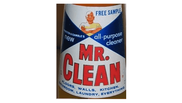
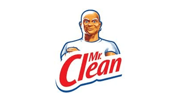
The original Mr. Clean logo, created upon the foundation of the brand, featured quite a flat image of the mascot, drawn in warm shades against a white background on top of the badge, and a neat extra-bold lettering in red capitals, also on a white segment of a white-and-blue label. The logo stayed unchanged for almost forty years, which makes it the most long-lasting badge of Mr. Clean.
1997 – 2002
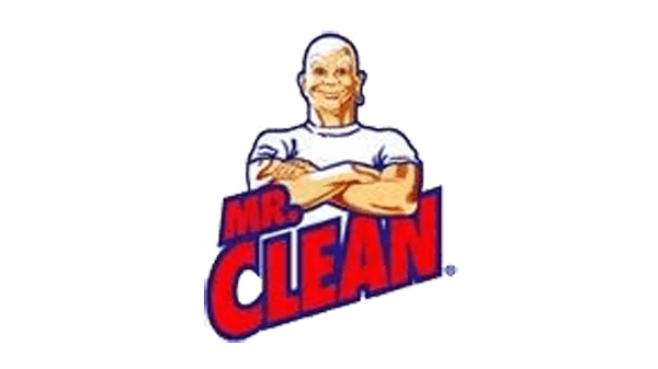
The first redesign was held by the brand only in 1997, but the “leap to progress” appeared to be very visible. The famous muscleman was redrawn in a more modern style and gained quite a thick blue outline, which made the image brighter. The red lettering was rewritten in a geometric sans-serif typeface and set diagonally right under the graphical part, with the intensely red characters also outlined in blue.
2002 – 2006
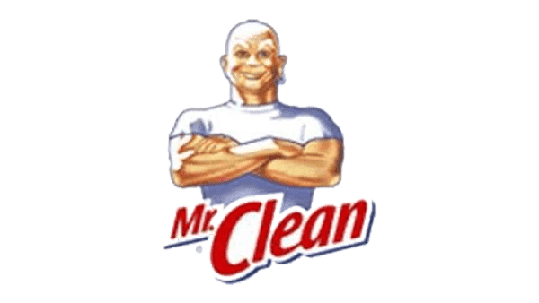
In 2002 the outline was removed from the graphical part, and the red lettering was rewritten in a more elegant and lightweight typeface, with the red characters gaining smooth blue shadows, creating a voluminous image.
2006 – 2008
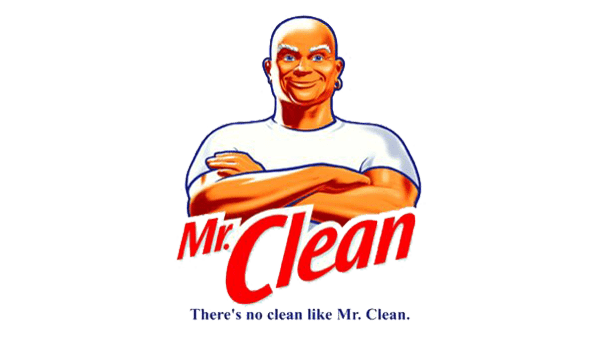
Another redesign, held in 2006, made the Mr. Clean logo more distinctive by bringing back the blue outline and intensifying the shades of the mascot’s image. The composition was also changed, as the lettering part got enlarged and moved a bit higher, overlapping the crossed arms of the man.
2008 – 2010
The version of 2008 has made the red lettering smaller, and moved it a bit down, opening the brutal muscle hands of the brand’s mascot. As for the image, it was a little modified, with the shoulders of the man getting wider, and their contours — softer.
2010 – 2014
In 2010 a significantly different version of the Mr. Clean logo was introduced. The man was redrawn with more volume and a light glow behind his back, which replaced the flat blue outline. The lettering part of the composition was also changed, becoming darker, straighter, and stricter.
2014 – today
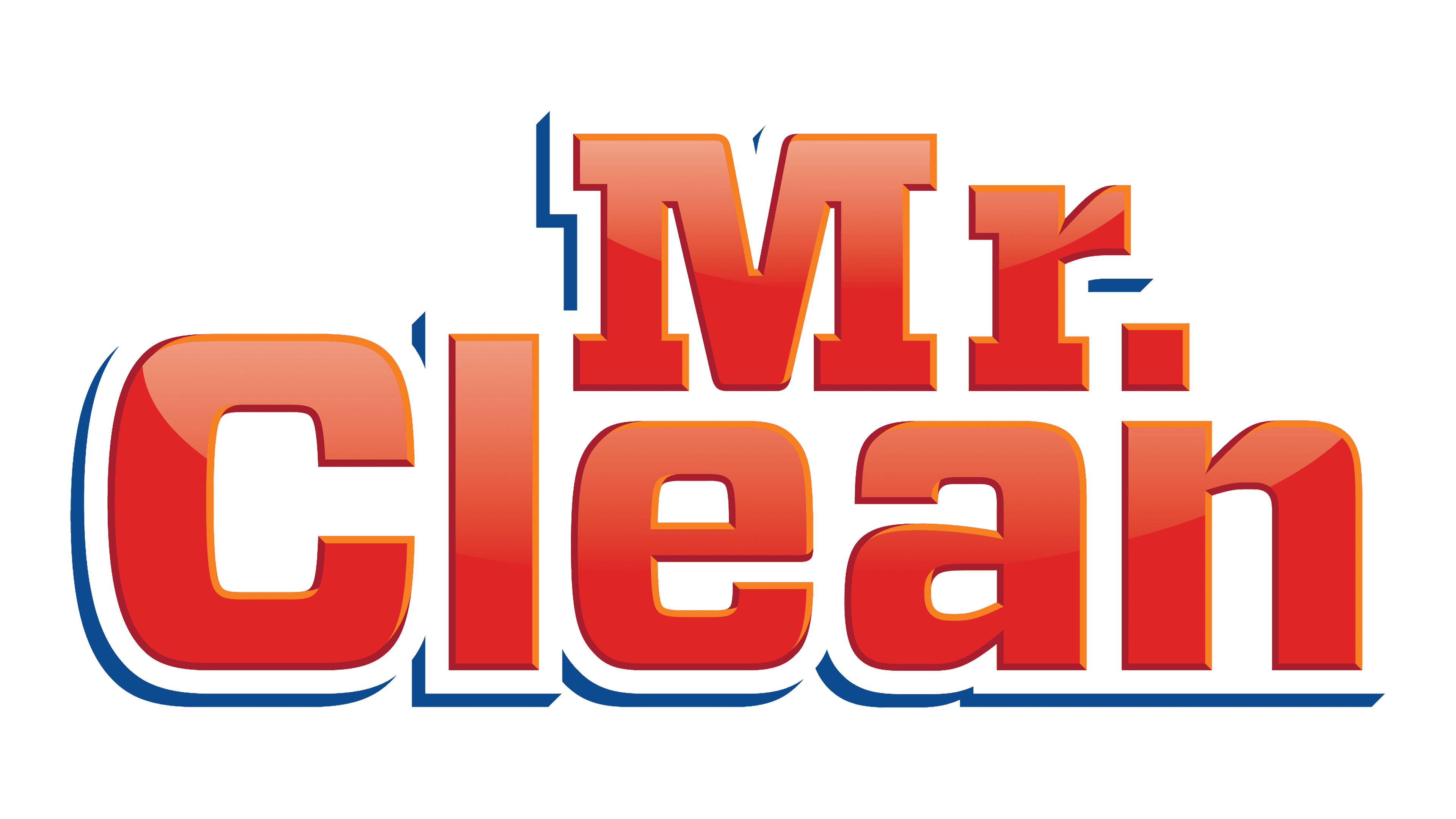
The redesign of 2014 was pretty unpredictable, as the main symbol of the brand, its mascot, the brutal bald man, was removed from the primary version of the logo. So now the only element on the badge is the gradient red lettering in a bold geometric font.
Colors
The bold title case lettering from the logo of the Mr. Clean brand is set in two different typefaces: the geometric serif for the “Mr.” And a more modern sans-serif for the “Clean”.
Fonts
The fonts used in Mr. Clean’s branding have evolved from simple, bold sans-serif fonts to more modern and refined typefaces. The typography has always been clean and easy to read, reflecting the brand’s straightforward approach to cleaning. The current branding often features a rounded, bold font that is approachable yet strong, reinforcing the brand’s position as a trusted household cleaner.
