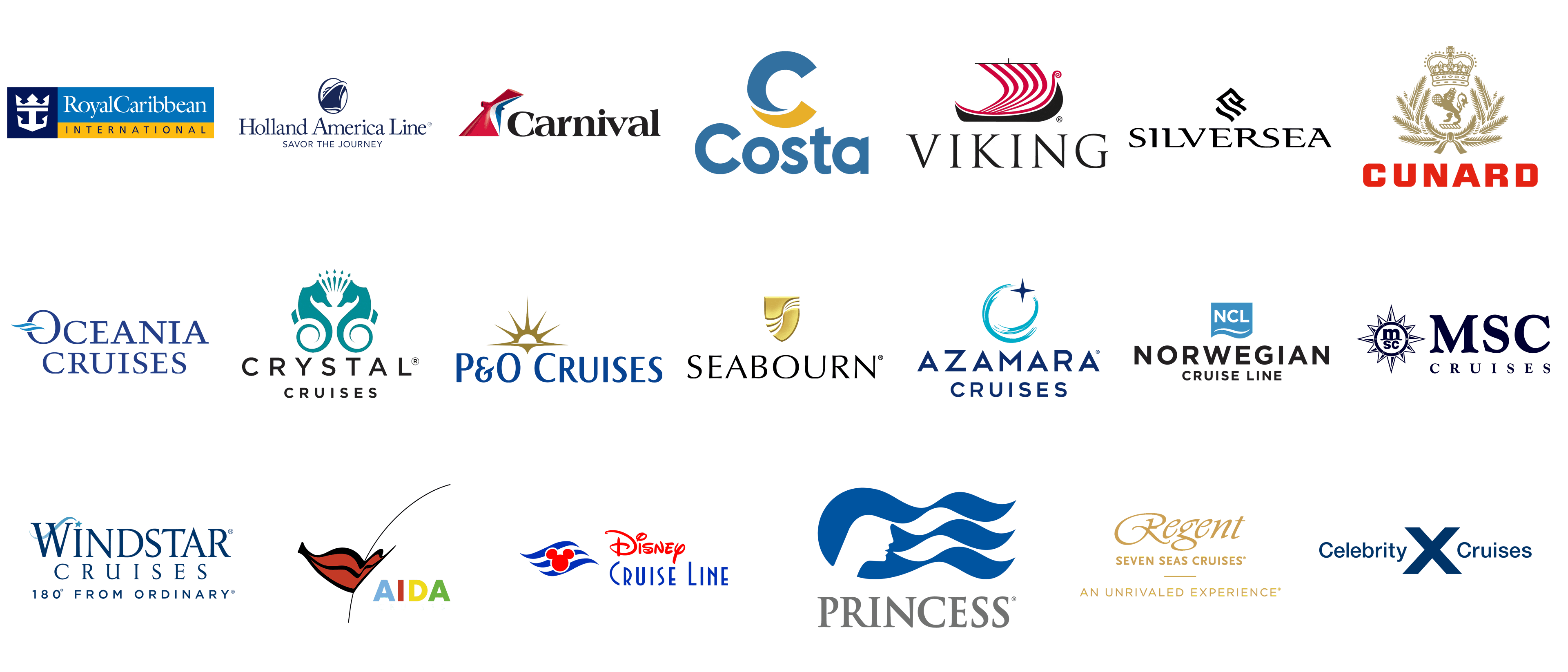
Logotypes are crucial for brand identity and recognition of cruise lines in the competitive travel industry. These symbols are designed to convey luxury, adventure, and reliability and are created with great care. They go beyond mere images; they embody the core values of the companies, shaping potential travelers’ perceptions and expectations.
Studying their logos shows a mix of creativity and strategic marketing. Each logo is designed to highlight the company’s unique features and history. By looking at these logos, one can understand how these companies set themselves apart in a busy market and communicate their promise to a worldwide audience.
Crystal
Crystal’ emblem showcases a distinctive turquoise design with two stylized seahorses. Their tails symmetrically curl to form an elegant, circular pattern. This visual element captures the essence of elegance and sophistication, making it memorable. Seahorses symbolize grace and tranquility, qualities often associated with the ocean and premium traveling.
Above the seahorses, a crown-like array of stylized crystals enhances the logo’s high-end reputation. The name appears in a modern, sans-serif font beneath the emblem, lending a contemporary and refined look. This design choice underscores its commitment to elegance and high standards.
Cunard Line
Cunard Line’s logo displays a regal lion holding a globe, symbolizing global travel and excellence. This imagery features the rich heritage and leadership in the industry. The lion is a symbol of strength and nobility. It represents Cunard Line’s maritime prestige and grandeur. A crown atop the lion reflects the line’s royal heritage and prestige.
Laurel branches encircle the lion and crown, adding a classical touch and enhancing the logo’s timeless appeal. The name ‘Cunard’ is shown in bold, red uppercase letters below the emblem, emphasizing the strength and tradition. This combination of elements communicates opulence, reliability, and a commitment to exceptional experiences.
Celebrity
This logo features a stylized ‘X’ symbol, representing the company’s innovative approach to travel. This bold design highlights the dedication to offering unique experiences. The ‘X’ is a visual shorthand for them, making it easily recognizable and reinforcing its modern reputation.
The words ‘Celebrity’ and ‘Voyages’ flank the ‘X’ in a clean, sans-serif typeface. This minimalist design underscores the company’s focus on luxury and sophistication. The overall effect is a logo that communicates innovation and high-end experiences, setting Celebrity Cruises apart in the competitive travel market.
Disney Cruise Line
Disney Cruise Line’s emblem features the iconic Mickey Mouse silhouette, a symbol instantly recognized worldwide. This integration effectively conveys the fun and family-friendly nature of Disney Cruise Line. The silhouette is cleverly incorporated into a wave-like design, suggesting that ocean travel is central to the maritime experience.
The words are presented in a playful yet elegant font, blending Disney’s whimsical charm with the sophistication of an adventure. This combination appeals to children and adults, highlighting their unique ability to offer magical and memorable voyages. The design effectively communicates the company’s promise of enchantment and adventure on the high seas.
Holland America Line
Holland America Line’s logo features a stylized profile of a classic ship with waves below, capturing the essence of maritime travel. This visual reflects its long history and expertise in the industry. The sleek, modern depiction of the ship symbolizes tradition and innovation, key attributes of the Holland America Line.
Beneath the ship graphic, the name ‘Holland America Line’ is displayed in a sophisticated serif font, reinforcing the company’s commitment to excellence and elegance. This font choice lends a timeless quality to the logo, emphasizing the company’s long history and dedication to exceptional cruise experiences. The overall design communicates luxury and reliability, appealing to discerning travelers.
AIDA
AIDA Cruises’ logo is vibrant and colorful. It features stylized red lips and an eye, creating a friendly and inviting impression. This playful design reflects the fun and lively experiences passengers can expect on AIDA ships. Bright colors and bold shapes ensure the logo stands out, making it easily recognizable.
The inscription is displayed in bold, multicolored letters, emphasizing its commitment to diversity and excitement. This design approach highlights AIDA’s energetic and inclusive nature, appealing to various travelers. The overall effect is a logo that communicates joy, adventure, and a modern, approachable image.
Windstar
Windstar’s logo embodies elegance and simplicity, utilizing a minimalist design to exude sophistication. The logo often features a stylized wind symbol, which evokes the freedom and adventure associated with sailing. This visual element is timeless and contemporary, highlighting key aspects of the Windstar experience.
The name is presented in a classic serif font, reinforcing the company’s emphasis on refined, intimate voyages. This font choice enhances the logo’s elegance and traditional appeal, aligning with their commitment to luxurious, personalized voyages. Overall, the design conveys exclusivity and high-quality service.
Oceania
Oceania Cruises’ logo showcases a blend of classic and modern elements, with a prominent ‘O’ symbol that includes wave motifs, symbolizing ocean travel. This design reflects the their focus on providing sophisticated and luxurious experiences. The combination of contemporary and traditional components conveys both luxury and timelessness.
The text is displayed in a refined serif font, highlighting their dedication to high-quality, elegant voyages. This font choice adds a touch of tradition, reinforcing the company’s upscale image. The overall design communicates luxury, refinement, and a commitment to exceptional service.
Royal Caribbean International
Royal Caribbean International’s logo features a stylized crown and anchor emblem, symbolizing its leadership and prestige in the cruise industry. This emblem represents adventure and majesty, fitting for a name renowned for innovative travel experiences. The crown and anchor combination underscores its dedication to excellence and exploration.
The name appears next to the emblem in a bold, modern typeface, emphasizing its global presence and appeal. This design element reinforces the their forward-thinking and innovative approach to travel. The overall effect is a logo that communicates strength, reliability, and a commitment to providing exceptional travel experiences.
Silversea
Silversea’ logo features a sleek, sophisticated design with a stylized ‘S’ resembling flowing water or waves, suggesting luxury and smooth sailing. This design highlights their focus on delivering high-end, exclusive experiences. The logo’s simplicity and elegance reflect the refined image that Silversea strives to maintain.
The name caption is written in an elegant serif font below the emblem, enhancing the logo’s luxurious look. This font choice adds a touch of classic elegance, aligning with the their upscale and sophisticated offerings. The overall design communicates exclusivity, opulence, and a commitment to high-quality service.
MSC Cruises
MSC Cruises’ logo features a striking compass rose emblem, reflecting the company’s global reach and navigational prowess in the cruise industry. At the center of the compass is the MSC monogram, symbolizing the brand’s identity and commitment to exploration. The compass rose, with its detailed points, evokes a sense of adventure and precision, highlighting MSC Cruises’ dedication to providing exceptional travel experiences across the seas. The company name is displayed in a sophisticated serif font, reinforcing the brand’s elegance and commitment to quality. The deep blue color palette conveys a sense of trust, stability, and the vastness of the ocean. Overall, the logo captures the essence of luxury, exploration, and excellence that MSC Cruises is renowned for.
Azamara Cruises
Azamara Cruises’ logo features a contemporary and dynamic design, with a stylized crescent moon and a star, symbolizing the company’s focus on night-time exploration and celestial beauty. The crescent moon, rendered in a vibrant aqua blue, suggests tranquility and the allure of the sea, while the star represents guidance and exceptional service. The company name is presented in a clean, modern typeface, conveying a sense of sophistication and forward-thinking. The combination of blue hues reflects the serene and upscale experience Azamara offers its guests. The logo effectively communicates the brand’s dedication to unique, immersive travel experiences and its commitment to luxury and elegance on the high seas.
Carnival Cruise Line
Carnival Cruise Line’s logo is instantly recognizable with its distinctive red, white, and blue funnel, symbolizing fun and adventure at sea. The funnel design, reminiscent of a ship’s smokestack, conveys the company’s maritime heritage and its status as a leader in the cruise industry. The bold, black typography of the company name adds a touch of elegance and authority, balancing the playful funnel graphic. The vibrant colors evoke feelings of excitement and joy, aligning with Carnival’s reputation for offering lively, entertaining, and family-friendly cruises. Overall, the logo encapsulates the brand’s ethos of providing memorable and enjoyable vacations for all ages.
Costa Cruises
Costa Cruises’ logo features a bold and modern design, with a stylized ‘C’ that appears to be formed by two overlapping waves in blue and yellow. This design element symbolizes the sun and the sea, reflecting the company’s Mediterranean roots and its commitment to providing sunny, joyful cruising experiences. The use of the circular motif conveys a sense of inclusivity and unity, aligning with Costa’s focus on hospitality and community. The clean, sans-serif font used for the company name enhances the logo’s modern and approachable feel. The blue and yellow color scheme evokes feelings of warmth, relaxation, and adventure, perfectly capturing the essence of Costa Cruises.
P&O Cruises
P&O Cruises’ logo features an elegant and timeless design, with a stylized golden sun rising above the horizon, symbolizing new beginnings and the promise of exceptional journeys. The sun’s rays extend outwards, suggesting warmth, energy, and the far-reaching destinations that P&O Cruises offers. The company name is displayed in a refined, serif font, underscoring the brand’s heritage and commitment to excellence. The blue and gold color palette conveys a sense of luxury, stability, and maritime tradition. This logo encapsulates the brand’s long-standing reputation for delivering high-quality, memorable cruising experiences with a touch of British elegance.
Norwegian Cruise Line
Norwegian Cruise Line’s logo is characterized by its clean, modern design featuring a stylized wave and a block of sky blue. The wave symbolizes freedom, adventure, and the vast possibilities of cruising, aligning with the brand’s slogan “Feel Free.” The sky blue square adds a touch of calm and serenity, suggesting a relaxed and enjoyable vacation experience. The company name is presented in bold, black typography, reinforcing the brand’s strength and reliability. This logo effectively communicates Norwegian Cruise Line’s commitment to providing flexible, innovative, and carefree travel experiences on the world’s oceans.
Seabourn Cruise Line
Seabourn Cruise Line’s logo exudes luxury and sophistication with its elegant shield emblem and flowing lines. The gold shield symbolizes protection and high standards, reflecting Seabourn’s commitment to excellence and safety. The flowing lines within the shield suggest waves and movement, emphasizing the brand’s dedication to smooth and luxurious cruising experiences. The company name is written in a refined, serif font, adding a touch of classic elegance. The use of gold and black in the color scheme conveys opulence, exclusivity, and a premium service level. Overall, the logo captures Seabourn’s essence of luxury, refinement, and unparalleled service in the cruise industry.
Princess Cruises
Princess Cruises’ logo is distinguished by its iconic “Sea Witch” symbol, featuring a profile of a woman’s face with flowing hair that resembles ocean waves. This design element represents beauty, elegance, and the enchantment of the sea. The logo captures the essence of the magical and transformative experiences that Princess Cruises offers its passengers. The company name is displayed in a sophisticated serif font beneath the emblem, reinforcing the brand’s commitment to providing high-quality and luxurious cruising experiences. The blue color palette evokes a sense of calm, trust, and the vastness of the ocean. Overall, the logo communicates Princess Cruises’ dedication to elegance, luxury, and exceptional service.
Regent Seven Seas Cruises
Regent Seven Seas Cruises’ logo features an elegant and refined design with a flowing script font and gold accents. The word “Regent” is written in an ornate, cursive style, conveying luxury, sophistication, and exclusivity. The tagline “Seven Seas Cruises” is presented in a clean, serif font below, emphasizing the company’s global reach and commitment to delivering world-class travel experiences. The use of gold in the color scheme suggests opulence, premium quality, and a commitment to high standards. This logo effectively communicates Regent’s dedication to providing luxurious, all-inclusive cruising experiences with a focus on personalized service and attention to detail.
Viking Ocean Cruises
Viking Ocean Cruises’ logo features a distinctive and memorable design with a stylized Viking ship. The red and white striped sails of the ship evoke a sense of adventure, exploration, and maritime heritage, aligning with the company’s name and ethos. The bold, black typography of the company name adds a touch of authority and reliability, balancing the adventurous spirit of the ship graphic. The use of the Viking ship as the central element underscores the brand’s focus on cultural enrichment and immersive travel experiences. Overall, the logo captures the essence of Viking Ocean Cruises’ commitment to providing unique, culturally rich, and memorable voyages across the world’s oceans.
