Morgan Motor Company was founded in 1910 in Malvern Link. Over the next 25 years, it built three-wheeled vehicles with one rear drive wheel.
Meaning and History
![]()
Studying the company logo, it is hard not to mention that the very first brand logo was used by the company for almost a century (from 1909 to 2008).
1909 – 1980
![]()
The company logo consisted of a circle, inside which there was a vertical rectangle, perpendicular to which was another rectangle with the name of the company in white. Wings were depicted on both sides of the circle. The logo was done in white and blue colors.
1980 – 2008
![]()
It might seem that nothing was done to the logo since 1909. However, when placing the two logos side by side, it is clear that the name was printed in bold. This seemingly small change brought more attention to the company name, which was getting lost earlier.
2008 – 2020
![]()
In 2008, the winged logo became more modern and is now three-dimensional. Under the logo is the inscription “Morgan Motor Company”. The main colors are silver and blue.
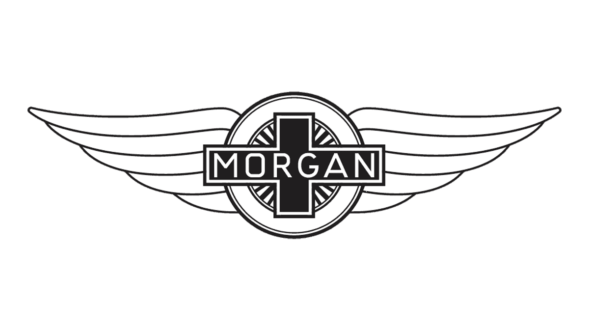
2020 – now
![]()
The previous logo was now an embellishment rather than the main element. It was made flat with no metallic elements. The cross with the name instantly stood out as it was made darker and one solid color. The large name inscription now became the focal point. It is done using a font similar to GS Frank Bold, which was also seen on the cross in the previous logo.
Emblem and Symbol
The emblem is depicted in gray and different shades of blue color, which symbolizes the freedom, purity and excellence of the company.