Minnesota Vikings Logo
Tags: Minneapolis | NFC North | NFL | USA
Minnesota Vikings are a professional sports club, founded in the early 1960s. Its headquarters and main hub is located in Bank Stadium, Minneapolis. The club plays American football, participating in the National Football League. The franchise won numerous matches throughout its 61 successful seasons. On the fields, the team is represented by its official mascot – Victor the Viking
Meaning and history
The club’s story begins in 1959, when two Minnesota businessmen were granted a chance to found a new franchise, which would compete in the freshly made American Football League. The team appeared in 1960.
The team’s first match was played in the next year. Since that moment, it has won minimum three matches in every played season except for the worst 1962 one. Due to this, the Vikings is listed among the highest performance indexes of all teams.
The project’s name derives from how the medieval Scandinavian warriors were named. They were known for their determined mood, impulsive temper, and strong character. All this may be related to the football Vikings. And what’s notable too, these medieval barbaric warriors once settled down in North America, and the Scandinavian community was represented well in Minnesota during the 1960s.
What is Minnesota Vikings?
Minnesota Vikings is a franchise name, which appeared in 1961. The team competes in the National Football League. The team’s home is Bank Stadium, based in Minneapolis. Throughout the team’s history, they had only one failed season of 1962. During the other seasons, Vikings won at least three matches.
1961 – 1965
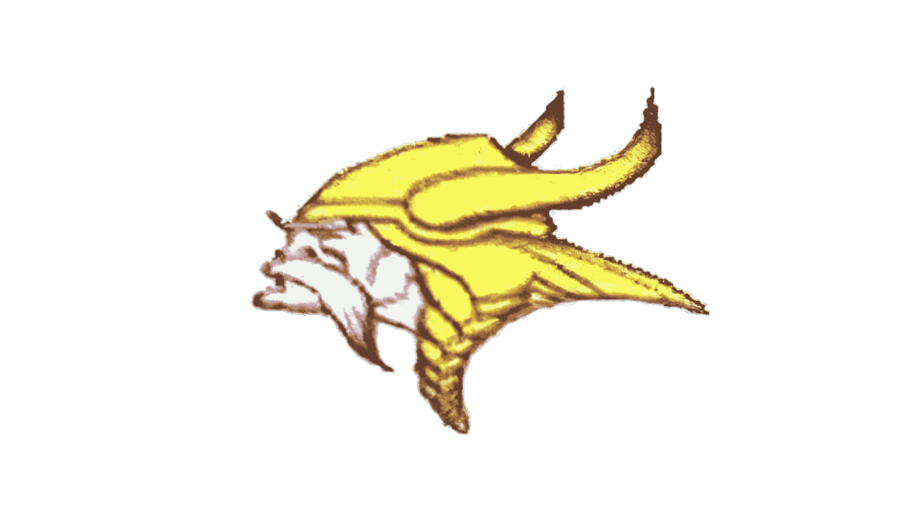
The original logotype was nothing more than a head of a viking, turned to the left and wearing a golden helmet. The warrior had distinctive, long yellow hair, partially bent in a pigtail and white mustache. What’s interesting is the helmet, ornamented with two large horns, turned upright.
1965 – 2013
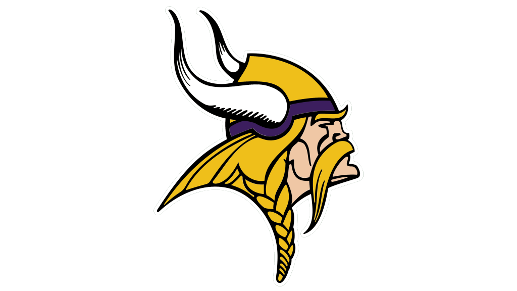
Then, they turned the head to the right, and the helmet’s horns now colored white with several black dashes were turned up and left. The viking slightly nodded up. The pigtail was changed a bit, but in general it stayed unchanged. His mustache and hair became yellow, while the helmet got a dark violet stripe. There was also a thin black contour for the whole emblem.
2013 – Today
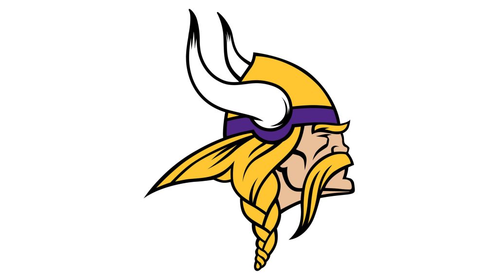
The 2013 shows the familiar head drawn in profile. The familiar viking keeps his head straightly and doesn’t tilt it. The shortened horns became almost fully white, with the strikes only at the top. They also had black contours. As for the fewer changes, so the pigtail became a bit smaller, and the violet line on the helmet was drawn lighter.
Color
In the 60s, Vikings were the single brand in the Football Leagues, active in the USA, to wear a golden, white and violet color code. Why? Well, they aimed to make an unrepeatable brand identity, capable of distinguishing the team along others. At that times, purple was used by nobody, so they chose it. The gold reflects the Scandinavian background of the club. Finally, white is used to depict the Viking’s skin.
Font
Traditionally, they’ve never had any words shown in the logotype. But sometimes they place the name inside a circular or rectangular badge. The font features serif characters, similar to the runes: in the ‘Minnesota’ word, the first ‘m’ is uppercase, and its bars have horns at the top. The two following ‘n’ characters have just sharp vertical bars. The ‘v’ symbol of ‘Vikings’ word also have upper horns. The ‘k’ letters has a bolder and longer lower bar. And the ‘g’ is drawn with sharp tip in the same manner as the ‘n’.


