Microsoft Word Logo
Tags: Microsoft Corporation | text documents | text-processing | writing
Microsoft Word is text-processing software released in 1983. It is used widely among Windows users to create and edit documents due to its convenient interface and numerous functions, These mainly touch on text formatting: selection of fonts and letter sizes, image insertion, charts, tables, etc. You can also save the document as .pdf, .doc, or .rtf. Word is a part of Microsoft Office, a broad collection of tools for work.
Meaning and History
Word’s story began in 1981 when Microsoft Corporation acquired Multi-Tool Word created by Charles Simonyi and Richard Brodie.
In 1983, Microsoft developed MS-DOS, which contained a line of applications including Word. It wasn’t so progressive: you could only write text, and select the script, and its size. But it quickly became the flagship software of the operational system.
As the years went on, Microsoft advanced Word’s functions. In 1995, with the Win 1995 release, they added numerous functions. You could undo and redo the actions, implement tables, format the paragraphs, etc. The subsequent updates came in 1997, 2000, and 2003.
The prominent milestone occurred in 2007, when Microsoft introduced Office – a group of tools, containing Word. Since then, users could save the files in .doc format, which offered data recovery and file size reduction. Word continued to evolve with each new version, incorporating advanced features such as SmartArt graphics, improved collaboration tools, cloud integration, and support for mobile devices.
Nodaways, Microsoft plans to implement AI-based solutions into Word, allowing users to avoid misspellings.
What is Microsoft Word?
Microsoft Word is 1983-launched software for writing and editing text documents with a broad spectrum of tools. You can implement pictures, videos, tables, lists, etc. Word lets you change the font of the letters and their size. Additionally, you can save the file in .doc, .pdf, and .rtf formats.
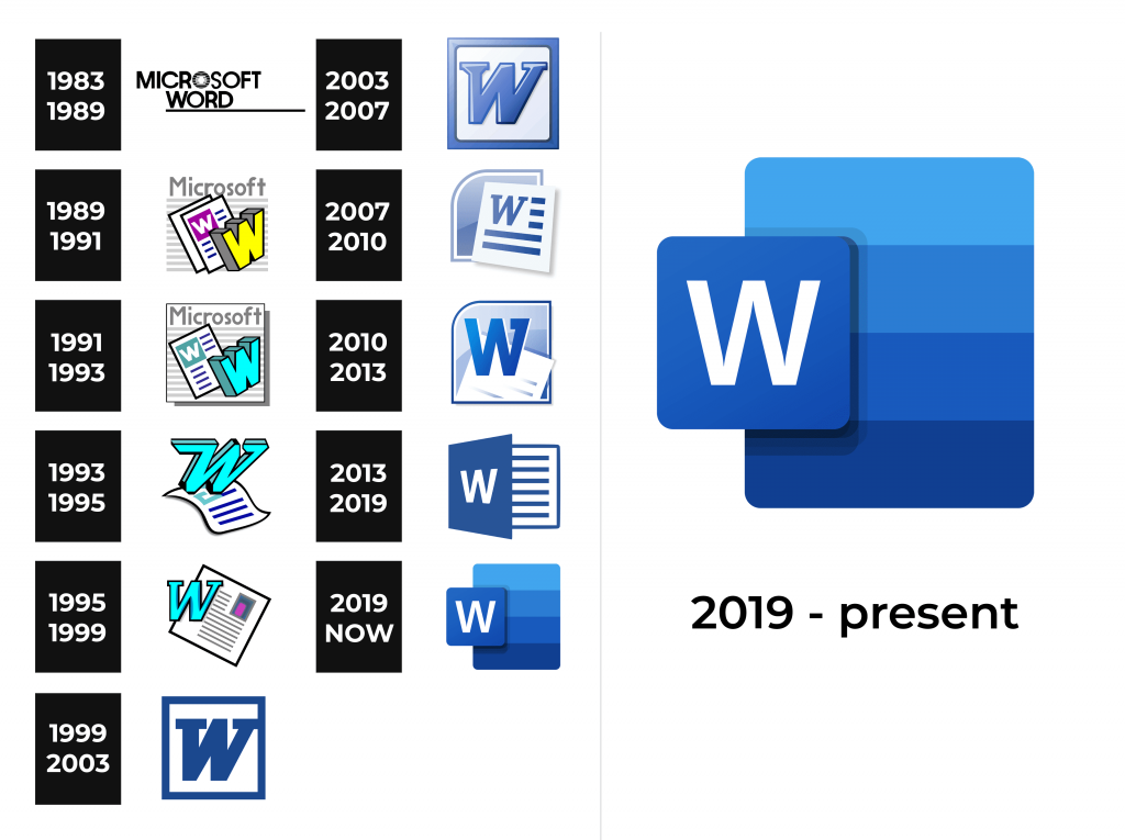
1983 – 1989
The original logotype of Microsoft Word depicted the corporation’s wordmark of the time (it had a distinctive ‘O’, composed of numerous strokes) plus the software’s name. The lettering was in all sans-serif caps, and there was an underscore.
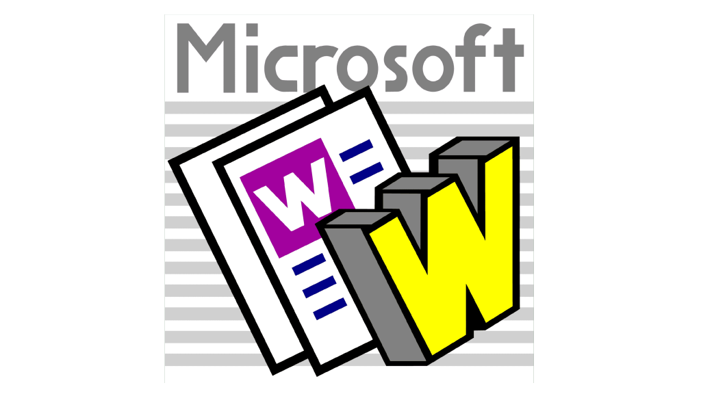
1987 – 1991
Later, the icon changed its appearance. It was a cartoon-styled depiction of two sheets, one laid over another. The upper sheet depicted a pink square with a capital ‘w’, surrounded by blue lines reminding a text. In front of the sheets was an uppercase 3D ‘W’ character, whose sides were gray, while the front side was yellow. Behind all that image, they drew 12 bright gray stripes reminding text. The ‘Microsoft’ word was atop.
1991 – 1993
During the 1991-1993 period, the software used an icon with only one sheet, which showed a pale blue square with a white ‘w’ on it. Aside from it, there was a bright blue 3D ‘W’ with its contours colored black. The area behind was enclosed in a thin squarish frame and showed numerous stripes and the name atop.
1993 – 1995
Later, they changed the sheet’s appearance, making it a wavy paper containing several blue lines, reminding a text and a pale blue squarish shape above. Above it was an abrupt, smooth capital character ‘w’, with the upper tips of the sidebars elongated and turned to the left.
1995 – 1999
The 1995 icon showed the bright blue ‘w’ placed at the left edge of the square sheet with numerous parallel lines on it. There was also an image, showing something pink.
1999 – 2003
The following insignia depicted a small square frame with a thick uppercase ‘w’, decorated with prominent serifs. The whole image was dark blue.
2003 – 2007
Later, they recolored the logo in gradient blue and white and made it 3D. Additionally, the letter became separate (previously, its right tip was implemented into the square).
2007 – 2010
The 2007 edition of the Word’s icon displayed a white paper with a big ‘w’ and numerous lines on it. It was positioned over a gradient blue and pale blue rectangle with a circled upper left edge. It was put within a frame mimicking its shape.
2010 – 2013
The 2010 icon depicted a rectangular shape with the top left angle rounded a bit less than before.
The frame became dark blue, while the shape itself was split into two color zones: the upper one depicted two shades of blue shifting in a gradient effect, and the lower one showed pale blue, turning into the deep blue close to the bottom.
The symbol ‘w’ was redrawn to show no serifs. It had a white contour to stand out from the backdrop. Finally, the sheet with some text emerged from the bottom.
2013 – 2019
Following the software revamp, the well-known logo of Microsoft Word had gotten a fresh makeover. The logo took the shape of a semi-open notebook, containing text. The closing part was a big square with the white ‘w’ on it.
2019 – today
The latter logotype represents the versatility of the application with maximum minimalism. The backdrop, made as a rectangle, depicts four stripes of several shades of blue, getting darker from the upper one to the lowest. At the top left, a little square finds its place. The white ‘w’ stands centrally on it.
Font
The unmistakable “W” within the Word emblem has a semi-bold style without serifs. It bears a striking resemblance to the distinguished characters found in renowned typefaces like Neue Frutiger Arabic Bold or Humanist 777 Std Bold, emanating a sense of timeless elegance.
Color
The captivating color code of the Microsoft Word brand is set up in several shades of blue and white. It reflects the company’s professional approach to Word’s development and its commitment to the best customer service.


