Miami Dolphins Logo
Tags: Brian Flores | East Division NFL | NFL | USA
Miami Dolphins are a professional rugby franchise from the East Division of NFL. The team was established in 1965 and started playing the next year. The team is one of the strongest and most popular across the United States. Today the franchise is owned by Stephen M.Ross and the team’s head coach is Brian Flores.
Meaning and history
The Miami Dolphins is one on the teams who have always been constant in their visual identity design and despite numerous redesigns, always kept the original concept and style of the logo, which made it iconic and instantly recognizable.
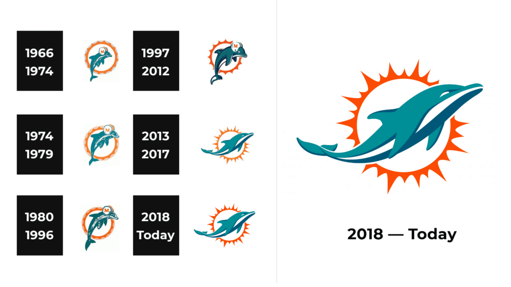
1966 – 1974
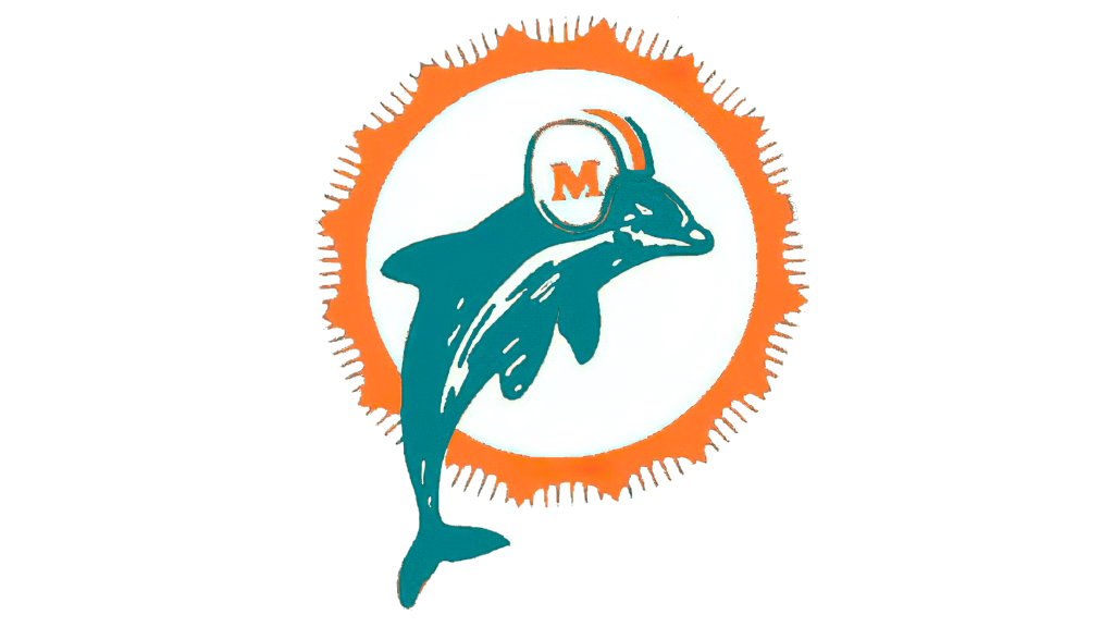
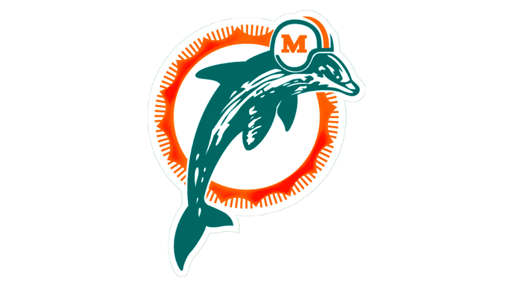
The initial logo was created for the team in 1966 and was composed of a turquoise-blue dolphin in a football helmet, leaping in front of the stylized sun image. The helmet featured a bold orange letter “M”, repeating the color of the sunburst, and an orange and turquoise stripes.
1974 – 1979
The logo gets its first redesign only in 1974, but nothing really changes, except for cleaned and modified contours and the enlargement of the dolphin itself. The color palette and composition remain untouched. It was also the time period when the team started placing the logo on their helmets.
1980 – 1996
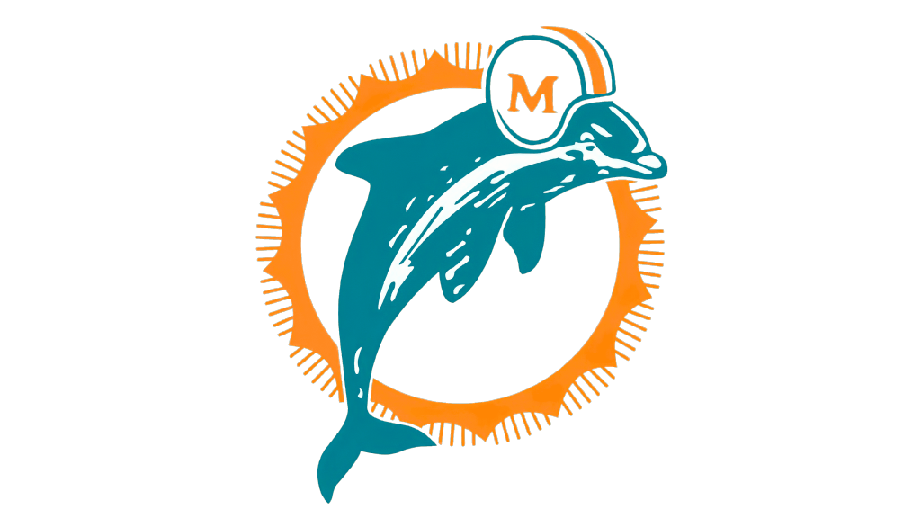
Another redesign was held in 1980. The letter “M” on the helmet is now drawn in a bolder and more modern serif typeface and the color palette is switched to a darker and more intense one. The new logo stays with the team for another 16 years, which is quite a long period.
1997 – 2012
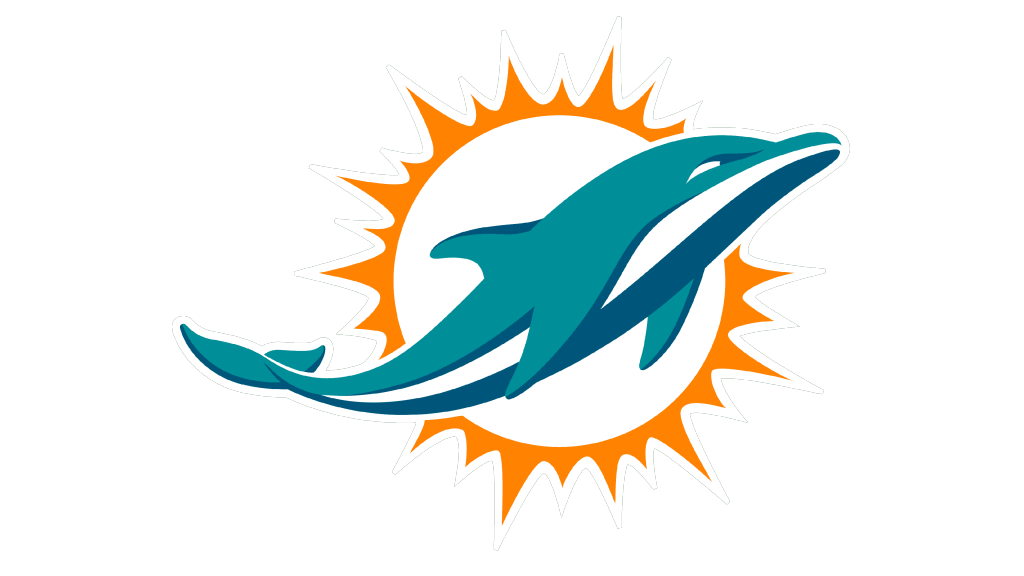
In 1997 the iconic logo has undergone some significant changes — the dolphin and the sunburst were thoroughly redrawn in a sleeker contemporary way, with clean and smooth lines. The dolphin’s face now looks tricky and fun. Another important detail of the new image is the addition of a dark blue color to the traditional team’s palette.
The alternate logo, predicting the dolphin with a football was also designed in 1997. No sun was in it, but four bold lines coming out of the ball.
2013 – 2017
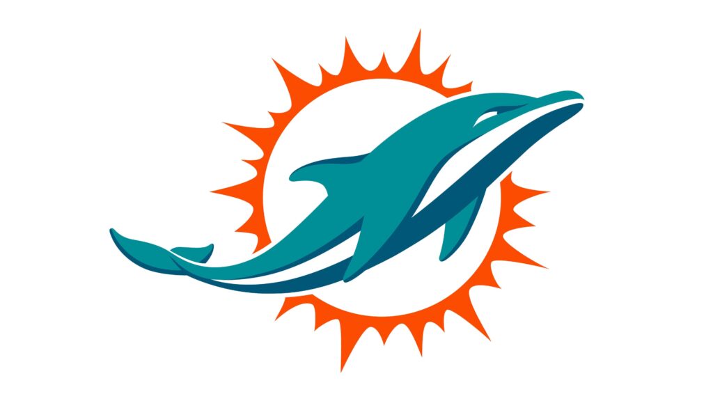
Probably the most significant changes were made to the Rugby team’s logo in 2013. First of all, the helmet was removed, and the dolphin is now not leaping but swimming. Its contours have also been refined.
2018 – Today
The color of the sunburst was changed from orange to a darker, closer to red, shade in 2018. All the other details remained untouched.
Symbol
The leaping dolphin and the shining star have been the symbol of the Miami rugby team since the year of its establishment. The kind and smart animal reflect the game style of the players and the turquoise and orange color palette represent expertise, passion, and happiness.
Emblem
For the emblem, the team placed its iconic dolphin with the sunburst inside a turquoise square, which makes the image look balanced and bright. Sometimes the emblem is accompanied by a wordmark, executed in the same color palette, with the use of a sleek modern sans-serif typeface.
Helmets
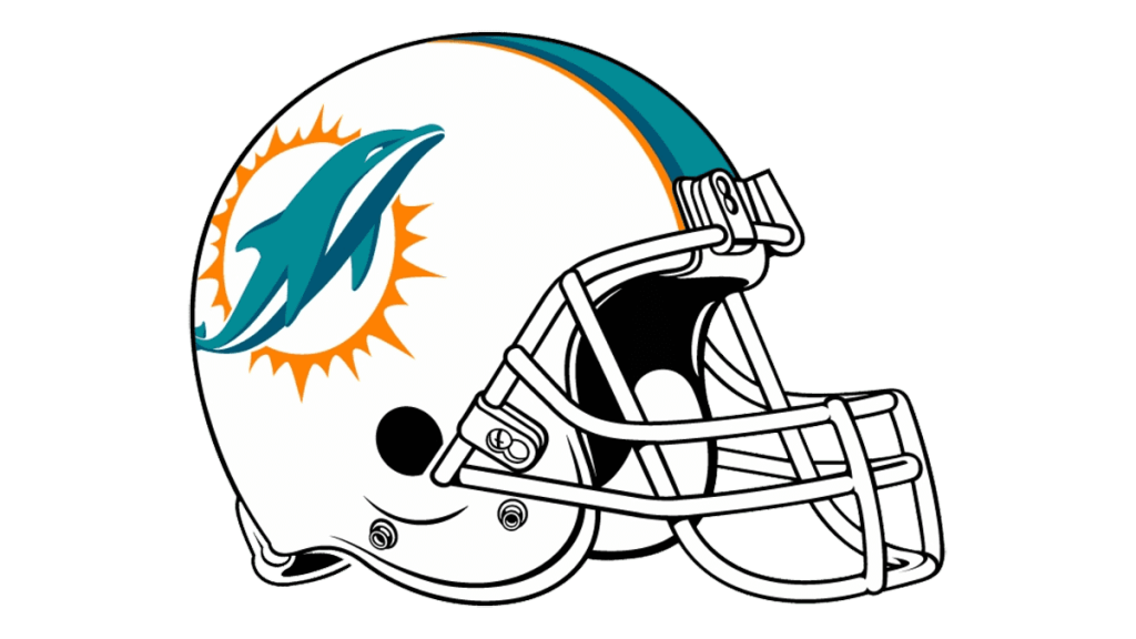
The Miami Dolphins’ helmets feature white color as the main and have a colorful emblem placed on its side. The grill of the helmet is colored white, which adds freshness and recognizability to the whole look.
Uniforms
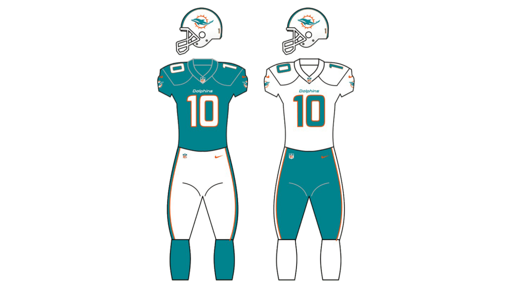
The Miami Dolphins’ uniforms feature the same color palette as their iconic logo. For the home games, the team wears turquoise-blue jerseys with white numbers in an orange outline and white pants with turquoise and orange stripes on the sides.
For the road uniforms, there are snow-white jerseys and pants with bright turquoise and orange accents and numbers.
